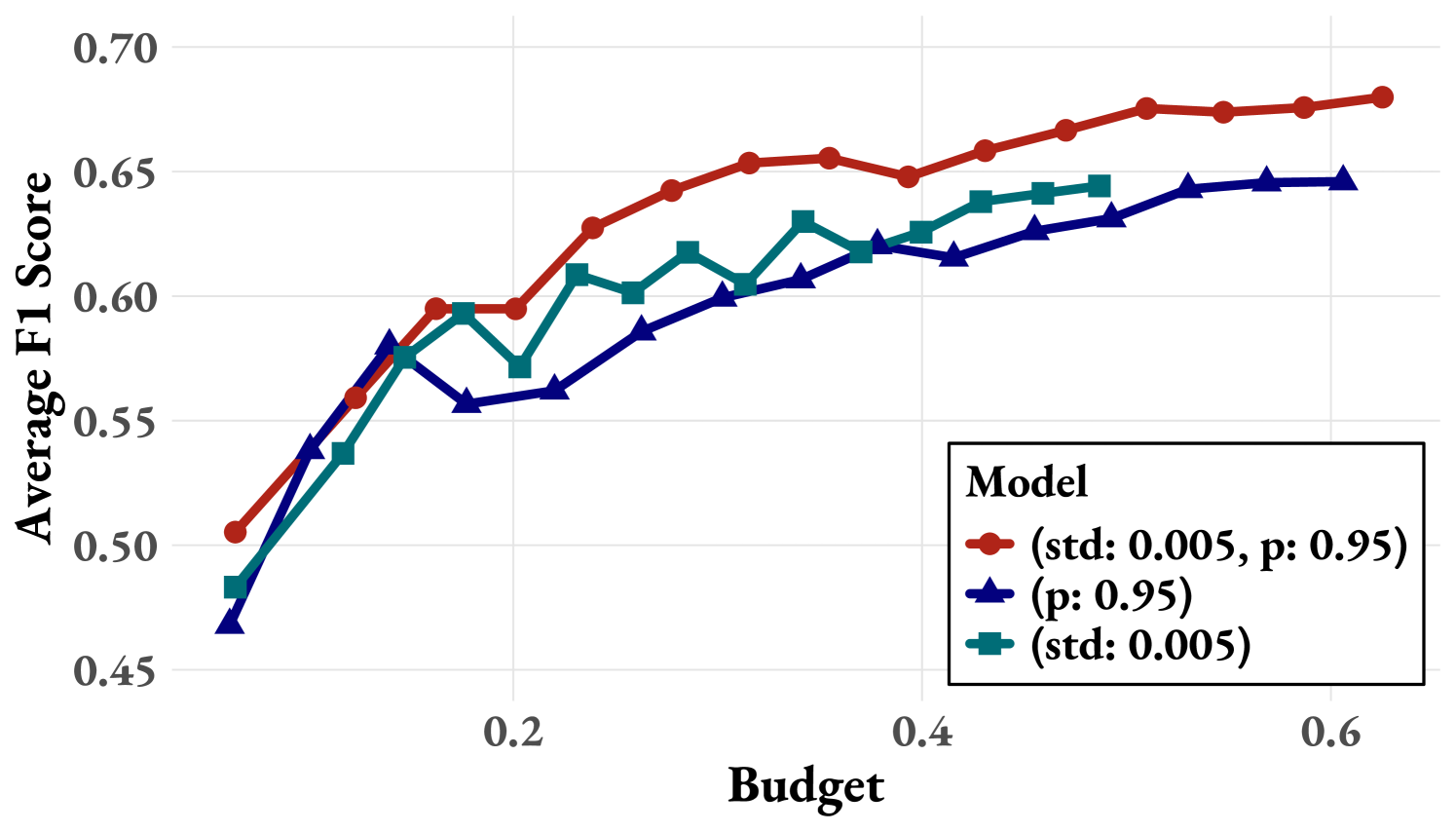
## Line Chart: Average F1 Score vs. Budget
### Overview
This line chart depicts the relationship between "Budget" and "Average F1 Score" for three different models. The chart shows how the average F1 score changes as the budget allocated to the model increases. A legend in the top-right corner identifies each model and provides associated statistical information.
### Components/Axes
* **X-axis:** "Budget" ranging from 0.0 to 0.7, with markers at 0.0, 0.2, 0.4, and 0.6.
* **Y-axis:** "Average F1 Score" ranging from 0.45 to 0.70, with markers at 0.45, 0.50, 0.55, 0.60, 0.65, and 0.70.
* **Legend:** Located in the top-right corner, labeled "Model". It contains three entries:
* Red line: "(std: 0.005, p: 0.95)"
* Blue line: "(p: 0.95)"
* Teal line: "(std: 0.005)"
### Detailed Analysis
* **Red Line (std: 0.005, p: 0.95):** This line represents a model with a standard deviation of 0.005 and a p-value of 0.95. The line slopes generally upward, indicating an increase in Average F1 Score as the Budget increases.
* At Budget = 0.0, Average F1 Score ≈ 0.49
* At Budget = 0.2, Average F1 Score ≈ 0.59
* At Budget = 0.4, Average F1 Score ≈ 0.64
* At Budget = 0.6, Average F1 Score ≈ 0.67
* **Blue Line (p: 0.95):** This line represents a model with a p-value of 0.95. The line initially decreases, then increases with the Budget.
* At Budget = 0.0, Average F1 Score ≈ 0.48
* At Budget = 0.2, Average F1 Score ≈ 0.55
* At Budget = 0.4, Average F1 Score ≈ 0.62
* At Budget = 0.6, Average F1 Score ≈ 0.65
* **Teal Line (std: 0.005):** This line represents a model with a standard deviation of 0.005. The line shows an initial increase, followed by fluctuations and a slight decrease.
* At Budget = 0.0, Average F1 Score ≈ 0.50
* At Budget = 0.2, Average F1 Score ≈ 0.61
* At Budget = 0.4, Average F1 Score ≈ 0.62
* At Budget = 0.6, Average F1 Score ≈ 0.63
### Key Observations
* The red line consistently demonstrates the highest Average F1 Score across all budget levels.
* The blue line exhibits the most significant initial drop in performance as the budget increases from 0.0 to 0.2.
* The teal line shows the most variability in performance, with fluctuations around the 0.62 mark.
* All three models show an overall positive trend, with increasing Average F1 Score as the Budget increases, although the rate of increase varies.
### Interpretation
The data suggests that increasing the budget generally improves the performance (as measured by Average F1 Score) of all three models. However, the red model consistently outperforms the other two, indicating it is the most effective at utilizing the increased budget. The initial dip in the blue model's performance suggests that there might be an initial cost or overhead associated with increasing the budget for that particular model. The statistical information provided in the legend (standard deviation and p-value) suggests that the red model's performance is more stable (lower standard deviation) and statistically significant (higher p-value) than the others. The chart highlights the importance of budget allocation in model performance and suggests that the red model is the most efficient choice for maximizing F1 score within the given budget range. The fluctuations in the teal line could indicate sensitivity to specific data subsets or a less robust training process.