## Multi-Task Learning Loss Curve: Sequential Task Performance
### Overview
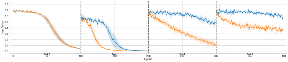
The image is a line chart displaying the training loss (Loss Value) over 400 epochs for two different models or methods (represented by blue and orange lines). The training is divided into four sequential tasks (Task 0 through Task 3), with each task beginning at specific epoch intervals. The chart illustrates how the models learn new tasks and potentially retain knowledge from previous ones.
### Components/Axes
* **X-Axis (Horizontal):** Labeled "Epoch". It ranges from 0 to 400, with major tick marks and labels at 0, 50, 100, 150, 200, 250, 300, 350, and 400.
* **Y-Axis (Vertical):** Labeled "Loss Value". It ranges from 0.0 to 0.8, with major tick marks and labels at 0.0, 0.1, 0.2, 0.3, 0.4, 0.5, 0.6, 0.7, and 0.8.
* **Task Segments:** The chart is divided into four vertical segments by dashed black lines at Epoch 100, 200, and 300. Each segment is labeled at the bottom:
* **Task 0:** Epochs 0-100.
* **Task 1:** Epochs 100-200.
* **Task 2:** Epochs 200-300.
* **Task 3:** Epochs 300-400.
* **Data Series:** Two primary lines are plotted, each with a shaded region representing variance or confidence interval.
* **Blue Line:** Represents one model/method.
* **Orange Line:** Represents a second model/method.
* **Legend:** No explicit legend is present within the chart area. The color association (Blue vs. Orange) is consistent throughout.
### Detailed Analysis
**Task 0 (Epochs 0-100):**
* **Trend:** Both lines start at a high loss (~0.7) and follow a nearly identical, steep downward curve, converging to a very low loss (~0.05) by epoch 100.
* **Data Points (Approximate):**
* Start (Epoch 0): Blue ≈ 0.70, Orange ≈ 0.70.
* End (Epoch 100): Blue ≈ 0.05, Orange ≈ 0.05.
**Task 1 (Epochs 100-200):**
* **Trend:** At the start of Task 1 (Epoch 100), both lines experience a sharp, vertical jump in loss, indicating the introduction of a new task. The orange line then decreases rapidly, reaching near-zero loss by epoch ~175. The blue line decreases more slowly, reaching a similar low loss by epoch ~200.
* **Data Points (Approximate):**
* Start (Epoch 100): Blue ≈ 0.60, Orange ≈ 0.60.
* Mid-point (Epoch 150): Blue ≈ 0.40, Orange ≈ 0.10.
* End (Epoch 200): Blue ≈ 0.02, Orange ≈ 0.01.
**Task 2 (Epochs 200-300):**
* **Trend:** Another sharp loss jump occurs at epoch 200. The orange line shows a steady, consistent decline throughout the task. The blue line declines much more slowly and with more volatility, maintaining a significantly higher loss than the orange line for the entire segment.
* **Data Points (Approximate):**
* Start (Epoch 200): Blue ≈ 0.70, Orange ≈ 0.65.
* Mid-point (Epoch 250): Blue ≈ 0.60, Orange ≈ 0.35.
* End (Epoch 300): Blue ≈ 0.50, Orange ≈ 0.15.
**Task 3 (Epochs 300-400):**
* **Trend:** A final loss jump at epoch 300. The pattern from Task 2 continues and intensifies. The orange line descends steadily. The blue line remains high and relatively flat, showing minimal improvement and high variance.
* **Data Points (Approximate):**
* Start (Epoch 300): Blue ≈ 0.70, Orange ≈ 0.65.
* Mid-point (Epoch 350): Blue ≈ 0.65, Orange ≈ 0.45.
* End (Epoch 400): Blue ≈ 0.60, Orange ≈ 0.35.
### Key Observations
1. **Performance Divergence:** While both models perform identically on the first task (Task 0), a significant performance gap emerges from Task 1 onward, with the orange model consistently achieving lower loss values faster.
2. **Catastrophic Forgetting Indicator:** The blue model shows strong signs of catastrophic forgetting. Its loss resets to a high value at the start of each new task (2, 3) and fails to recover to the low loss levels it achieved on previous tasks. Its final loss in Task 3 (~0.60) is much higher than its final loss in Task 0 (~0.05).
3. **Stability:** The orange model demonstrates more stable and efficient learning across sequential tasks. Its loss curves are smoother, and it reaches lower final loss values in each subsequent task compared to the blue model.
4. **Variance:** The shaded confidence intervals are wider for the blue line, especially in Tasks 2 and 3, indicating less consistent training runs or higher sensitivity to initial conditions.
### Interpretation
This chart is a classic visualization of **continual** or **sequential learning** in machine learning, where a model is trained on multiple tasks one after another. The data suggests the following:
* **The orange method is superior for continual learning.** It effectively learns new tasks (evidenced by decreasing loss within each segment) while mitigating catastrophic forgetting (its performance on the overall sequence remains strong). This could be due to techniques like experience replay, elastic weight consolidation, or a more robust architecture.
* **The blue method suffers from severe catastrophic forgetting.** As it learns each new task, it "forgets" the knowledge from previous tasks, causing its performance to degrade on the overall sequence. The high, flat loss in Task 3 suggests it has reached a point of minimal further learning capacity within this sequential framework.
* **The initial task (Task 0) is likely the simplest or most foundational,** as both models master it completely. The increasing difficulty or dissimilarity of subsequent tasks exposes the limitations of the blue model's learning approach.
* **Practical Implication:** For applications requiring a model to learn from a stream of data over time without retraining from scratch (e.g., robotics, personalized assistants, adaptive systems), the approach represented by the orange line is far more viable. The blue approach would require frequent full retraining on all data to maintain performance, which is often impractical.