## [Combined Statistical Charts]: Impact of Transformation on Model Weight Distributions and Metrics
### Overview
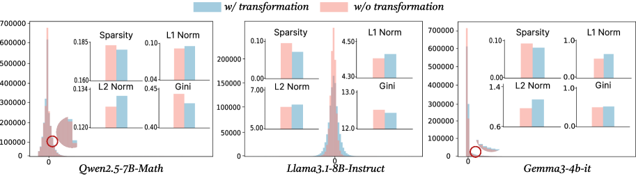
The image presents a comparative statistical analysis of three different large language models (LLMs) under two conditions: "w/ transformation" (blue) and "w/o transformation" (pink). For each model, a main histogram shows the distribution of a value (likely weight or activation values) centered around zero, accompanied by four smaller bar charts comparing key statistical metrics. The analysis aims to demonstrate the effect of a specific transformation on the models' internal parameter distributions.
### Components/Axes
1. **Legend**: Located at the top center of the entire figure.
* Blue square: `w/ transformation`
* Pink square: `w/o transformation`
2. **Main Histograms (3 total)**:
* **X-axis**: Unlabeled, but centered on `0`. Represents the value of model parameters (weights/activations).
* **Y-axis**: Represents frequency/count. Scale varies per model (0-700,000 for Qwen and Gemma, 0-200,000 for Llama).
* **Data Series**: Two overlapping distributions (blue for "w/ transformation", pink for "w/o transformation").
* **Annotation**: A red circle highlights a specific point on the x-axis near zero for each model's histogram.
3. **Bar Chart Insets (4 per model, 12 total)**:
* Each inset compares a single metric between the two conditions.
* **Metrics**: `Sparsity`, `L1 Norm`, `L2 Norm`, `Gini`.
* **Y-axis**: Metric value (scale specific to each chart).
* **X-axis**: Two bars, blue (left) and pink (right).
4. **Model Labels**: Located below each corresponding histogram.
* Left: `Qwen2.5-7B-Math`
* Center: `Llama3.1-8B-Instruct`
* Right: `Gemma3-4b-it`
### Detailed Analysis
**1. Qwen2.5-7B-Math (Left Panel)**
* **Histogram**: Both distributions are sharply peaked near zero. The pink ("w/o") distribution appears slightly taller and narrower at the peak. The red circle is placed on the x-axis at approximately 0.
* **Bar Charts**:
* **Sparsity**: Pink (~0.185) > Blue (~0.180). Transformation slightly reduces sparsity.
* **L1 Norm**: Blue (~0.09) > Pink (~0.08). Transformation increases L1 norm.
* **L2 Norm**: Blue (~0.135) > Pink (~0.130). Transformation increases L2 norm.
* **Gini**: Pink (~0.45) > Blue (~0.44). Transformation slightly reduces the Gini coefficient.
**2. Llama3.1-8B-Instruct (Center Panel)**
* **Histogram**: Distributions are broader than Qwen's. The pink distribution has a higher peak. The red circle is on the x-axis near 0.
* **Bar Charts**:
* **Sparsity**: Pink (~0.10) > Blue (~0.08). Transformation reduces sparsity.
* **L1 Norm**: Blue (~4.50) > Pink (~4.35). Transformation increases L1 norm.
* **L2 Norm**: Blue (~7.5) > Pink (~7.0). Transformation increases L2 norm.
* **Gini**: Pink (~13.0) > Blue (~12.5). Transformation reduces the Gini coefficient.
**3. Gemma3-4b-it (Right Panel)**
* **Histogram**: Similar sharp peak near zero as Qwen. The pink distribution is taller. The red circle is on the x-axis near 0.
* **Bar Charts**:
* **Sparsity**: Pink (~0.10) > Blue (~0.09). Transformation reduces sparsity.
* **L1 Norm**: Blue (~0.9) > Pink (~0.8). Transformation increases L1 norm.
* **L2 Norm**: Blue (~1.3) > Pink (~1.2). Transformation increases L2 norm.
* **Gini**: Pink (~0.9) > Blue (~0.85). Transformation reduces the Gini coefficient.
### Key Observations
1. **Consistent Trend Across Models**: For all three models, the transformation consistently leads to:
* **Increased L1 and L2 Norms**: The blue bars are always higher than the pink bars for these metrics.
* **Decreased Gini Coefficient**: The pink bars are always higher than the blue bars for the Gini metric.
* **Decreased Sparsity**: The pink bars are always higher than the blue bars for Sparsity.
2. **Histogram Shape**: The "w/o transformation" (pink) distributions consistently show a higher peak at zero compared to the "w/ transformation" (blue) distributions, suggesting the transformation spreads the values slightly away from zero.
3. **Magnitude of Effect**: The relative change in metrics appears most pronounced in the `Llama3.1-8B-Instruct` model, particularly for the L1 and L2 Norms.
### Interpretation
This visualization demonstrates the effect of a specific (unspecified) transformation on the weight or activation distributions of three LLMs. The data suggests the transformation has a **regularizing or redistributing effect**.
* **Increased Norms (L1, L2)**: The transformation increases the overall magnitude of the parameters, making the vector of values "longer" in geometric terms.
* **Decreased Gini Coefficient**: The Gini coefficient measures inequality or concentration. A decrease indicates the transformation makes the distribution of parameter values **more uniform** and less concentrated around a few large values.
* **Decreased Sparsity**: The transformation reduces the number of parameters that are exactly or near zero, making the model's representations denser.
* **Peircean Reading**: The consistent pattern across three different model architectures (Qwen, Llama, Gemma) suggests the transformation's effect is **robust and model-agnostic**. The red circles on the histograms likely highlight the region of highest density (near zero), which is precisely where the transformation seems to have its most visible effect—smoothing and slightly flattening the peak. This could imply the transformation is designed to mitigate issues related to extreme sparsity or high concentration of values (e.g., improving training stability, reducing quantization error, or enhancing model robustness). The trade-off appears to be an increase in the overall norm of the parameters.