## Scatter Plot: t-SNE Visualization of Decomposed factors
### Overview
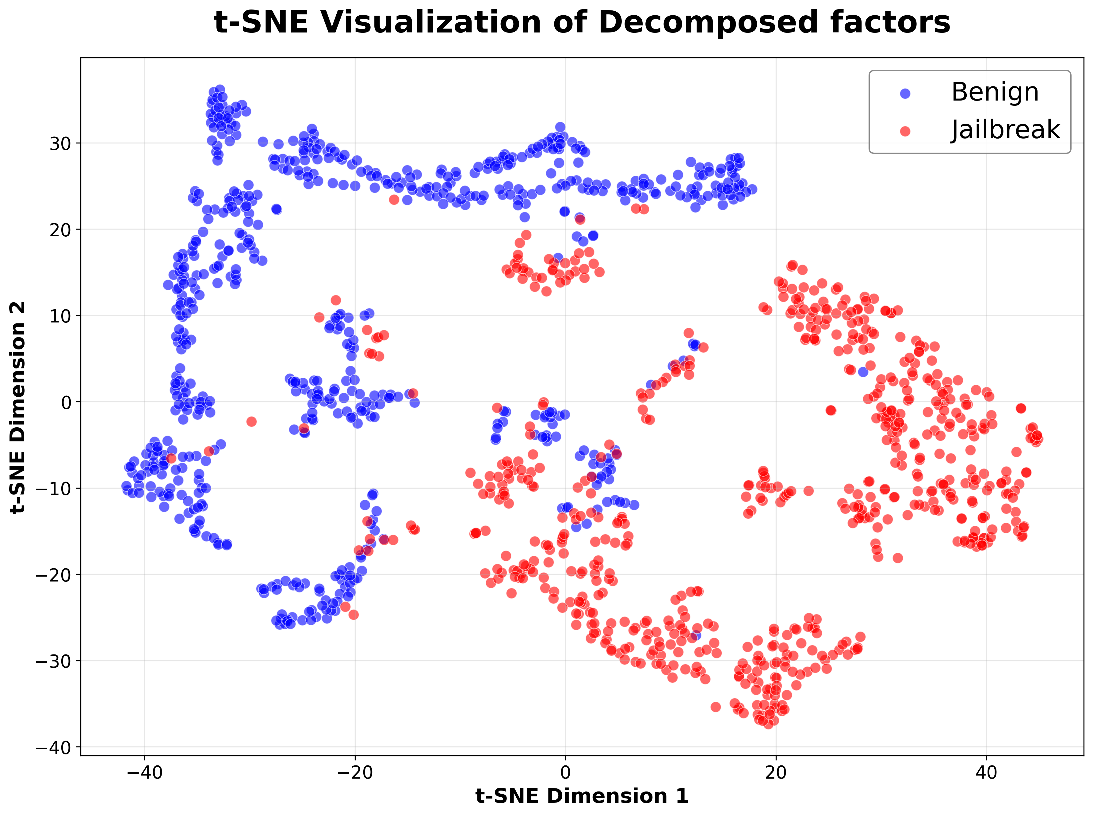
This image is a two-dimensional scatter plot generated using t-SNE (t-Distributed Stochastic Neighbor Embedding), a dimensionality reduction technique. The plot visualizes the distribution of data points from two distinct classes, labeled "Benign" and "Jailbreak," in a reduced feature space. The primary purpose is to show how separable or clustered these two classes are based on their decomposed factors.
### Components/Axes
* **Title:** "t-SNE Visualization of Decomposed factors" (centered at the top).
* **X-Axis:** Labeled "t-SNE Dimension 1". The scale runs from approximately -40 to +40, with major tick marks at intervals of 20 (-40, -20, 0, 20, 40).
* **Y-Axis:** Labeled "t-SNE Dimension 2". The scale runs from approximately -40 to +30, with major tick marks at intervals of 10 (-40, -30, -20, -10, 0, 10, 20, 30).
* **Legend:** Located in the top-right corner of the plot area. It contains two entries:
* A blue circle symbol followed by the text "Benign".
* A red circle symbol followed by the text "Jailbreak".
* **Grid:** A light gray grid is present in the background, aligned with the major tick marks on both axes.
### Detailed Analysis
The plot contains hundreds of individual data points, each represented by a semi-transparent circle. The transparency allows for the visualization of point density where clusters overlap.
* **"Benign" Class (Blue Points):**
* **Spatial Distribution:** The blue points are predominantly clustered on the left side of the plot (negative values on Dimension 1).
* **Key Clusters:**
1. A large, dense, and vertically elongated cluster spans from approximately (-40, -10) to (-30, 30). This is the most prominent blue cluster.
2. A smaller, distinct cluster is located in the bottom-left quadrant, centered around (-25, -25).
3. Several smaller, looser groupings and individual points are scattered in the central region, roughly between Dimension 1 values of -20 and 0.
* **Trend:** The overall visual trend for the blue class is a concentration along the left edge of the plot, with some dispersion toward the center.
* **"Jailbreak" Class (Red Points):**
* **Spatial Distribution:** The red points are predominantly clustered on the right side of the plot (positive values on Dimension 1).
* **Key Clusters:**
1. A very large, dense, and sprawling cluster dominates the right half of the plot. It extends from approximately (0, -35) to (40, 15), with the highest density in the bottom-right quadrant (e.g., around (20, -30)).
2. A smaller, separate cluster is visible in the upper-right area, centered near (30, 10).
3. A notable, isolated cluster of red points appears in the upper-middle region, centered around (0, 15).
* **Trend:** The red class shows a strong concentration on the right side, with a significant dense region in the lower-right and a clear separation of a smaller cluster in the upper-middle area.
* **Overlap Region:**
* There is a transitional zone in the center of the plot, roughly between Dimension 1 values of -10 and 10, where blue and red points intermingle. This indicates that for some data instances, the decomposed factors of "Benign" and "Jailbreak" are not perfectly separable in this 2D projection.
### Key Observations
1. **Clear Class Separation:** There is a strong, visually apparent separation between the majority of the "Benign" (left) and "Jailbreak" (right) data points along the first t-SNE dimension.
2. **Cluster Structure:** Both classes form multiple distinct clusters rather than a single homogeneous cloud, suggesting potential sub-categories or variations within each class.
3. **Density Variation:** The "Jailbreak" class appears to have a higher point density in its main cluster compared to the more spread-out primary "Benign" cluster.
4. **Isolated Anomalies:** A few blue points are found deep within red clusters (e.g., near (30, 5)) and vice-versa (e.g., a red point near (-35, -5)). These could represent outliers, mislabeled data, or adversarial examples.
### Interpretation
This t-SNE plot provides strong visual evidence that the "decomposed factors" extracted from the underlying data contain sufficient information to distinguish between "Benign" and "Jailbreak" instances in most cases. The clear spatial segregation implies that a classifier trained on these factors would likely achieve high accuracy.
The presence of distinct clusters within each class is particularly interesting. It suggests that "Benign" and "Jailbreak" are not monolithic categories. For example, the different blue clusters might correspond to different types of benign queries or user behaviors, while the separate red clusters could represent different jailbreak strategies or attack vectors. The isolated cluster of red points in the upper-middle area (around (0,15)) is especially noteworthy, as it is spatially separated from the main red mass, potentially indicating a unique subclass of jailbreak attempts.
The central overlap region is critical from a security perspective. Data points in this zone represent the "hard cases" where the decomposed features of a benign and a jailbreak attempt are similar. These are the instances where a detection system is most likely to make errors (false positives or false negatives). Analyzing the specific characteristics of these overlapping points could be key to improving the robustness of a detection model.
In summary, the visualization demonstrates the effectiveness of the decomposition method for feature separation while also revealing the complex, multi-faceted nature of both benign and malicious behaviors within the analyzed system.