## Scatter Plot: t-SNE Visualization of Decomposed factors
### Overview
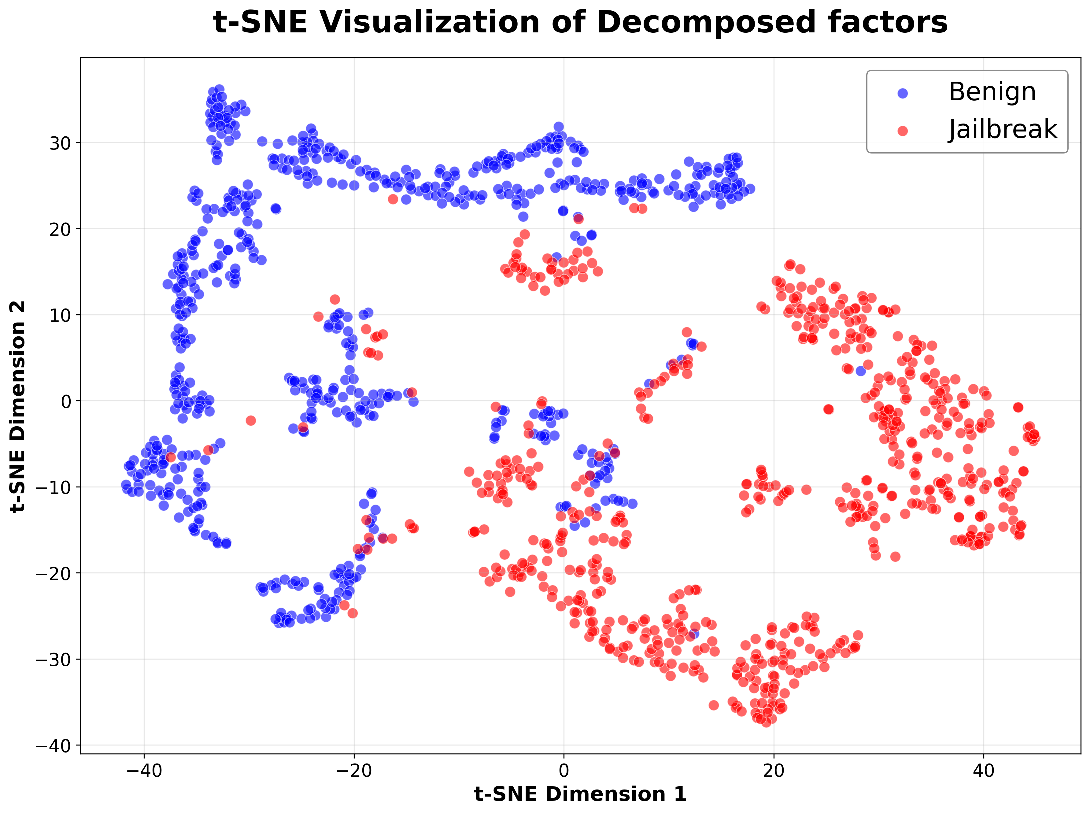
The image is a scatter plot visualizing data points in a two-dimensional space using t-distributed Stochastic Neighbor Embedding (t-SNE). The plot aims to represent high-dimensional data in a lower-dimensional space while preserving the local structure. The data points are colored blue and red, representing two categories: "Benign" and "Jailbreak," respectively. The plot shows the distribution and clustering of these two categories based on the decomposed factors.
### Components/Axes
* **Title:** t-SNE Visualization of Decomposed factors
* **X-axis:** t-SNE Dimension 1, with scale markers at -40, -20, 0, 20, and 40.
* **Y-axis:** t-SNE Dimension 2, with scale markers at -40, -30, -20, -10, 0, 10, 20, and 30.
* **Legend:** Located in the top-right corner.
* Blue circles: "Benign"
* Red circles: "Jailbreak"
* The background has a light gray grid.
### Detailed Analysis
* **Benign (Blue):**
* A large cluster is located in the top-left quadrant, with data points ranging approximately from x=-45 to -20 and y=15 to 35.
* Another cluster is located in the bottom-left quadrant, with data points ranging approximately from x=-45 to -15 and y=-25 to -5.
* A smaller cluster is located around x=-20 to 0 and y=0 to 5.
* **Jailbreak (Red):**
* A cluster is located in the bottom-right quadrant, with data points ranging approximately from x=10 to 45 and y=-35 to 15.
* A cluster is located around x=0 to 20 and y=0 to 20.
* A cluster is located around x=-10 to 10 and y=-20 to -5.
* There is some overlap between the two categories, particularly around the center of the plot.
### Key Observations
* The "Benign" data points are primarily clustered in the left side of the plot, while the "Jailbreak" data points are primarily clustered on the right side.
* There is a clear separation between the two categories, but some overlap indicates that the decomposed factors are not perfectly distinguishable.
* The t-SNE algorithm has successfully reduced the dimensionality of the data while preserving some of the original structure, as evidenced by the clustering of data points.
### Interpretation
The t-SNE plot visualizes the separation between "Benign" and "Jailbreak" data based on decomposed factors. The clustering suggests that these factors can differentiate between the two categories, although some overlap indicates that the separation is not perfect. This visualization can be used to understand the relationships between the decomposed factors and the two categories, and to identify potential features that can be used to classify new data points. The plot demonstrates the effectiveness of t-SNE in reducing the dimensionality of complex data while preserving meaningful relationships.