\n
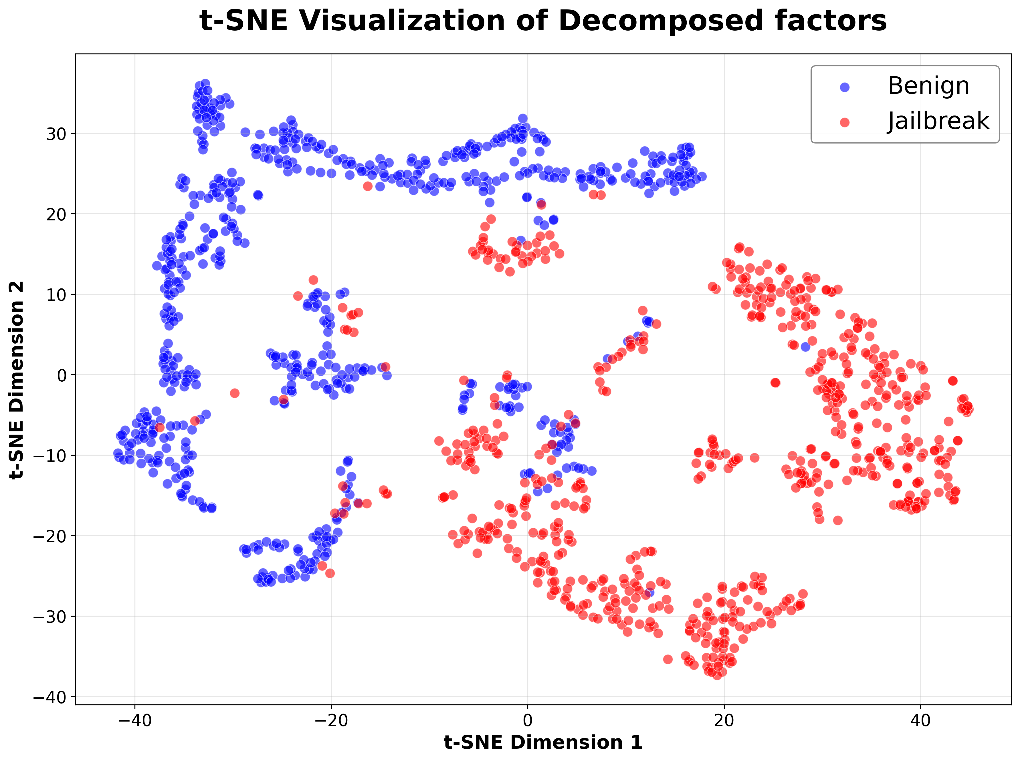
## Scatter Plot: t-SNE Visualization of Decomposed Factors
### Overview
This image presents a scatter plot generated using t-distributed Stochastic Neighbor Embedding (t-SNE). The plot visualizes the distribution of "Decomposed factors" across two dimensions (t-SNE Dimension 1 and t-SNE Dimension 2) for two categories: "Benign" and "Jailbreak". The points are color-coded to distinguish between the two categories.
### Components/Axes
* **Title:** "t-SNE Visualization of Decomposed factors" (centered at the top)
* **X-axis:** "t-SNE Dimension 1" (ranging approximately from -50 to 50)
* **Y-axis:** "t-SNE Dimension 2" (ranging approximately from -40 to 40)
* **Legend:** Located in the top-right corner.
* **Blue circles:** Labelled "Benign"
* **Red circles:** Labelled "Jailbreak"
* **Data Points:** Numerous circular points representing individual data instances.
### Detailed Analysis
The plot shows a clear separation between the "Benign" and "Jailbreak" categories.
**Benign (Blue):**
The "Benign" data points are primarily clustered in the left half of the plot, with a concentration between t-SNE Dimension 1 values of -40 and -10, and t-SNE Dimension 2 values of -10 and 30. There are a few scattered points extending towards the right, but the majority remain on the left.
* Approximate coordinates (sampled):
* (-42, 28)
* (-35, 15)
* (-25, 22)
* (-15, 5)
* (-5, -8)
* (-40, -15)
* (-30, -25)
**Jailbreak (Red):**
The "Jailbreak" data points are predominantly located in the right half of the plot, with a concentration between t-SNE Dimension 1 values of 10 and 45, and t-SNE Dimension 2 values of -30 and 20. There is a noticeable vertical spread, with points extending from approximately -30 to 20 on the t-SNE Dimension 2 axis.
* Approximate coordinates (sampled):
* (15, 18)
* (25, 8)
* (35, -5)
* (40, -20)
* (20, -30)
* (10, 10)
* (45, 5)
There is some overlap between the two categories in the central region of the plot (around t-SNE Dimension 1 = 0), but the overall separation is quite distinct.
### Key Observations
* The t-SNE visualization effectively separates the "Benign" and "Jailbreak" categories into distinct clusters.
* The "Benign" cluster is more tightly grouped than the "Jailbreak" cluster, suggesting greater homogeneity within the benign data.
* The "Jailbreak" cluster exhibits a wider range of values along both t-SNE dimensions, indicating more variability within the jailbreak data.
* There are a few "Benign" points that appear closer to the "Jailbreak" cluster, and vice versa, suggesting some instances may be misclassified or represent transitional states.
### Interpretation
The t-SNE plot demonstrates that the "Decomposed factors" can be used to effectively distinguish between "Benign" and "Jailbreak" instances. The clear separation suggests that the factors capture meaningful differences between these two categories. The wider spread of the "Jailbreak" cluster could indicate that jailbreak attempts are more diverse in their characteristics than benign operations. The overlap between the clusters suggests that some instances are not easily categorized, potentially due to noise or ambiguity in the data. This visualization is useful for understanding the underlying structure of the data and identifying potential features that contribute to the distinction between benign and jailbreak behavior. The t-SNE dimensionality reduction technique has successfully projected the high-dimensional data into a two-dimensional space while preserving the relative distances between data points, allowing for visual inspection of the clusters.