## Diagram: Task Complexity Comparison
### Overview
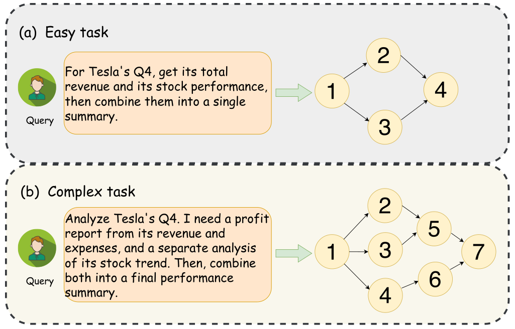
The image presents two diagrams illustrating the difference in complexity between an "easy task" and a "complex task." Both diagrams depict a workflow, starting with a query and progressing through a series of steps represented by numbered nodes. The "complex task" diagram has more nodes and branches, visually demonstrating its increased complexity compared to the "easy task."
### Components/Axes
* **Diagram Structure:** Each diagram consists of a query box, an arrow indicating the start of the process, and a network of numbered nodes connected by arrows.
* **Nodes:** The nodes are numbered circles, representing individual steps or processes.
* **Arrows:** Arrows indicate the flow of information or the sequence of steps.
* **Query Box (Left):** Contains a text description of the task.
* **Task Labels (Top-Left):** "(a) Easy task" and "(b) Complex task"
* **Background:** Each task is contained within a rounded-corner box with a dashed border.
### Detailed Analysis
**(a) Easy Task**
* **Query Text:** "For Tesla's Q4, get its total revenue and its stock performance, then combine them into a single summary."
* **Nodes:**
* Node 1: Initial node.
* Node 2: Connected to Node 1.
* Node 3: Connected to Node 1.
* Node 4: Connected to Nodes 2 and 3.
* **Flow:** The process starts at Node 1, splits into two paths (Nodes 2 and 3), and converges at Node 4.
**(b) Complex Task**
* **Query Text:** "Analyze Tesla's Q4. I need a profit report from its revenue and expenses, and a separate analysis of its stock trend. Then, combine both into a final performance summary."
* **Nodes:**
* Node 1: Initial node.
* Node 2: Connected to Node 1.
* Node 3: Connected to Node 1.
* Node 4: Connected to Node 1.
* Node 5: Connected to Node 2 and Node 3.
* Node 6: Connected to Node 4.
* Node 7: Connected to Node 5 and Node 6.
* **Flow:** The process starts at Node 1, splits into three paths (Nodes 2, 3, and 4), and converges at Node 7 after passing through Nodes 5 and 6.
### Key Observations
* The "Complex task" diagram has more nodes (7) and branches than the "Easy task" diagram (4), indicating a more intricate process.
* Both tasks involve analyzing Tesla's Q4 data, but the "Complex task" requires a more detailed analysis (profit report, stock trend analysis) compared to the "Easy task" (total revenue, stock performance).
### Interpretation
The diagrams visually represent the difference in complexity between two tasks related to analyzing Tesla's Q4 data. The "Easy task" involves a straightforward combination of revenue and stock performance, while the "Complex task" requires a more in-depth analysis of revenue, expenses, and stock trends before combining them into a final performance summary. The increased number of nodes and branches in the "Complex task" diagram illustrates the greater number of steps and dependencies involved in completing the task. The diagrams effectively communicate the concept of task complexity through a visual representation of workflow.