## Line Chart: Probability Distribution Comparison
### Overview
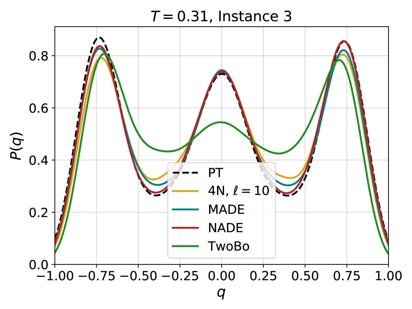
The image is a line chart comparing the probability distribution P(q) across different models (PT, 4N, MADE, NADE, TwoBo) for a system at temperature T = 0.31, instance 3. The x-axis represents 'q', ranging from -1.00 to 1.00, and the y-axis represents P(q), ranging from 0.0 to 0.8. The chart displays a bimodal distribution, with peaks around q = -0.75 and q = 0.75.
### Components/Axes
* **Title:** T = 0.31, Instance 3
* **X-axis:**
* Label: q
* Scale: -1.00, -0.75, -0.50, -0.25, 0.00, 0.25, 0.50, 0.75, 1.00
* **Y-axis:**
* Label: P(q)
* Scale: 0.0, 0.2, 0.4, 0.6, 0.8
* **Legend:** Located in the center of the chart.
* PT (Black, dashed line)
* 4N, l = 10 (Gold line)
* MADE (Teal line)
* NADE (Red line)
* TwoBo (Green line)
### Detailed Analysis
* **PT (Black, dashed line):** The PT line forms the upper bound of the probability distribution. It has peaks at approximately q = -0.75 and q = 0.75, reaching a P(q) value of approximately 0.85. It has a local minimum at q = 0.0, with a P(q) value of approximately 0.73.
* **4N, l = 10 (Gold line):** The 4N line follows a similar trend to the PT line but with slightly lower P(q) values. It has peaks at approximately q = -0.75 and q = 0.75, reaching a P(q) value of approximately 0.80. It has a local minimum at q = 0.0, with a P(q) value of approximately 0.30.
* **MADE (Teal line):** The MADE line also follows a similar trend to the PT line but with slightly lower P(q) values than the 4N line. It has peaks at approximately q = -0.75 and q = 0.75, reaching a P(q) value of approximately 0.82. It has a local minimum at q = 0.0, with a P(q) value of approximately 0.74.
* **NADE (Red line):** The NADE line is very close to the MADE line. It has peaks at approximately q = -0.75 and q = 0.75, reaching a P(q) value of approximately 0.83. It has a local minimum at q = 0.0, with a P(q) value of approximately 0.74.
* **TwoBo (Green line):** The TwoBo line has a similar shape but with a lower peak and higher valley. It has peaks at approximately q = -0.75 and q = 0.75, reaching a P(q) value of approximately 0.84. It has a local minimum at q = 0.0, with a P(q) value of approximately 0.54.
### Key Observations
* All models exhibit a bimodal distribution with peaks around q = -0.75 and q = 0.75.
* The PT model has the highest peaks, closely followed by NADE, MADE, 4N, and TwoBo.
* The TwoBo model has a significantly higher probability at q = 0.0 compared to the other models.
* The 4N model has the lowest probability at q = 0.0 compared to the other models.
### Interpretation
The chart compares the probability distributions generated by different models (PT, 4N, MADE, NADE, TwoBo) for a specific system at a given temperature and instance. The bimodal distribution suggests that the system has two preferred states, corresponding to the peaks at q = -0.75 and q = 0.75. The differences in the peak heights and valley depths indicate variations in how well each model captures the underlying physics of the system. The PT model appears to provide the closest fit, as it forms the upper bound of the probability distribution. The TwoBo model seems to favor a state where q is closer to 0.0 compared to the other models.