\n
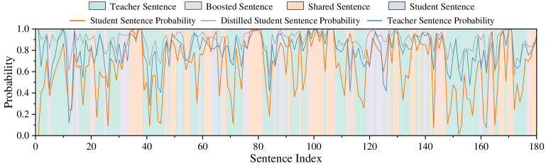
## Line Chart: Sentence Probability Comparison
### Overview
The image presents a line chart comparing the probabilities of sentences generated by different models: Student, Distilled Student, and Teacher. The chart visualizes these probabilities across a sequence of 180 sentences. The background is filled with colored bands representing the sentence type (Teacher, Boosted, Shared, Student).
### Components/Axes
* **X-axis:** "Sentence Index" ranging from 0 to 180.
* **Y-axis:** "Probability" ranging from 0.0 to 1.0.
* **Data Series:**
* "Student Sentence Probability" (Light Blue Line)
* "Distilled Student Sentence Probability" (Medium Orange Line)
* "Teacher Sentence Probability" (Darker Orange Line)
* **Legend:** Located at the top of the chart, indicating the color correspondence for each sentence type:
* Teacher Sentence: Light Green
* Boosted Sentence: Light Purple
* Shared Sentence: Light Orange
* Student Sentence: Light Blue
* **Background Bands:** Colored bands representing the sentence type for each sentence index.
### Detailed Analysis
The chart displays three fluctuating lines representing the probability scores for each model across the 180 sentences. The background bands indicate the type of sentence being evaluated.
* **Student Sentence Probability (Light Blue):** The line fluctuates significantly between approximately 0.4 and 0.95. It generally stays below the Teacher Sentence Probability. The trend is highly oscillatory, with frequent peaks and troughs.
* **Distilled Student Sentence Probability (Medium Orange):** This line also fluctuates, but generally remains between approximately 0.6 and 0.95. It appears to track the Teacher Sentence Probability more closely than the Student Sentence Probability. The trend is also oscillatory, but with slightly larger amplitude in some regions.
* **Teacher Sentence Probability (Darker Orange):** This line exhibits a similar oscillatory pattern, ranging from approximately 0.7 to 1.0. It consistently shows the highest probability scores among the three models.
**Approximate Data Points (sampled):**
| Sentence Index | Student Probability | Distilled Student Probability | Teacher Probability |
|---|---|---|---|
| 0 | ~0.85 | ~0.88 | ~0.95 |
| 20 | ~0.55 | ~0.75 | ~0.85 |
| 40 | ~0.65 | ~0.80 | ~0.90 |
| 60 | ~0.70 | ~0.85 | ~0.95 |
| 80 | ~0.50 | ~0.70 | ~0.80 |
| 100 | ~0.80 | ~0.90 | ~0.98 |
| 120 | ~0.60 | ~0.75 | ~0.85 |
| 140 | ~0.75 | ~0.88 | ~0.95 |
| 160 | ~0.85 | ~0.92 | ~0.98 |
| 180 | ~0.70 | ~0.80 | ~0.90 |
### Key Observations
* The Teacher Sentence Probability consistently outperforms both the Student and Distilled Student Sentence Probabilities.
* The Distilled Student Sentence Probability generally performs better than the Student Sentence Probability.
* All three lines exhibit high variability, suggesting that the probability scores are sensitive to the specific sentence being evaluated.
* The background bands show a roughly periodic pattern of sentence types, with each type appearing multiple times throughout the sequence.
### Interpretation
The chart demonstrates the performance of a student model and its distilled version compared to a teacher model in terms of sentence probability. The higher probabilities consistently achieved by the Teacher model suggest it is a more accurate or confident predictor. The Distilled Student model's improved performance over the Student model indicates that the distillation process effectively transferred knowledge from the Teacher model. The oscillatory nature of the lines suggests that the models' performance varies depending on the complexity or characteristics of the individual sentences. The periodic sentence types in the background may indicate a structured dataset or a specific training methodology. The data suggests that distillation is a viable technique for improving the performance of student models, but there is still a gap between the student models and the teacher model. The fluctuations in probability could be due to variations in sentence length, grammatical complexity, or semantic content.