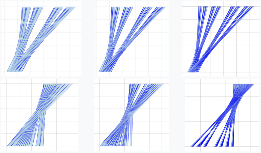
## Diagram Type: Abstract Line Plot Grid
### Overview
The image displays a 2x3 grid of six individual plots. Each plot contains a set of blue lines on a white background with a light gray, square grid. There are no visible titles, axis labels, legends, or numerical markers of any kind. The plots appear to be a visual comparison of different line patterns or functions, possibly representing data series, mathematical curves, or a generative art sequence. The primary variation between plots is the color intensity (shade of blue) and the specific arrangement and density of the lines.
### Components/Axes
* **Grid Structure:** A 2-row by 3-column arrangement of six distinct plotting areas.
* **Plot Background:** White with a light gray, uniform square grid (approximately 8x8 grid cells per plot).
* **Data Elements:** Multiple blue lines per plot. The lines are solid and vary in shade from light sky blue to a deep, dark blue.
* **Labels & Text:** **None present.** There are no axis titles, tick labels, plot titles, legends, or embedded text.
* **Axes:** **None visible.** The plots lack defined X or Y axes with scales or markers.
### Detailed Analysis
**Component Isolation & Trend Verification:**
* **Top-Left Plot:**
* **Color:** Lightest blue shade.
* **Pattern:** Lines originate from the bottom-left quadrant and fan out towards the top-right. They appear to diverge, with some lines curving more sharply than others. The overall trend is upward and to the right.
* **Top-Center Plot:**
* **Color:** Medium-light blue.
* **Pattern:** Similar diverging fan pattern from bottom-left to top-right. The lines appear slightly more densely packed and the blue is darker than the first plot.
* **Top-Right Plot:**
* **Color:** Medium-dark blue.
* **Pattern:** Continues the diverging fan pattern. The lines are more distinct and the blue is more saturated. The spread at the top-right appears slightly wider.
* **Bottom-Left Plot:**
* **Color:** Light blue (similar to Top-Center).
* **Pattern:** Lines originate from the bottom-left but exhibit a more complex, overlapping, and crossing pattern in the center before fanning out towards the top-right. This creates a denser, more tangled visual in the middle of the plot.
* **Bottom-Center Plot:**
* **Color:** Medium-dark blue (similar to Top-Right).
* **Pattern:** Similar crossing and overlapping pattern as the Bottom-Left plot, but with darker lines. The central tangle is pronounced, and the lines diverge towards the top-right.
* **Bottom-Right Plot:**
* **Color:** Darkest blue shade.
* **Pattern:** The most complex and dense pattern. Lines appear to originate from multiple points along the bottom edge, crossing extensively in the center and lower half, creating a thick, dark bundle. They then separate and extend towards the top-right corner. This plot has the highest visual density and the darkest color.
### Key Observations
1. **Progression of Color:** There is a clear gradient in color intensity across the grid, generally moving from lighter blues in the top-left to darker blues in the bottom-right.
2. **Progression of Complexity:** The line patterns evolve from a relatively simple, diverging fan (top row) to a more complex, crossing, and densely bundled arrangement (bottom row). The bottom-right plot is the most complex.
3. **Consistent Directionality:** In all six plots, the general flow of lines is from the bottom-left region towards the top-right region.
4. **Absence of Quantitative Data:** The complete lack of labels, scales, or legends makes it impossible to assign any quantitative meaning, units, or specific categories to the lines or plots. The information is purely visual and relational.
### Interpretation
The image presents a visual study of pattern evolution. The grid structure suggests a comparison or a sequence. The two key variables changing across the plots are **color saturation** (light to dark blue) and **pattern complexity** (simple divergence to complex crossing/bundling).
* **What it Suggests:** This could be a visualization of:
* The output of an iterative algorithm or simulation where parameters change over steps (e.g., increasing noise, changing initial conditions).
* A comparison of different mathematical functions or data series grouped by a property that correlates with color (e.g., time, intensity, category).
* An artistic exploration of form, where the "data" is the aesthetic relationship between line, color, and density.
* **Relationships:** The top row shows a cleaner relationship between the starting and ending points of the lines. The bottom row introduces interference or interaction between the lines, suggesting a system where elements influence each other's paths. The darkening color could symbolize increasing magnitude, density, or importance.
* **Anomalies:** The primary anomaly is the **complete absence of explanatory text**. For a technical document, this renders the chart uninterpretable beyond its visual aesthetics. The bottom-right plot is an outlier in terms of density and darkness, representing the extreme end of the observed progressions.
**Note on Language:** No text in any language is present in the image. Therefore, no transcription or translation is required.