\n
## Chart: Alluvial Diagram Set
### Overview
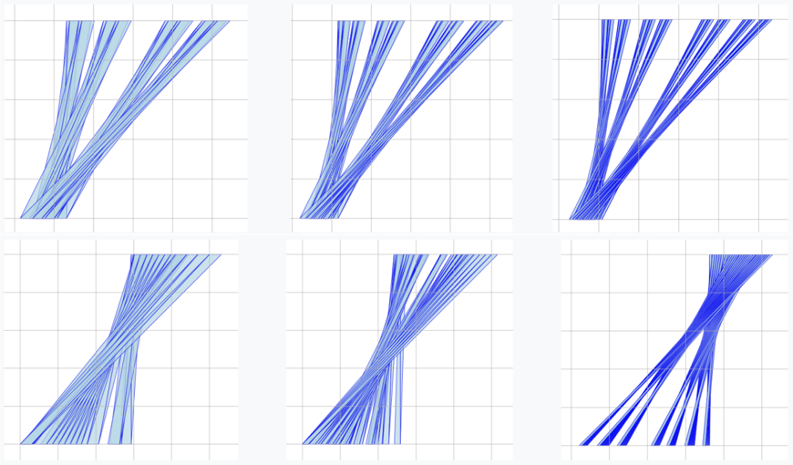
The image presents a 2x3 grid of alluvial diagrams. Each diagram visualizes the flow of data between different categories, represented by vertical columns. The width of the lines connecting the columns indicates the magnitude of the flow. All diagrams share a similar structure, but the flow patterns differ slightly between them. There are no explicit labels or axes titles present in the image.
### Components/Axes
The diagrams consist of:
* **Vertical Columns:** Representing categories or stages. There are two columns in each diagram.
* **Flows:** Lines connecting the columns, representing the movement of data between categories. The thickness of the lines indicates the quantity of data flowing.
* **Grid:** A background grid is present in each diagram, providing a visual reference for the flow patterns.
### Detailed Analysis or Content Details
Due to the lack of labels, precise data extraction is impossible. However, we can describe the flow patterns in each diagram:
* **Top-Left:** The flow starts from the left column and splits into two streams towards the right column. The upper stream is thinner than the lower stream.
* **Top-Center:** Similar to the top-left, but the split is more even, with roughly equal flow in both streams.
* **Top-Right:** The flow starts from the left column and converges into a single stream towards the right column. The flow is concentrated at the top of the right column.
* **Bottom-Left:** The flow starts from the left column and splits into two streams towards the right column. The upper stream is thicker than the lower stream.
* **Bottom-Center:** The flow starts from the left column and splits into two streams towards the right column. The streams are roughly equal in thickness.
* **Bottom-Right:** The flow starts from the left column and converges into a single stream towards the right column. The flow is concentrated at the bottom of the right column.
The color of the flows is a consistent shade of blue across all diagrams. The intensity of the blue appears to be uniform, suggesting that the color does not represent a quantitative variable.
### Key Observations
* All diagrams show a flow from a starting point (left column) to an ending point (right column).
* The diagrams exhibit different flow patterns: splitting, converging, and balanced flows.
* The absence of labels makes it difficult to interpret the meaning of the categories and flows.
* The diagrams appear to be visually similar, suggesting they might represent variations of the same underlying process or dataset.
### Interpretation
The diagrams likely represent the distribution of data across different categories or stages. The splitting diagrams suggest a divergence or branching of data, while the converging diagrams suggest a consolidation or merging of data. The balanced diagrams indicate an even distribution of data.
Without labels, it's impossible to determine the specific meaning of these flows. However, the diagrams could be used to visualize:
* **Customer Segmentation:** Flow from initial customer characteristics to final customer segments.
* **Process Flow:** Flow from input stages to output stages in a manufacturing or business process.
* **Migration Patterns:** Flow from origin locations to destination locations.
* **Decision Trees:** Flow from initial conditions to final decisions.
The variations between the diagrams suggest that different scenarios or datasets are being compared. The diagrams could be used to identify trends, patterns, and anomalies in the data. The consistent use of blue color suggests a unified theme or category across all diagrams. The diagrams are a visual representation of data transformation or movement, but their precise meaning remains unclear without additional context.