## Diagram Type: Grid-Based Line Configurations
### Overview
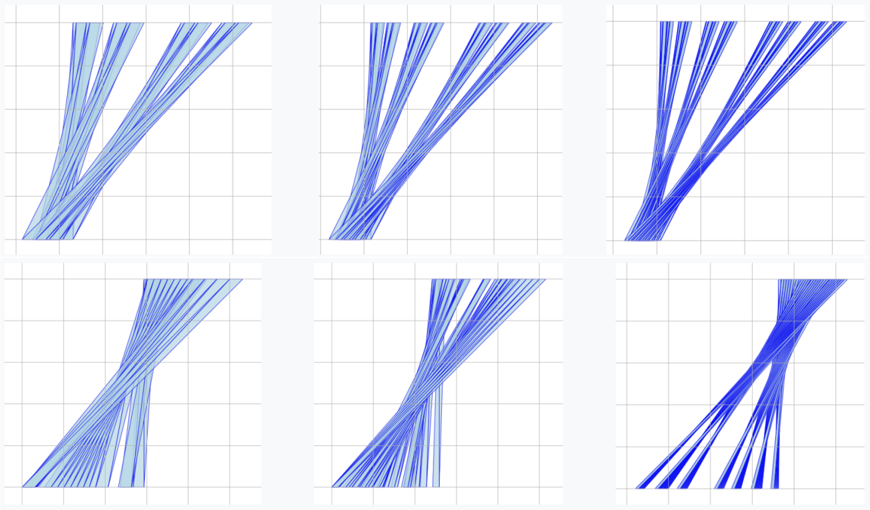
The image contains six grid-based diagrams arranged in two rows and three columns. Each diagram features blue lines with varying densities, angles, and intersection patterns. No textual labels, legends, or axis markers are visible. The grids are uniform (likely 10x10 or similar), and the lines are rendered in shades of blue with no explicit scale or numerical annotations.
### Components/Axes
- **Grid Structure**: All diagrams use a consistent grid layout with horizontal and vertical lines forming squares.
- **Line Characteristics**:
- **Color**: All lines are blue, with no variation in hue or saturation.
- **Density**: Varies significantly between diagrams (e.g., sparse vs. dense clusters).
- **Angles**: Lines range from horizontal/vertical to diagonal orientations.
- **Intersections**: Some diagrams show overlapping lines, while others maintain parallel paths.
### Detailed Analysis
1. **Top-Left Diagram**:
- Lines originate from the bottom-left corner and diverge outward in a fan-like pattern.
- Density decreases with distance from the origin.
2. **Top-Middle Diagram**:
- Lines cluster densely in the center-left region, spreading outward in a V-shape.
- Angles are more uniform compared to other diagrams.
3. **Top-Right Diagram**:
- Lines radiate from the bottom-left to the top-right, forming a diagonal spread.
- Higher density near the origin, tapering off toward the edges.
4. **Bottom-Left Diagram**:
- Lines intersect diagonally, creating a crisscross pattern.
- Density is moderate, with no clear origin point.
5. **Bottom-Middle Diagram**:
- Lines form a spiral-like structure originating from the bottom-left.
- Angles vary gradually, suggesting rotational motion.
6. **Bottom-Right Diagram**:
- Lines converge toward the center-right, forming a funnel-like structure.
- Highest density at the convergence point, with sparse lines at the periphery.
### Key Observations
- **Density Variations**: The top-right and bottom-right diagrams exhibit the highest line density, while the top-left and bottom-left have the lowest.
- **Angular Diversity**: The bottom-middle diagram shows the greatest angular variation, while the top-middle has the most uniform angles.
- **Intersection Complexity**: The bottom-left and bottom-middle diagrams feature the most complex intersections, whereas the top diagrams prioritize directional spread.
### Interpretation
The diagrams likely represent abstract models of dynamic systems, such as:
- **Data Flow Networks**: Lines could symbolize pathways or connections, with density indicating traffic volume.
- **Geometric Simulations**: The grids and line angles might simulate physical forces or motion trajectories.
- **Statistical Distributions**: The spread and clustering of lines could represent variability in a dataset.
Notably, the absence of labels or legends limits quantitative interpretation. The diagrams emphasize qualitative patterns (e.g., convergence, divergence) rather than precise measurements. Further context (e.g., axis labels, legends) would be required to validate hypotheses about their purpose.