## ACF Plots: Four State Autocorrelation Analysis
### Overview
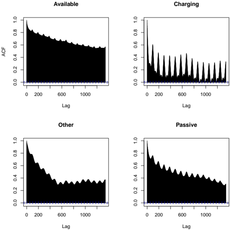
The image displays a 2x2 grid of four Autocorrelation Function (ACF) plots. Each plot corresponds to a different state or category: "Available", "Charging", "Other", and "Passive". The plots visualize how the autocorrelation of a time series for each state decays as the lag (time difference) increases. All plots share the same axes scales and a blue dashed significance threshold line.
### Components/Axes
* **Chart Type:** 2x2 grid of Autocorrelation Function (ACF) plots.
* **Titles (Top of each subplot):**
* Top-Left: `Available`
* Top-Right: `Charging`
* Bottom-Left: `Other`
* Bottom-Right: `Passive`
* **Y-Axis (Common to all plots):**
* **Label:** `ACF` (Autocorrelation Function)
* **Scale:** Linear, from `0.0` to `1.0`.
* **Markers:** `0.0`, `0.2`, `0.4`, `0.6`, `0.8`, `1.0`.
* **X-Axis (Common to all plots):**
* **Label:** `Lag`
* **Scale:** Linear, from `0` to just beyond `1000`.
* **Markers:** `0`, `200`, `600`, `1000`.
* **Significance Threshold:** A horizontal blue dashed line is present in each plot at approximately `ACF = 0.05`. Values above this line are considered statistically significant.
* **Data Representation:** Each plot shows a solid black area representing the ACF value at each lag from 0 to ~1200.
### Detailed Analysis
**1. Plot: Available (Top-Left)**
* **Trend:** Shows a very slow, monotonic decay with a slight convex curve. The autocorrelation remains high for a long duration.
* **Data Points (Approximate):**
* Lag 0: ACF = 1.0 (by definition).
* Lag 200: ACF ≈ 0.85.
* Lag 600: ACF ≈ 0.70.
* Lag 1000: ACF ≈ 0.60.
* **Pattern:** The decay is smooth with very minor, low-amplitude oscillations superimposed on the primary downward trend.
**2. Plot: Charging (Top-Right)**
* **Trend:** Exhibits a sharp initial drop followed by strong, regular periodic spikes.
* **Data Points & Pattern (Approximate):**
* Lag 0: ACF = 1.0.
* Initial Drop: Plummets to near `0.1` by Lag ~50.
* Periodic Spikes: Sharp peaks occur at regular intervals of approximately 100-120 lag units. The amplitude of these spikes gradually decays.
* Spike Heights: First major spike (Lag ~120) reaches ~0.6. Subsequent spikes at ~240, ~360, etc., diminish to ~0.5, ~0.45, etc., down to ~0.3 at Lag 1000.
* Baseline: Between spikes, the ACF hovers near or below the blue significance line.
**3. Plot: Other (Bottom-Left)**
* **Trend:** Shows a faster initial decay than "Available" or "Passive", with more pronounced, irregular fluctuations.
* **Data Points (Approximate):**
* Lag 0: ACF = 1.0.
* Lag 200: ACF ≈ 0.65.
* Lag 400: ACF ≈ 0.45 (local minimum).
* Lag 600: ACF ≈ 0.30.
* Lag 800-1000: ACF fluctuates between ~0.30 and ~0.40.
* **Pattern:** The decay is not smooth; it has a "bumpy" or "wavy" appearance with several local minima and maxima, suggesting more complex or noisy short-term dependencies.
**4. Plot: Passive (Bottom-Right)**
* **Trend:** Shows a steady, moderate decay with a subtle, regular wave-like pattern.
* **Data Points (Approximate):**
* Lag 0: ACF = 1.0.
* Lag 200: ACF ≈ 0.75.
* Lag 600: ACF ≈ 0.50.
* Lag 1000: ACF ≈ 0.40.
* **Pattern:** The overall decay is smoother than "Other" but less smooth than "Available". A low-frequency oscillation is visible, with gentle peaks and troughs occurring every ~200-250 lag units.
### Key Observations
1. **Distinct Temporal Signatures:** Each state exhibits a unique autocorrelation profile, indicating fundamentally different temporal dynamics.
2. **"Charging" is Periodic:** The "Charging" state is the only one with a strong, clear periodic component, suggesting a regular, repeating cycle (e.g., a charging pulse or check-in interval).
3. **Persistence Hierarchy:** The rate of decay (memory length) varies: `Available` (slowest decay, longest memory) > `Passive` > `Other` > `Charging` (fastest initial decay, but with periodic re-emergence of correlation).
4. **Significance:** For lags beyond ~100, only the periodic spikes in "Charging" and the slowly decaying tail of "Available" consistently remain above the significance threshold. The "Other" and "Passive" series drop near or below it more frequently at higher lags.
### Interpretation
These ACF plots are diagnostic tools for understanding the time-series behavior of a system across four states. The data suggests:
* **"Available" State:** Exhibits long-term memory or persistence. Once in this state, the system is likely to remain so for an extended period. This could represent a device being idle and ready.
* **"Charging" State:** Is characterized by a short-term correlation that resets quickly, but with a strong, regular heartbeat. This is classic behavior for a process with a fixed cycle time, such as a battery management system performing periodic charging pulses or status updates.
* **"Other" State:** Shows moderate short-term memory with significant noise or irregularity. This may represent a catch-all category for miscellaneous activities or transitions, lacking a consistent temporal pattern.
* **"Passive" State:** Demonstrates a middle-ground persistence, longer than "Other" but shorter than "Available". The gentle wave pattern might indicate a slow, underlying rhythm or a tendency to fluctuate between slightly different levels of passivity.
**Overall System Insight:** The stark contrast between the plots, especially the periodicity of "Charging" versus the smooth decay of "Available", implies these states are governed by different underlying mechanisms. Analyzing the transitions between these states, using this ACF information as a baseline, could reveal how the system's behavior shifts from persistent to cyclical to noisy modes. The "Charging" plot's regularity is the most actionable feature, potentially allowing for prediction of the next cycle peak.