## Diverging Horizontal Bar Charts: Comparison of Differences at T=0.3, T=0.6, and T=1.0
### Overview
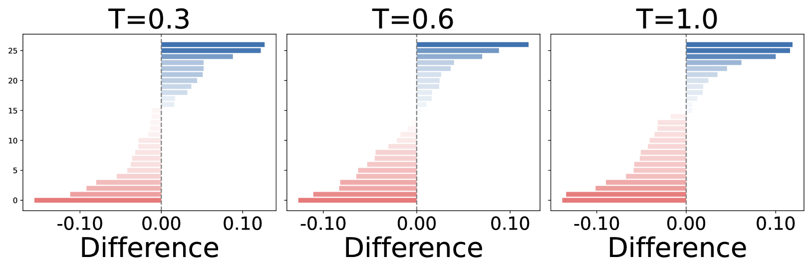
The image displays three side-by-side horizontal bar charts, each representing a dataset labeled by a parameter "T" (T=0.3, T=0.6, and T=1.0). The charts visualize the distribution of a "Difference" metric across approximately 27 discrete categories (indices 0 through 26). The data is sorted by magnitude, with negative values (red/pink) extending to the left of a central zero-axis and positive values (blue) extending to the right.
### Components/Axes
* **Layout:** Three identical chart panels arranged horizontally.
* **Panel Titles:**
* Left: "T=0.3"
* Center: "T=0.6"
* Right: "T=1.0"
* **X-Axis:** Labeled "Difference" at the bottom of each chart.
* Scale: Marked at -0.10, 0.00, and 0.10.
* Range: Extends approximately from -0.15 to +0.15.
* Reference: A vertical dashed line at 0.00 separates negative and positive values.
* **Y-Axis:** Unlabeled, representing discrete indices or categories ranging from 0 at the bottom to 26 at the top.
* **Color Encoding:**
* **Red/Pink:** Negative values (left of the dashed line).
* **Blue:** Positive values (right of the dashed line).
* The intensity of the color correlates with the magnitude of the difference (darker colors indicate larger absolute values).
### Detailed Analysis
The data is sorted by magnitude, creating a distinct wedge-like shape in the distribution.
* **Trend Verification:**
* In all three charts, the bars are sorted by length.
* Indices 0 through ~15 are negative (red), with the largest negative values at the bottom (index 0).
* Indices ~16 through 26 are positive (blue), with the largest positive values at the top (index 26).
* The transition from negative to positive occurs consistently around index 15-16.
* **Data Point Approximations (Consistent across all T values):**
* **Maximum Negative (Bottom, Index 0):** Approximately -0.14.
* **Maximum Positive (Top, Index 26):** Approximately +0.12.
* **Transition Point:** The bars near the center (indices 15-16) are very close to 0.00.
### Key Observations
* **High Stability:** The distribution of "Difference" values is remarkably consistent across all three T values. There is no significant visual variation between the charts for T=0.3, T=0.6, and T=1.0.
* **Asymmetry:** The negative (red) bars have a slightly larger maximum magnitude (~ -0.14) compared to the positive (blue) bars (~ +0.12).
* **Sorting:** The data is strictly ordered by magnitude, which is a common visualization technique to highlight the range of differences rather than the specific identity of the categories.
### Interpretation
* **Parameter Invariance:** The primary takeaway is that the parameter "T" (likely representing Temperature, Time, or a hyperparameter in a model) has negligible impact on the "Difference" metric within the range of 0.3 to 1.0. The system appears robust or invariant to changes in T.
* **System Behavior:** The consistent "wedge" shape suggests that the underlying process generating these differences is stable. The fact that the negative values are slightly larger than the positive values suggests a slight bias in the system toward negative differences.
* **Peircean Investigative Note:** If this were a sensitivity analysis, one would conclude that the variable T is not a significant driver of the observed differences. The uniformity across the three panels implies that the data generation process is either deterministic or that the variance introduced by T is smaller than the resolution of the chart.