\n
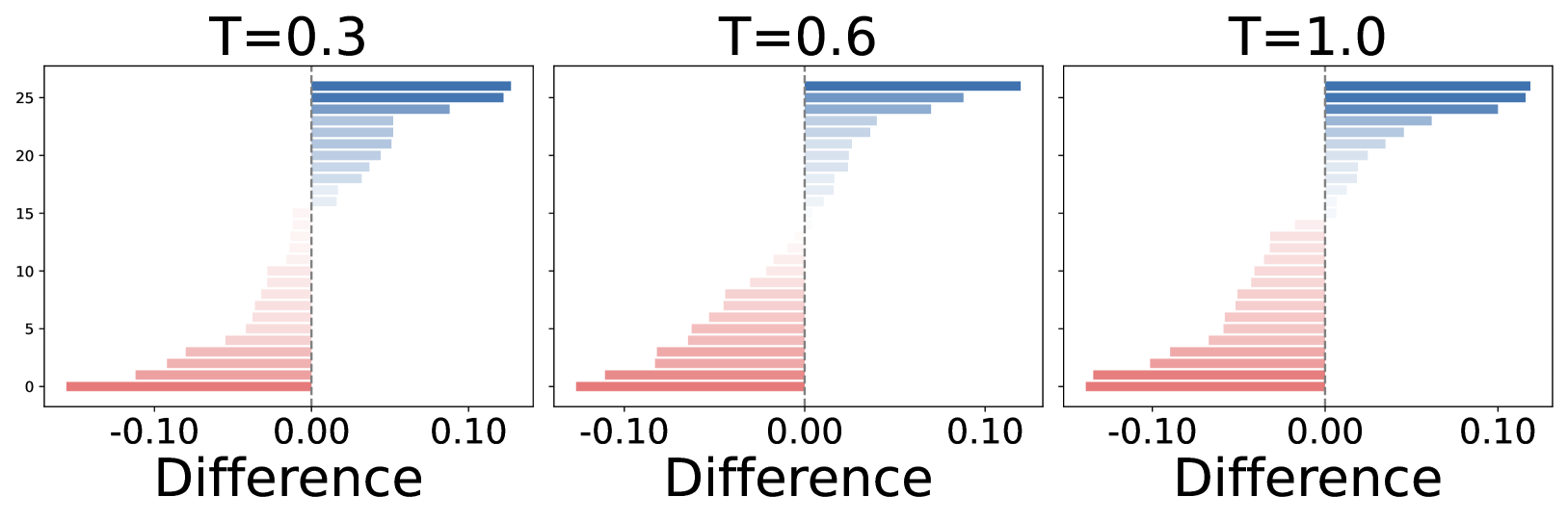
## Bar Chart: Difference Distribution at Varying T Values
### Overview
The image presents three side-by-side bar charts, each representing the distribution of "Difference" values for different values of "T" (0.3, 0.6, and 1.0). Each chart displays a series of vertical bars, colored in shades of blue and red, indicating the frequency or count of differences within specific ranges. A vertical dashed line is present in each chart, positioned at 0.0 on the "Difference" axis.
### Components/Axes
* **X-axis:** Labeled "Difference", ranging from approximately -0.10 to 0.10.
* **Y-axis:** Represents the frequency or count, ranging from 0 to approximately 35. No explicit label is present, but it is implied to be a count.
* **Titles:** Each chart has a title indicating the value of "T": "T=0.3", "T=0.6", and "T=1.0".
* **Bars:** Two distinct colors are used for the bars: a light blue/grey and a light red/pink. These likely represent different categories or groups within the "Difference" data.
* **Vertical Dashed Line:** Present in each chart at x=0.0, potentially representing a threshold or mean value.
### Detailed Analysis
Each chart will be analyzed individually, then compared.
**Chart 1: T=0.3**
* The blue bars (positive differences) generally increase in height from left to right, peaking around a difference of 0.08, then decreasing. The maximum height is approximately 32.
* The red bars (negative differences) increase in height from left to right, peaking around a difference of -0.04, then decreasing. The maximum height is approximately 10.
* The dashed line at 0.0 visually separates the positive and negative difference distributions.
**Chart 2: T=0.6**
* The blue bars show a similar trend to T=0.3, increasing to a peak around 0.08, with a maximum height of approximately 30.
* The red bars also show a similar trend, peaking around -0.04, with a maximum height of approximately 12.
* The dashed line remains at 0.0.
**Chart 3: T=1.0**
* The blue bars again increase to a peak around 0.08, with a maximum height of approximately 28.
* The red bars peak around -0.04, with a maximum height of approximately 10.
* The dashed line remains at 0.0.
**Comparative Analysis:**
* As "T" increases from 0.3 to 1.0, the overall height of the blue bars (positive differences) decreases slightly, from approximately 32 to 28.
* The height of the red bars (negative differences) shows a slight increase from T=0.3 to T=0.6, then decreases back to the level of T=0.3.
* The shape of the distributions remains relatively consistent across all three charts, with peaks around the same difference values.
### Key Observations
* The distributions are not symmetrical around the 0.0 line. There are more positive differences than negative differences in all three charts.
* The peak of the distributions consistently occurs at a positive difference value (around 0.08).
* The effect of "T" on the distributions appears to be relatively small, with only minor changes in the heights of the bars.
### Interpretation
The data suggests that the "Difference" values are generally positive, and that this tendency is consistent across different values of "T". The parameter "T" appears to have a minor influence on the magnitude of the differences, but does not fundamentally alter the shape of the distribution. The dashed line at 0.0 serves as a reference point, highlighting the prevalence of positive differences. The consistent peak around 0.08 suggests a systematic bias or underlying factor contributing to these positive differences. Without knowing what "Difference" and "T" represent, it's difficult to provide a more specific interpretation. However, the data suggests a relationship where increasing "T" doesn't drastically change the distribution of differences, but may slightly reduce the magnitude of positive differences.