## Bar Chart: Distribution of Differences Across Temperature Thresholds (T=0.3, T=0.6, T=1.0)
### Overview
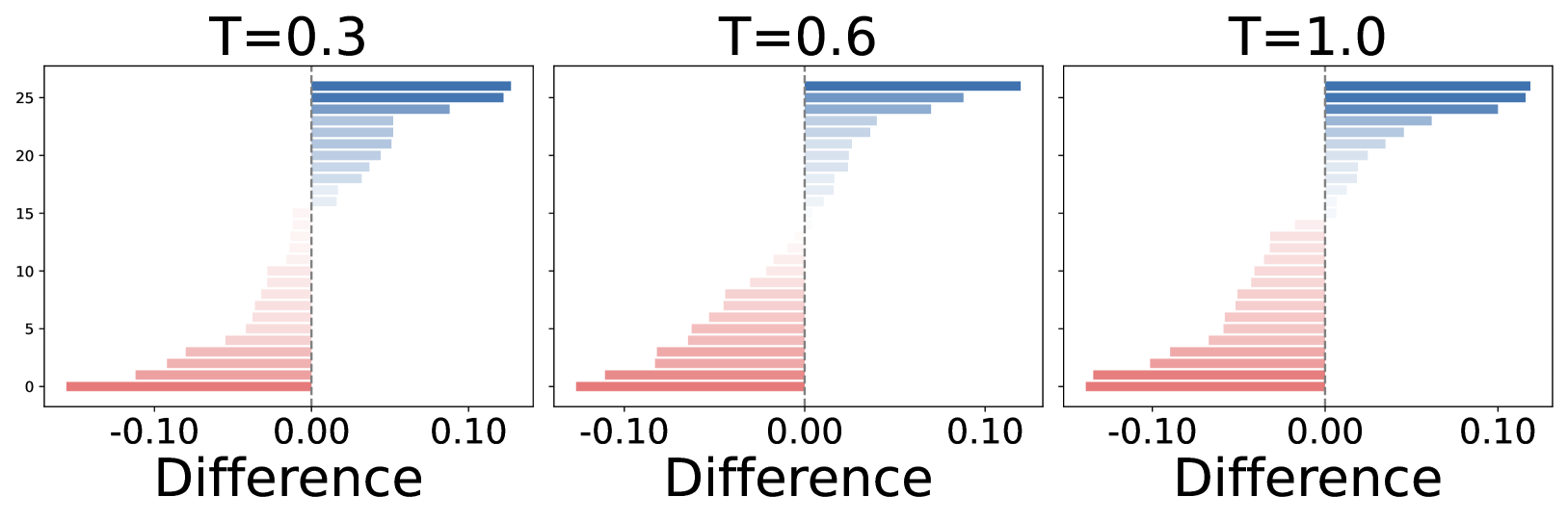
The image contains three horizontally aligned bar charts comparing distributions of "Difference" values across three temperature thresholds (T=0.3, T=0.6, T=1.0). Each chart uses a color-coded legend (red for negative differences, blue for positive differences) and shares identical axis scales. Bars are ordered by magnitude, with the longest bars at the top of each chart.
### Components/Axes
- **X-axis (Horizontal)**: Labeled "Difference" with a range from -0.10 to 0.10 in increments of 0.05.
- **Y-axis (Vertical)**: Unlabeled numerical scale from 0 to 25, representing frequency/count of differences.
- **Legend**: Located on the right side of all charts, with:
- **Red**: Negative differences (left of 0.00)
- **Blue**: Positive differences (right of 0.00)
- **Chart Labels**: Titles above each chart indicate temperature thresholds (T=0.3, T=0.6, T=1.0).
### Detailed Analysis
#### T=0.3
- **Positive Differences (Blue)**:
- Longest bar at ~0.05 difference (frequency ~25).
- Gradual decline to ~0.10 difference (frequency ~15).
- **Negative Differences (Red)**:
- Longest bar at ~-0.05 difference (frequency ~10).
- Gradual decline to ~-0.10 difference (frequency ~5).
#### T=0.6
- **Positive Differences (Blue)**:
- Longest bar at ~0.07 difference (frequency ~22).
- Slightly broader distribution than T=0.3.
- **Negative Differences (Red)**:
- Longest bar at ~-0.06 difference (frequency ~8).
- Narrower distribution than T=0.3.
#### T=1.0
- **Positive Differences (Blue)**:
- Longest bar at ~0.08 difference (frequency ~24).
- Most pronounced positive skew.
- **Negative Differences (Red)**:
- Longest bar at ~-0.07 difference (frequency ~6).
- Minimal negative values compared to higher T thresholds.
### Key Observations
1. **Positive Skew**: All charts show a stronger concentration of positive differences (blue bars) than negative differences (red bars).
2. **Threshold Correlation**: As T increases (0.3 → 1.0), the magnitude and frequency of positive differences increase, while negative differences decrease.
3. **Symmetry**: Distributions are roughly symmetric around 0.00 difference, but with a clear bias toward positive values at higher T.
4. **Consistency**: Color coding (red/blue) and axis scales are identical across all charts, ensuring comparability.
### Interpretation
The data suggests that increasing the temperature threshold (T) correlates with a greater prevalence of positive differences in the measured variable. This could indicate a directional shift in the underlying phenomenon (e.g., a system becoming more favorable to positive outcomes as T rises). The symmetry around zero implies that negative differences, while less frequent, still occur but diminish in prominence at higher T values.