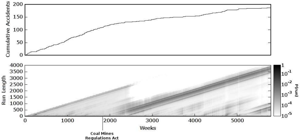
## Combined Chart: Cumulative Accidents and Run Length Probability
### Overview
The image presents two charts stacked vertically. The top chart is a line graph showing the cumulative number of accidents over time. The bottom chart is a heatmap displaying the probability of different run lengths over time. The x-axis for both charts represents time in weeks. A vertical line indicates the implementation of the Coal Mines Regulations Act.
### Components/Axes
**Top Chart:**
* **Y-axis:** "Cumulative Accidents", ranging from 0 to 200 in increments of 50.
* **X-axis:** Implied "Weeks" (same as the bottom chart).
* **Data Series:** A single black line representing the cumulative accident count.
**Bottom Chart:**
* **Y-axis:** "Run Length", ranging from 0 to 4000 in increments of 500.
* **X-axis:** "Weeks", ranging from 0 to approximately 5500 in increments of 1000.
* **Color Scale:** A vertical color bar on the right side labeled "P(run)". The scale is logarithmic, ranging from 1 (darkest) to 10^-5 (lightest). The scale markers are 1, 10^-1, 10^-2, 10^-3, 10^-4, and 10^-5.
* **Vertical Line:** A vertical line at approximately 2200 weeks, labeled "Coal Mines Regulations Act".
### Detailed Analysis or ### Content Details
**Top Chart (Cumulative Accidents):**
* The cumulative accident count increases over time, but the rate of increase varies.
* Initially, the line slopes upward steeply, indicating a rapid increase in accidents.
* Around 1000 weeks, the slope decreases, suggesting a slower rate of accidents.
* The line flattens out somewhat after approximately 4000 weeks, indicating a further reduction in the accident rate.
* Approximate data points:
* At 0 weeks, Cumulative Accidents = 0
* At 1000 weeks, Cumulative Accidents = 75 +/- 5
* At 2000 weeks, Cumulative Accidents = 130 +/- 5
* At 3000 weeks, Cumulative Accidents = 150 +/- 5
* At 4000 weeks, Cumulative Accidents = 180 +/- 5
* At 5000 weeks, Cumulative Accidents = 190 +/- 5
**Bottom Chart (Run Length Probability):**
* The heatmap shows the probability of different run lengths over time. Darker areas indicate higher probabilities.
* There is a general trend of increasing run length probability over time, visible as a diagonal band from the bottom-left to the top-right.
* Before the "Coal Mines Regulations Act" line, there are some areas of higher probability at shorter run lengths.
* After the "Coal Mines Regulations Act" line, the higher probability areas seem to shift towards longer run lengths.
* The probability distribution appears to change around the time of the "Coal Mines Regulations Act".
* The heatmap shows bands of varying probability, suggesting that certain run lengths are more common at different times.
### Key Observations
* The cumulative accident count increases over time, but the rate of increase slows down.
* The "Coal Mines Regulations Act" appears to have an impact on both the cumulative accident count and the run length probability.
* The heatmap shows a general trend of increasing run length probability over time.
### Interpretation
The data suggests that the "Coal Mines Regulations Act" may have had a positive impact on safety in coal mines. The cumulative accident count shows a decrease in the rate of accidents after the act was implemented. The heatmap shows a shift towards longer run lengths, which could indicate that accidents are becoming less frequent or that the mines are operating more consistently.
The relationship between the two charts is that they both provide information about safety in coal mines over time. The cumulative accident count gives an overall picture of the number of accidents, while the heatmap provides more detailed information about the probability of different run lengths.
A notable outlier is the period before 1000 weeks, where the cumulative accident count increases rapidly. This could indicate that there were some specific factors that contributed to a higher accident rate during this time.