\n
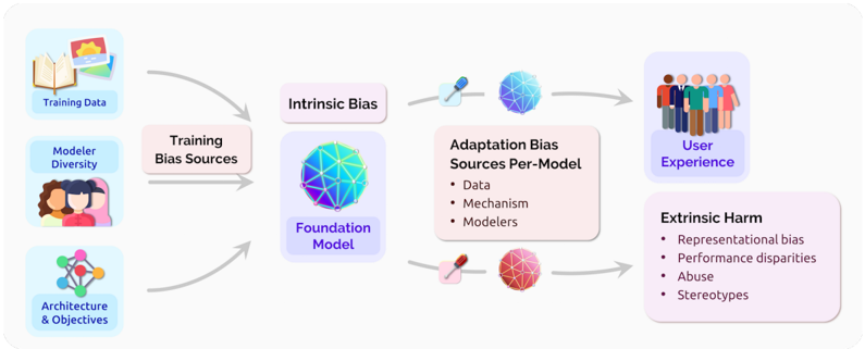
## Diagram: Bias Flow in Model Development
### Overview
The image is a diagram illustrating the flow of bias from training sources through model development to user experience and potential harm. It depicts how biases can be introduced at various stages and manifest in different forms. The diagram uses icons and text labels to represent these stages and types of bias.
### Components/Axes
The diagram is structured around a flow from left to right, with three main sections: Training Bias Sources, Intermediate Bias Stages, and Outcomes.
* **Training Bias Sources (Left):**
* Training Data (icon: books and a computer)
* Modeler Diversity (icon: group of people)
* Architecture & Objectives (icon: molecular structure)
* **Intermediate Bias Stages (Center):**
* Intrinsic Bias (icon: blue sphere with network lines)
* Adaptation Bias (icon: blue sphere with network lines, syringe, and a red sphere with network lines)
* Sources Per-Model: Data, Mechanism, Modelers (listed as bullet points)
* **Outcomes (Right):**
* User Experience (icon: group of people)
* Extrinsic Harm (icon: red sphere with network lines)
* Representational bias
* Performance disparities
* Abuse
* Stereotypes (listed as bullet points)
Arrows indicate the flow of bias from the training sources to the intermediate stages and finally to the outcomes.
### Detailed Analysis or Content Details
The diagram shows a cyclical flow from the "Training Bias Sources" to "Intrinsic Bias" and then to "Adaptation Bias". The "Adaptation Bias" stage is further broken down into sources: "Data", "Mechanism", and "Modelers". Both "Intrinsic Bias" and "Adaptation Bias" then lead to two outcomes: "User Experience" and "Extrinsic Harm".
* **Training Data:** This is the initial source of bias, represented by an icon of books and a computer.
* **Modeler Diversity:** The diversity of the people building the model is another source of bias.
* **Architecture & Objectives:** The design and goals of the model itself can introduce bias.
* **Intrinsic Bias:** This is represented by a blue sphere with network lines.
* **Adaptation Bias:** This is represented by a blue sphere with network lines, and a red sphere with network lines. The syringe icon suggests a process of injecting or modifying the model.
* **User Experience:** The outcome of the model's use, represented by a group of people.
* **Extrinsic Harm:** The negative consequences of the model, represented by a red sphere with network lines. The listed harms are:
* Representational bias
* Performance disparities
* Abuse
* Stereotypes
The arrows indicate a flow of influence. The arrow from "Training Bias Sources" to "Intrinsic Bias" is curved. The arrow from "Training Bias Sources" to "Foundation Model" is curved. The arrows from "Intrinsic Bias" and "Adaptation Bias" to "User Experience" and "Extrinsic Harm" are straight.
### Key Observations
The diagram highlights that bias can originate from multiple sources during the training phase and can manifest in various harmful ways. The distinction between "Intrinsic Bias" and "Adaptation Bias" suggests that bias can be inherent in the data or model itself, or it can be introduced during the adaptation or deployment process. The diagram emphasizes the importance of considering bias at all stages of model development.
### Interpretation
This diagram illustrates a critical perspective on the development and deployment of machine learning models. It demonstrates that bias is not simply a data problem, but a systemic issue that arises from the entire process, from data collection and model design to implementation and usage. The diagram suggests that addressing bias requires a holistic approach that considers all potential sources and consequences. The use of color (blue for positive/neutral stages, red for negative outcomes) reinforces the idea that bias can lead to harmful results. The cyclical nature of the flow suggests that bias can be perpetuated and amplified if not actively addressed. The diagram serves as a visual reminder of the ethical responsibilities of those involved in developing and deploying AI systems. The diagram does not provide any quantitative data, but rather a conceptual framework for understanding the flow of bias.