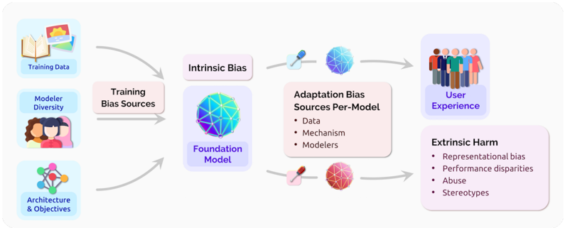
## Flowchart: Bias Propagation in AI Model Development
### Overview
This diagram illustrates the lifecycle of bias propagation in AI systems, starting from training data and modeler inputs through to user experience and societal harms. It uses color-coded spheres to represent different bias types and their relationships.
### Components/Axes
1. **Input Sources** (Left Column):
- Training Data (book/sun icon)
- Modeler Diversity (three people icon)
- Architecture & Objectives (network diagram)
2. **Core Components**:
- Training Bias Sources (pink rectangle)
- Foundation Model (blue sphere)
- Intrinsic Bias (blue sphere)
- Adaptation Bias Sources Per-Model (pink rectangle with three bullet points)
- User Experience (diverse people icon)
- Extrinsic Harm (red sphere with four bullet points)
3. **Flow Arrows**:
- Gray arrows connect components sequentially
- Red arrow connects Foundation Model to Adaptation Bias Sources
- Blue arrow connects Adaptation Bias Sources to User Experience
### Detailed Analysis
1. **Training Bias Sources**:
- Receives input from all three left-column components
- Feeds into Foundation Model
2. **Foundation Model**:
- Blue sphere with geometric pattern
- Receives input from Training Bias Sources
- Outputs to both Intrinsic Bias and Adaptation Bias Sources
3. **Intrinsic Bias**:
- Blue sphere with different geometric pattern
- Directly connected to Foundation Model
4. **Adaptation Bias Sources Per-Model**:
- Pink rectangle containing:
- Data
- Mechanism
- Modelers
- Connected to Foundation Model (red arrow)
- Connected to User Experience (blue arrow)
5. **User Experience**:
- Icon showing diverse group of people
- Receives input from Adaptation Bias Sources
6. **Extrinsic Harm**:
- Red sphere with four bullet points:
- Representational bias
- Performance disparities
- Abuse
- Stereotypes
- Connected to User Experience
### Key Observations
1. **Bias Multiplication Effect**: The diagram shows how initial biases multiply through different stages of model development
2. **Color Coding**:
- Blue = Foundational/Intrinsic elements
- Pink = Training/Adaptation stages
- Red = Harmful outcomes
3. **Bidirectional Flow**: The red arrow between Foundation Model and Adaptation Bias Sources suggests feedback loops
4. **Harm Amplification**: Single input sources lead to multiple harm categories through different pathways
### Interpretation
This diagram demonstrates how bias becomes embedded in AI systems through multiple pathways:
1. **Initial Bias Injection**: Occurs during training data collection, modeler diversity limitations, and architectural choices
2. **Foundation Model Amplification**: The core model inherits and potentially magnifies these biases
3. **Adaptation Stage Vulnerabilities**: When models are adapted for specific uses, new biases can be introduced through data, mechanisms, and modeler decisions
4. **User Impact**: These biases manifest in user experiences through both direct representation issues and harmful outcomes like abuse and stereotyping
The color progression (blue → pink → red) visually represents the transformation of neutral inputs into harmful outputs through technical and social processes. The geometric patterns on the spheres suggest complex, interconnected systems where bias can manifest in non-obvious ways.