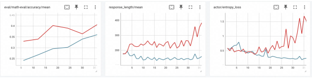
This document provides a technical extraction of data from three performance monitoring charts, likely from a machine learning experiment tracking interface (such as Weights & Biases or TensorBoard).
### Overview
The image consists of three distinct line charts arranged horizontally. Each chart tracks two data series (Red and Blue) over a shared X-axis representing training steps or epochs (ranging from approximately 0 to 35).
---
### Chart 1: eval/math-eval/accuracy/mean
**Metadata:**
* **Title:** `eval/math-eval/accuracy/mean`
* **Y-Axis (Accuracy):** Scale from 0.25 to 0.45 (increments of 0.05).
* **X-Axis (Steps):** Scale from 5 to 35 (increments of 5).
**Data Series Analysis:**
1. **Red Line (Upper Series):**
* **Trend:** Shows a general upward trajectory with a significant peak around step 18, followed by a slight dip and a recovery at the end.
* **Key Points:** Starts at ~0.33 (step 6), peaks at ~0.40 (step 18), dips to ~0.36 (step 30), and ends at ~0.41 (step 35).
2. **Blue Line (Lower Series):**
* **Trend:** Shows a steady, consistent upward slope throughout the duration.
* **Key Points:** Starts at ~0.24 (step 6), reaches ~0.30 (step 20), and ends at ~0.36 (step 35).
**Summary:** Both models improve in accuracy over time, but the Red series maintains a higher mean accuracy throughout the evaluation.
---
### Chart 2: response_length/mean
**Metadata:**
* **Title:** `response_length/mean`
* **Y-Axis (Length):** Scale from 100 to 400 (increments of 100).
* **X-Axis (Steps):** Scale from 0 to 35 (increments of 5).
**Data Series Analysis:**
1. **Red Line (Upper Series):**
* **Trend:** Initially stable with minor oscillations between 200 and 250, followed by a sharp, volatile increase in the final third of the timeline.
* **Key Points:** Starts at ~180. Oscillates around 240 for most of the run. Spikes sharply after step 30, ending at ~380.
2. **Blue Line (Lower Series):**
* **Trend:** After an initial drop, the line remains relatively flat with low-amplitude oscillations.
* **Key Points:** Starts at ~180, drops to ~140 by step 5, and remains between 130 and 160 for the remainder of the run.
**Summary:** The Red series shows a significant increase in response length (potential "verbosity" or "reasoning" expansion) toward the end of training, while the Blue series remains concise.
---
### Chart 3: actor/entropy_loss
**Metadata:**
* **Title:** `actor/entropy_loss`
* **Y-Axis (Loss):** Scale from 0.5 to 1.5 (increments of 0.5).
* **X-Axis (Steps):** Scale from 0 to 35 (increments of 5).
**Data Series Analysis:**
1. **Red Line (Increasing Series):**
* **Trend:** Initially stable/slightly declining, followed by a dramatic and volatile upward trend starting around step 20.
* **Key Points:** Starts at ~0.6. Remains below 0.7 until step 20. Spikes aggressively with high variance, peaking near 1.7 and ending at ~1.5.
2. **Blue Line (Decreasing Series):**
* **Trend:** Shows an initial small spike, followed by a gradual, steady decline (convergence).
* **Key Points:** Starts at ~0.6, peaks briefly at ~0.8 (step 6), then trends downward to end at ~0.25.
**Summary:** The Red series experiences a "divergence" or significant increase in entropy loss in the later stages, correlating with the increased response length in Chart 2. The Blue series shows standard loss convergence.
---
### Technical Observations & Correlations
* **Correlation:** There is a strong positive correlation between the **Red Line's** increase in `response_length` (Chart 2) and its increase in `entropy_loss` (Chart 3) after step 30.
* **Performance:** While the Red series achieves higher accuracy (Chart 1), it does so at the cost of significantly higher entropy and longer response lengths compared to the Blue series.
* **Language:** All text in the interface is in **English**.