## Line Chart: Position vs. Timestep
### Overview
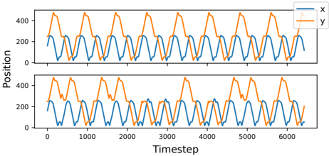
The image displays two stacked line charts representing the "Position" of two variables, labeled 'x' and 'y', over a series of "Timesteps." The top panel appears to show a nominal or baseline state, while the bottom panel shows a state with a distinct anomaly in the 'y' variable.
### Components/Axes
* **X-Axis:** Labeled "Timestep". The scale ranges from 0 to approximately 6500, with major tick marks at 0, 1000, 2000, 3000, 4000, 5000, and 6000.
* **Y-Axis:** Labeled "Position". The scale ranges from 0 to slightly above 400, with major tick marks at 0, 200, and 400.
* **Legend:** Located in the top-right corner of the image.
* **Blue Line:** Labeled "x".
* **Orange Line:** Labeled "y".
* **Layout:** Two identical subplots stacked vertically.
### Detailed Analysis
#### Blue Line ('x')
* **Trend:** The blue line exhibits a consistent, high-frequency oscillation throughout both the top and bottom panels.
* **Range:** The values oscillate between approximately 20 and 260.
* **Waveform:** The pattern is sinusoidal, appearing regular and stable across the entire duration (0 to 6500 timesteps). There is no visible difference between the top and bottom panels for this variable.
#### Orange Line ('y')
* **Trend:** The orange line exhibits a lower-frequency oscillation compared to the blue line.
* **Range:** The values oscillate between approximately 20 and 480.
* **Waveform:** The pattern is non-sinusoidal, characterized by a steep rise, a plateau at the peak (around 480), and a steep decline.
* **Top Panel:** The pattern is highly regular and periodic.
* **Bottom Panel:** The pattern is irregular. Specifically, between timesteps 2000 and 3000, the orange line deviates from the periodic pattern seen in the top panel. It appears to have a phase shift or a "missing" cycle, resulting in a different frequency and peak distribution compared to the top panel.
### Key Observations
* **System Decoupling:** The blue line ('x') remains unaffected by the changes occurring in the orange line ('y'), suggesting that 'x' and 'y' may be independent variables or that the system generating 'x' is isolated from the system generating 'y'.
* **Anomaly:** The bottom panel contains a clear disruption in the orange signal between timesteps 2000 and 3000. This suggests a transient fault, a system reset, or an external perturbation affecting only the 'y' variable.
* **Amplitude Difference:** The orange variable ('y') has a significantly larger range of motion (approx. 460 units) compared to the blue variable ('x') (approx. 240 units).
### Interpretation
This data likely represents the output of a control system, robotic movement, or sensor telemetry.
The top panel serves as a "control" or "nominal" dataset, demonstrating the expected periodic behavior of both variables. The bottom panel represents an "experimental" or "fault" dataset. The disruption in the orange line ('y') between timesteps 2000 and 3000 is the most significant feature. Because the blue line ('x') remains perfectly consistent across both panels, we can infer that the cause of the anomaly in the bottom panel is specific to the subsystem or process responsible for 'y'. The plateaued peaks of the orange line suggest a mechanical or software limit (saturation) being reached at the top of its range.