## Line Chart: Dual Time Series with Periodic Oscillations
### Overview
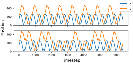
The image displays two vertically stacked line charts (subplots) sharing the same axes labels and scales. Each chart plots two data series, labeled "x" and "y", against a common time axis. Both series exhibit strong, regular periodic oscillations, with the "y" series consistently showing a larger amplitude than the "x" series. The overall visual impression is of two synchronized, repeating waveforms.
### Components/Axes
* **Chart Type:** Two stacked line charts (subplots).
* **X-Axis (Both Subplots):**
* **Label:** "Timestep"
* **Scale:** Linear, ranging from 0 to approximately 6500.
* **Major Tick Marks:** 0, 1000, 2000, 3000, 4000, 5000, 6000.
* **Y-Axis (Both Subplots):**
* **Label:** "Position"
* **Scale:** Linear, ranging from 0 to just above 400.
* **Major Tick Marks:** 0, 200, 400.
* **Legend (Top-Right of each subplot):**
* A blue line segment labeled "x".
* An orange line segment labeled "y".
* **Data Series:**
* **Series "x" (Blue Line):** Oscillates with a lower amplitude.
* **Series "y" (Orange Line):** Oscillates with a higher amplitude.
### Detailed Analysis
**Top Subplot Analysis:**
* **Trend Verification:** Both lines show a clear, repeating sawtooth or triangular wave pattern. Each cycle consists of a rapid rise to a peak followed by a rapid fall to a trough.
* **Data Points & Values (Approximate):**
* **Series "x" (Blue):** Peaks at approximately 250 on the Position axis. Troughs near 0. The period (time between peaks) is roughly 500-600 timesteps.
* **Series "y" (Orange):** Peaks at approximately 450 on the Position axis. Troughs near 0. Its period appears identical to that of series "x", indicating the oscillations are synchronized.
* **Relationship:** The peaks and troughs of the two series align perfectly in time. The "y" waveform is essentially a scaled-up version of the "x" waveform.
**Bottom Subplot Analysis:**
* **Trend Verification:** The same fundamental periodic pattern is present. However, the waveforms, particularly for series "y", appear slightly less regular and more "jagged" or noisy compared to the top subplot.
* **Data Points & Values (Approximate):**
* **Series "x" (Blue):** Similar to the top plot, peaks around 250 and troughs near 0. The pattern remains very consistent.
* **Series "y" (Orange):** Peaks are still around 450, but the shape of the peaks and the descent is more variable. Some peaks are slightly lower or have small notches. The troughs remain near 0.
* **Relationship:** The synchronization between "x" and "y" is maintained, but the "y" series shows more variation in its peak morphology.
### Key Observations
1. **Perfect Synchronization:** The most striking feature is the exact temporal alignment of the peaks and troughs between the "x" and "y" series in both subplots. They are phase-locked.
2. **Amplitude Ratio:** The amplitude of the "y" series is consistently about 1.8 times that of the "x" series (450 vs. 250).
3. **Periodicity:** The oscillations are highly regular, with a stable period of approximately 500-600 timesteps across the entire visible range (0-6500).
4. **Subplot Variation:** While the top subplot shows very clean, smooth waveforms, the bottom subplot introduces slight irregularities and noise, primarily affecting the "y" series. This could indicate a different experimental condition, added noise, or a system under slight stress.
5. **Baseline:** Both series consistently return to a baseline position of approximately 0 at the trough of each cycle.
### Interpretation
This data strongly suggests a **coupled oscillatory system**. The "x" and "y" variables are not independent; their movements are fundamentally linked. The constant amplitude ratio and perfect synchronization imply a direct, possibly linear, relationship between them (e.g., `y ≈ 1.8 * x`).
The "Timestep" axis indicates this is a time-series recording from a simulation, sensor readout, or controlled experiment. The "Position" label suggests the variables track the location of something in one or more dimensions.
The difference between the two subplots is critical. If they represent different trials or system parameters, the bottom plot shows a system where the "y" component has become less stable or is experiencing interference, while the core oscillatory mechanism (driven by or reflected in "x") remains robust. This could be due to increased damping, external perturbation, or a change in a system parameter that affects the "y" variable's response more than the "x" variable's.
**In essence, the image depicts a stable, synchronized, two-component oscillator in the top panel, and a slightly degraded or perturbed version of the same system in the bottom panel.** The core relationship between x and y persists, but the fidelity of the y signal is reduced.