## Line Chart: Accuracy vs. Thinking Compute
### Overview
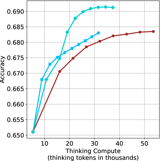
This image presents a line chart illustrating the relationship between "Thinking Compute" (measured in thousands of tokens) and "Accuracy". Three distinct data series are plotted, each represented by a different colored line. The chart appears to demonstrate how accuracy improves with increased computational effort ("Thinking Compute").
### Components/Axes
* **X-axis:** Labeled "Thinking Compute (thinking tokens in thousands)". The scale ranges from approximately 5 to 55, with markers at 10, 20, 30, 40, and 50.
* **Y-axis:** Labeled "Accuracy". The scale ranges from approximately 0.650 to 0.690, with markers at 0.650, 0.660, 0.670, 0.680, and 0.690.
* **Data Series:** Three lines are present, each representing a different model or configuration.
* **Line 1 (Cyan):** A solid line.
* **Line 2 (Blue):** A solid line with square markers.
* **Line 3 (Maroon):** A solid line with circular markers.
* **Grid:** A light gray grid is overlaid on the chart to aid in reading values.
### Detailed Analysis
* **Line 1 (Cyan):** This line exhibits a steep upward trend initially, rapidly increasing in accuracy from approximately 0.652 at 5 tokens to around 0.688 at 30 tokens. The slope then decreases, leveling off to approximately 0.690 at 50 tokens.
* (5, 0.652)
* (10, 0.668)
* (20, 0.682)
* (30, 0.688)
* (40, 0.689)
* (50, 0.690)
* **Line 2 (Blue):** This line also shows an upward trend, but it is less steep than Line 1. It starts at approximately 0.660 at 5 tokens and reaches around 0.683 at 50 tokens.
* (5, 0.660)
* (10, 0.670)
* (20, 0.678)
* (30, 0.681)
* (40, 0.682)
* (50, 0.683)
* **Line 3 (Maroon):** This line has the slowest upward trend. It begins at approximately 0.662 at 5 tokens and reaches around 0.682 at 50 tokens.
* (5, 0.662)
* (10, 0.668)
* (20, 0.675)
* (30, 0.679)
* (40, 0.682)
* (50, 0.682)
### Key Observations
* Line 1 (Cyan) consistently demonstrates the highest accuracy across all "Thinking Compute" values.
* The rate of accuracy improvement diminishes for all lines as "Thinking Compute" increases, suggesting a point of diminishing returns.
* Line 3 (Maroon) exhibits the lowest accuracy and the slowest rate of improvement.
* Lines 2 and 3 converge in accuracy at higher "Thinking Compute" values.
### Interpretation
The chart suggests that increasing "Thinking Compute" generally leads to improved accuracy, but the benefit of additional computation decreases as the amount of computation increases. Line 1 represents a model or configuration that is most effective at leveraging increased "Thinking Compute" to achieve higher accuracy. Line 3, conversely, shows limited gains from increased computation, potentially indicating a bottleneck in its architecture or training. The convergence of Lines 2 and 3 at higher "Thinking Compute" values suggests that both models reach a similar performance ceiling. This data could be used to optimize resource allocation, determining the point at which further investment in "Thinking Compute" yields minimal accuracy gains. The chart implies that there are different levels of efficiency in how these models utilize computational resources to achieve accuracy.