## Line Chart: Accuracy vs. Thinking Compute
### Overview
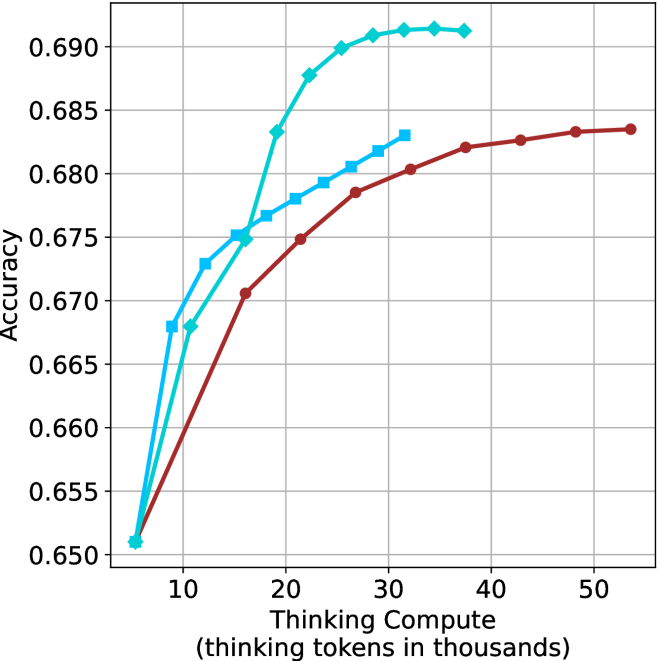
The image is a line chart plotting model accuracy against the amount of "thinking compute" allocated, measured in thousands of thinking tokens. It compares the performance of three distinct methods or models, represented by three lines with different colors and markers. The chart demonstrates a clear positive correlation between increased thinking compute and accuracy, with diminishing returns at higher compute levels.
### Components/Axes
* **Chart Type:** Line chart with markers.
* **X-Axis (Horizontal):**
* **Label:** "Thinking Compute (thinking tokens in thousands)"
* **Scale:** Linear scale from approximately 5 to 55 (thousands of tokens).
* **Major Tick Marks:** 10, 20, 30, 40, 50.
* **Y-Axis (Vertical):**
* **Label:** "Accuracy"
* **Scale:** Linear scale from 0.650 to 0.690.
* **Major Tick Marks:** 0.650, 0.655, 0.660, 0.665, 0.670, 0.675, 0.680, 0.685, 0.690.
* **Legend:** Positioned in the top-left corner of the plot area.
* **Cyan line with diamond markers:** Label not visible in the image.
* **Cyan line with square markers:** Label not visible in the image.
* **Red (brownish) line with circle markers:** Label not visible in the image.
* **Grid:** Light gray grid lines are present for both major x and y ticks.
### Detailed Analysis
**Data Series 1: Cyan line with diamond markers**
* **Trend:** Shows the steepest initial increase and reaches the highest overall accuracy plateau.
* **Data Points (Approximate):**
* (5, 0.651)
* (10, 0.673)
* (15, 0.675)
* (20, 0.683)
* (25, 0.688)
* (30, 0.690)
* (35, 0.691)
* (40, 0.691) - Plateau begins.
* **Observation:** Accuracy rises sharply from 5k to 25k tokens, then plateaus near 0.691 from approximately 30k tokens onward.
**Data Series 2: Cyan line with square markers**
* **Trend:** Increases steadily but at a lower rate than the diamond-marked cyan line, and plateaus at a lower accuracy.
* **Data Points (Approximate):**
* (5, 0.651)
* (10, 0.668)
* (15, 0.675)
* (20, 0.677)
* (25, 0.679)
* (30, 0.681)
* (35, 0.683) - Final data point.
* **Observation:** Follows a similar initial trajectory to the red line but diverges upward around 15k tokens. It ends at approximately 0.683 at 35k tokens.
**Data Series 3: Red (brownish) line with circle markers**
* **Trend:** Shows the most gradual increase, requiring significantly more compute to reach accuracy levels achieved earlier by the cyan lines.
* **Data Points (Approximate):**
* (5, 0.651)
* (15, 0.671)
* (20, 0.675)
* (25, 0.678)
* (30, 0.680)
* (35, 0.682)
* (40, 0.683)
* (45, 0.684)
* (50, 0.684) - Plateau begins.
* **Observation:** This line extends the furthest along the x-axis. It reaches an accuracy of ~0.684 at around 45k-50k tokens, a level the cyan diamond line surpassed at ~20k tokens.
### Key Observations
1. **Common Starting Point:** All three methods begin at the same accuracy point (~0.651) at the lowest compute level (5k tokens).
2. **Diverging Efficiency:** The methods diverge immediately. The cyan diamond method is the most compute-efficient, achieving high accuracy rapidly. The red method is the least compute-efficient for reaching high accuracy.
3. **Diminishing Returns:** All curves exhibit diminishing returns; the slope (accuracy gain per additional token) decreases as compute increases. The cyan diamond curve plateaus most distinctly.
4. **Performance Hierarchy:** At any given compute level above ~10k tokens, the performance order is consistent: Cyan Diamond > Cyan Square > Red. The gap between the top two narrows at very high compute for the red line.
### Interpretation
This chart illustrates a fundamental trade-off in AI model reasoning: the relationship between allocated "thinking" resources (compute tokens) and output quality (accuracy). The data suggests that:
1. **More Compute Helps, But Isn't Free:** Increasing the token budget for internal reasoning consistently improves accuracy across all tested methods, validating the core premise of "thinking" models.
2. **Algorithm/Architecture Matters Profoundly:** The stark difference between the three lines indicates that the underlying method for utilizing thinking tokens is a critical factor. The cyan diamond method represents a significantly more efficient reasoning algorithm, achieving superior performance with half the compute of the red method. This could be due to better planning, more effective use of context, or superior internal verification steps.
3. **The "Accuracy Ceiling" Concept:** Each method appears to approach an asymptotic maximum accuracy (a ceiling) for the given task. The cyan diamond method's ceiling (~0.691) is higher than the others, suggesting it may be fundamentally more capable, not just more efficient. The red method's ceiling (~0.684) is lower, implying that beyond a certain point, throwing more compute at this particular method yields no further benefit.
4. **Practical Implications:** For deployment, this analysis is crucial for cost-performance optimization. If latency or cost is tied to token count, the cyan diamond method is the clear choice. The red method would only be considered if it had other compensating advantages not shown here (e.g., lower base cost, better performance on a different metric). The chart provides the empirical data needed to make that engineering decision.
**Language:** All text in the image is in English.