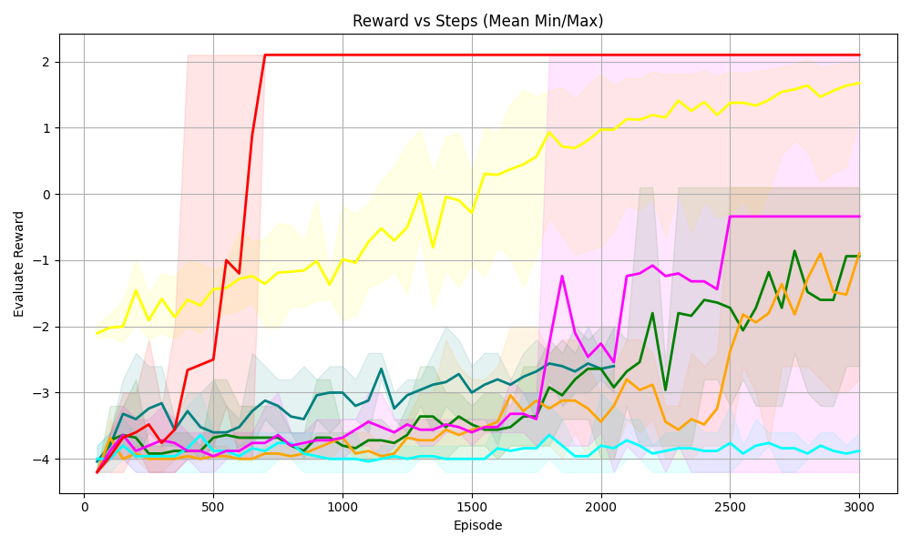
## Chart: Reward vs Steps (Mean Min/Max)
### Overview
The image is a line chart displaying the "Evaluate Reward" versus "Episode" (steps). There are multiple lines, each representing a different algorithm or configuration. The chart also includes shaded regions around some of the lines, indicating the min/max range of the reward.
### Components/Axes
* **Title:** Reward vs Steps (Mean Min/Max)
* **X-axis:** Episode, ranging from 0 to 3000 in increments of 500.
* **Y-axis:** Evaluate Reward, ranging from -4 to 2 in increments of 1.
* **Grid:** Present in the background.
* **Data Series:** Multiple lines with different colors, each representing a different algorithm or configuration.
* Red: Starts at approximately -4, increases sharply to approximately 2 by episode 750, and then remains constant at approximately 2.
* Yellow: Starts at approximately -2, gradually increases to approximately 1.8 by episode 3000.
* Green: Starts at approximately -4, fluctuates and gradually increases to approximately -1 by episode 3000.
* Orange: Starts at approximately -4, fluctuates and gradually increases to approximately -1 by episode 3000.
* Magenta: Starts at approximately -4, fluctuates, increases to approximately 0 by episode 2500, and then remains constant.
* Cyan: Starts at approximately -4, remains relatively constant at approximately -4.
* **Shaded Regions:** Shaded regions around some of the lines, indicating the min/max range of the reward.
* Red: Shaded region around the red line.
* Yellow: Shaded region around the yellow line.
* Green: Shaded region around the green line.
* Orange: Shaded region around the orange line.
* Magenta: Shaded region around the magenta line.
* Cyan: Shaded region around the cyan line.
### Detailed Analysis
* **Red Line:** The red line shows a rapid increase in reward early in the training process, quickly reaching a plateau at a reward of approximately 2. This suggests a fast-learning algorithm.
* **Yellow Line:** The yellow line shows a more gradual increase in reward, eventually reaching a reward of approximately 1.8 by the end of the training process. This suggests a slower-learning algorithm.
* **Green Line:** The green line shows a fluctuating reward, with a gradual increase over time. This suggests an algorithm that is learning but experiencing some instability.
* **Orange Line:** The orange line shows a fluctuating reward, with a gradual increase over time. This suggests an algorithm that is learning but experiencing some instability.
* **Magenta Line:** The magenta line shows a fluctuating reward, with a gradual increase over time. This suggests an algorithm that is learning but experiencing some instability.
* **Cyan Line:** The cyan line shows a relatively constant reward, suggesting that the algorithm is not learning.
### Key Observations
* The red line shows the fastest learning and highest reward.
* The yellow line shows a slower learning but still achieves a high reward.
* The green, orange, and magenta lines show fluctuating rewards, suggesting instability.
* The cyan line shows no learning.
### Interpretation
The chart compares the performance of different algorithms or configurations in terms of reward versus episode. The red line represents the most successful algorithm, achieving a high reward quickly. The yellow line represents a slower-learning but still successful algorithm. The green, orange, and magenta lines represent algorithms that are learning but experiencing some instability. The cyan line represents an algorithm that is not learning. The shaded regions around the lines indicate the min/max range of the reward, providing a measure of the variability of the algorithm's performance. The chart suggests that the red algorithm is the most effective, while the cyan algorithm is the least effective. The other algorithms show varying degrees of success and instability.