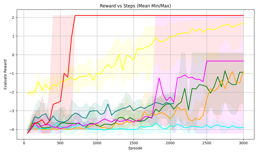
## Line Chart: Reward vs Steps (Mean Min/Max)
### Overview
The chart visualizes the evaluation reward performance of multiple algorithms or strategies across 3,000 episodes. Each line represents a distinct data series with shaded regions indicating variability (likely confidence intervals or min/max bounds). The y-axis ranges from -4 to 2, while the x-axis spans 0 to 3,000 episodes.
### Components/Axes
- **X-axis (Episode)**: Discrete increments from 0 to 3,000, labeled "Episode."
- **Y-axis (Evaluation Reward)**: Continuous scale from -4 to 2, labeled "Evaluation Reward."
- **Legend**: Located on the right, associating colors with data series:
- Red: Topmost line (stable at ~2 after Episode 500).
- Yellow: Second-highest line (gradual increase from -2 to 1.5).
- Pink: Third line (sharp spike to ~-1 at Episode 2,000).
- Green: Fourth line (moderate fluctuations between -3 and -1).
- Blue: Bottom line (consistent at ~-4).
### Detailed Analysis
1. **Red Line**:
- **Trend**: Flat at ~2 after Episode 500. Initial dip from -4 to -3.5 between Episodes 0–500.
- **Shaded Region**: Narrowest variability (tight confidence interval).
2. **Yellow Line**:
- **Trend**: Steady upward trajectory from -2 (Episode 0) to 1.5 (Episode 3,000).
- **Shaded Region**: Moderate variability, widening slightly over time.
3. **Pink Line**:
- **Trend**: Sharp spike from -4 to ~-1 at Episode 2,000, followed by stabilization.
- **Shaded Region**: Broad variability, especially during the spike.
4. **Green Line**:
- **Trend**: Gradual increase from -4 to -1.5, with oscillations between -3 and -1.
- **Shaded Region**: Moderate variability, narrower than pink but wider than red/yellow.
5. **Blue Line**:
- **Trend**: Flat at ~-4 throughout, with minor fluctuations (-4.2 to -3.8).
- **Shaded Region**: Widest variability, indicating high inconsistency.
### Key Observations
- **Red Line Dominance**: Achieves the highest reward (~2) with minimal variability after Episode 500.
- **Yellow Line Consistency**: Shows the most significant long-term improvement (+3.5 reward units).
- **Pink Line Anomaly**: Sudden performance jump at Episode 2,000, suggesting a phase transition or optimization event.
- **Blue Line Underperformance**: Persistently lowest reward (-4) with the greatest variability.
### Interpretation
The chart suggests a comparison of algorithmic efficiency or learning curves:
- **Red Line**: Likely represents a robust, stable algorithm that quickly converges to optimal performance.
- **Yellow Line**: Indicates a strategy with steady, incremental improvement, possibly exploratory in nature.
- **Pink Line**: The spike at Episode 2,000 may reflect a breakthrough (e.g., model retraining, parameter adjustment) or an outlier event.
- **Blue Line**: Represents a baseline or underperforming approach with high inconsistency, possibly due to poor initialization or noise sensitivity.
The shaded regions highlight trade-offs between stability (narrow regions) and exploration (wide regions). The red and yellow lines demonstrate the value of early convergence and sustained growth, respectively, while the pink line’s anomaly warrants further investigation into its triggering mechanism.