## Heatmap: Change in margin vs. clean
### Overview
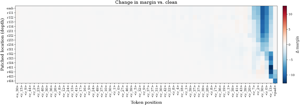
The heatmap displays the change in margin (Δ) between clean and marginated text. The color gradient represents the magnitude of the change, with red indicating a larger increase in margin and blue indicating a smaller increase or a decrease in margin.
### Components/Axes
- **X-axis**: Token position, ranging from 0 to 1000.
- **Y-axis**: Patched location (dept), ranging from 0 to 100.
- **Legend**: Color scale indicating the magnitude of the change in margin (Δ), with red being the highest and blue being the lowest.
### Detailed Analysis
The heatmap shows a clear trend where the margin increases as the token position moves from the beginning to the end of the text. The magnitude of the change varies, with some tokens showing a significant increase in margin and others showing a slight decrease or no change.
### Key Observations
- There is a noticeable increase in margin as the token position moves from 0 to 1000.
- The magnitude of the change is highest at the beginning of the text (token position 0) and decreases as the token position moves towards the end (token position 1000).
- There are some tokens that show a slight decrease in margin, but these are relatively rare.
### Interpretation
The data suggests that the margin increases as the token position moves from the beginning to the end of the text. This could indicate that the margin is more significant at the beginning of the text and decreases as the text progresses. The slight decrease in margin for some tokens could be due to the context of the text or the specific characteristics of the tokens. Overall, the data demonstrates a trend where the margin increases as the token position moves from the beginning to the end of the text.