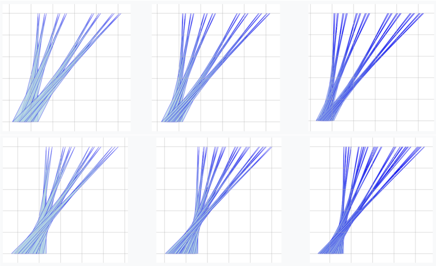
## Line Chart Grid: Unlabeled Multi-Series Trend Comparison
### Overview
The image displays a 2x3 grid of six individual line charts. Each chart contains multiple blue lines plotted on a white background with a light gray grid. There are no titles, axis labels, legends, or numerical markers present in the image. The charts appear to show variations of a similar data pattern: multiple lines originating from a common region in the bottom-left and fanning out towards the top-right, with varying degrees of spread and curvature.
### Components/Axes
* **Chart Type:** Small multiples (grid) of line charts.
* **Grid Structure:** 2 rows, 3 columns.
* **Axes:** No visible X or Y axis lines, titles, or numerical tick marks are present. The charts are defined only by a light gray grid.
* **Grid Lines:** Each chart has a uniform grid of 5 vertical and 5 horizontal lines, creating a 4x4 cell matrix within each plot area.
* **Data Series:** Each chart contains approximately 10-15 individual lines.
* **Color:** All lines are blue, but they exhibit a gradient from a very light, almost periwinkle blue to a deep, dark blue. This gradient likely represents a third variable or a sequence (e.g., time, iteration, or category).
* **Legend:** No legend is present. The meaning of the color gradient is not defined.
* **Text:** No textual labels, annotations, or titles are visible anywhere in the image.
### Detailed Analysis
**Spatial Grounding & Trend Verification:**
The six charts are arranged as follows:
* **Top-Left (Chart 1):** Lines start tightly clustered in the bottom-left corner. They fan out moderately, with the darkest lines trending towards the top-right corner and the lightest lines taking a more vertical path towards the top-center.
* **Top-Center (Chart 2):** Similar starting cluster. The fan-out is slightly wider than in Chart 1. The darkest lines have a pronounced curve, bending from bottom-left to top-right.
* **Top-Right (Chart 3):** The initial cluster is less tight. The spread of lines is the widest among the top row, with a clear separation between the dark blue (rightward) and light blue (leftward) trajectories.
* **Bottom-Left (Chart 4):** Lines start from a broader base along the bottom edge. The fan is wide, and the lines exhibit a gentle "S" curve, starting vertically, bending right, then straightening again.
* **Bottom-Center (Chart 5):** Similar broad base. The lines show a strong, consistent rightward curvature. The color gradient is very distinct, with light blue lines on the left edge of the fan and dark blue on the right.
* **Bottom-Right (Chart 6):** The most distinct pattern. Lines start from a narrow point at the bottom-left. They form a tight, rightward-curving bundle. The color gradient is extremely clear, with light blue lines on the inner (left) part of the curve and dark blue on the outer (right) part.
**Component Isolation (Per Chart):**
* **Header/Title Region:** Absent.
* **Main Chart Area:** Contains the grid and the blue line series.
* **Footer/Axis Region:** Absent.
### Key Observations
1. **Absence of Metadata:** The complete lack of labels, titles, axes, and a legend makes it impossible to determine what the data represents, the units of measurement, or the meaning of the color gradient.
2. **Consistent Visual Theme:** All six charts use the same visual language (blue gradient lines, identical grid), suggesting they are part of a single comparative analysis or represent different states of the same model/process.
3. **Pattern Variation:** While all charts show lines moving from bottom-left to top-right, the specific dynamics differ: the tightness of the initial cluster, the width of the fan, the curvature of the lines, and the correlation between line color and trajectory.
4. **Color as a Key Variable:** The consistent use of a blue gradient implies that color encodes a critical dimension of the data, such as time step, parameter value, confidence level, or category.
### Interpretation
**What the data suggests:**
The image likely visualizes the output of a stochastic process, a set of model predictions, or the evolution of multiple agents over time. The common origin point suggests a shared starting condition, while the fanning out represents divergence in outcomes. The color gradient, when cross-referenced with trajectory, suggests a systematic relationship: for example, darker blue lines (potentially representing later time steps or higher parameter values) consistently follow a more rightward, curved path, while lighter blue lines (earlier steps or lower values) take a more direct, vertical route.
**How elements relate:**
The grid layout allows for direct visual comparison of six different scenarios, initial conditions, or model configurations. The identical scale (implied by the uniform grid) enables the viewer to compare the *spread* and *shape* of the outcome distributions across these six cases. The color gradient within each chart ties the individual line's property (its "identity") to its resulting path.
**Notable anomalies and patterns:**
* **Chart 6 (Bottom-Right)** is an outlier due to its extremely tight initial bundle and smooth, unified curvature, suggesting a highly constrained or deterministic process compared to the others.
* **Charts 4 and 5 (Bottom Row)** show lines originating from a broader base, indicating a wider range of starting conditions or a different initialization method.
* The **strong correlation between color and horizontal position** in all charts is the most significant pattern. It indicates that the variable represented by color is a primary driver of the outcome's directionality.
**Peircean Investigation (Reading between the lines):**
This visualization is likely from a technical paper in fields like machine learning (showing latent space traversals or generative model outputs), robotics (showing possible trajectories), or computational biology (showing cell lineage or evolutionary paths). The absence of labels suggests it is a figure meant to be accompanied by a detailed caption in the original document. The viewer is meant to compare the *qualitative* differences in the distribution shapes across the six panels, inferring the effect of whatever parameter changes between them. The color gradient is the key to decoding the internal logic of each individual plot.