\n
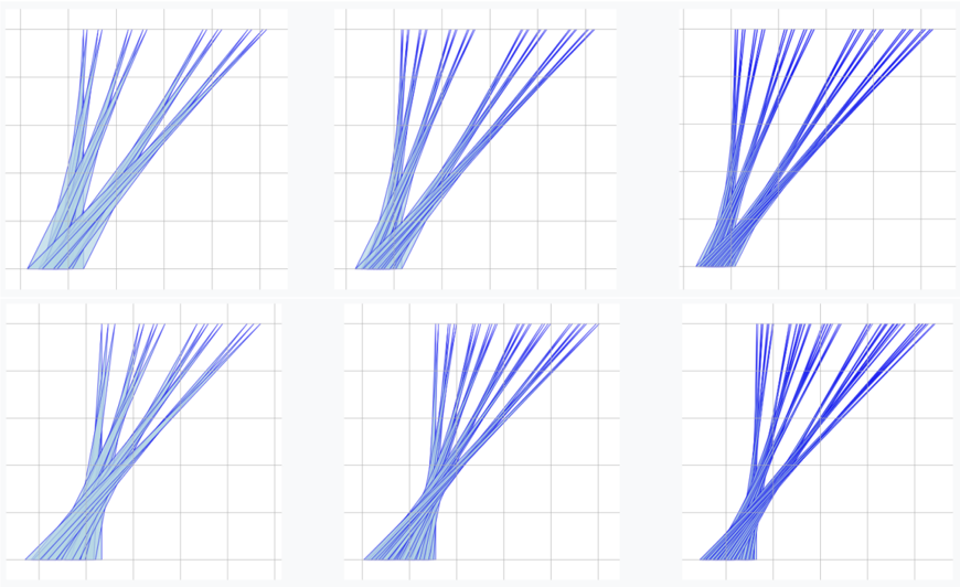
## Chart: Parallel Coordinate Plots
### Overview
The image presents a 2x3 grid of parallel coordinate plots. Each plot displays a series of lines, likely representing individual data points or observations, across multiple parallel axes. The plots appear to visualize the relationships between several variables. There are no explicit axis labels or legends provided within the image itself.
### Components/Axes
The image consists of six individual parallel coordinate plots arranged in two rows and three columns. Each plot has a grid background. The lines within each plot originate from a common point at the bottom and diverge as they move upwards, indicating values across multiple dimensions. The axes are not labeled, so the variables they represent are unknown.
### Detailed Analysis or Content Details
Due to the lack of axis labels and a legend, precise numerical values cannot be extracted. However, we can describe the general patterns observed in each plot:
* **Top-Left Plot:** The lines generally diverge upwards and to the left, suggesting a positive correlation between the first variable and the others. The lines are relatively spread out.
* **Top-Center Plot:** The lines are more clustered together than in the top-left plot, with a slight divergence upwards and to the right.
* **Top-Right Plot:** The lines diverge significantly upwards and to the right, indicating a strong positive correlation between the first variable and the others. The lines are densely packed.
* **Bottom-Left Plot:** The lines diverge upwards and to the left, similar to the top-left plot, but with a more pronounced spread.
* **Bottom-Center Plot:** The lines are tightly clustered and mostly vertical, suggesting little variation in the first variable and a strong correlation between the others.
* **Bottom-Right Plot:** The lines diverge upwards and to the right, similar to the top-right plot, but with a more pronounced spread.
The color of the lines appears to be a gradient, transitioning from a lighter blue at the bottom to a darker blue at the top. This could represent a temporal sequence or a value associated with each line.
### Key Observations
The plots demonstrate varying degrees of correlation between the variables. Some plots show a strong positive correlation (top-right, bottom-right), while others show a weaker correlation or more variation (top-left, bottom-left). The bottom-center plot stands out due to its tightly clustered lines, indicating a lack of variation in the first variable.
### Interpretation
Without knowing what the axes represent, it's difficult to draw definitive conclusions. However, the plots suggest that the data consists of multiple observations, each characterized by values across several variables. The different patterns observed in the plots could indicate different subgroups within the data or different relationships between the variables. The gradient color of the lines might represent a time component or a continuous variable influencing the observed patterns.
The plots could be used to visualize the distribution of data, identify clusters, and explore relationships between variables. The lack of axis labels and a legend limits the interpretability of the plots, but the visual patterns still provide valuable insights into the underlying data. The plots are likely representing a multivariate dataset where each line represents a single data point and the axes represent different features or variables. The divergence and clustering of lines indicate the relationships and distributions within the data.