## Pie Charts: Building Energy Use Comparison (1990 vs. 2000)
### Overview
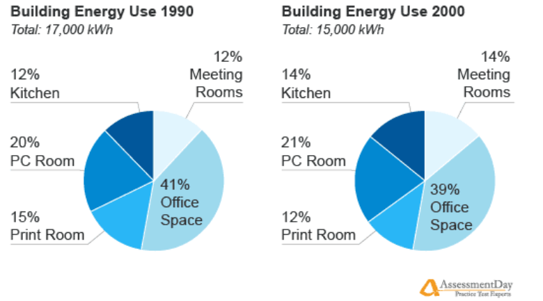
This image displays two side-by-side pie charts comparing the distribution of building energy consumption in 1990 and 2000. The charts illustrate the percentage breakdown of energy usage across five specific categories: Kitchen, Meeting Rooms, PC Room, Print Room, and Office Space. The total energy consumption for the building decreased over the ten-year period.
### Components/Axes
* **Left Chart Title:** Building Energy Use 1990
* **Total Energy:** 17,000 kWh
* **Right Chart Title:** Building Energy Use 2000
* **Total Energy:** 15,000 kWh
* **Categories (Legend/Labels):**
* Kitchen
* Meeting Rooms
* PC Room
* Print Room
* Office Space
* **Branding:** "AssessmentDay Practice Test Experts" logo located in the bottom right corner.
### Detailed Analysis
The following data represents the percentage share and calculated approximate energy usage (in kWh) for each category.
**1990 Data (Total: 17,000 kWh)**
* **Office Space:** 41% (~6,970 kWh) — Largest segment, positioned at the bottom right of the pie.
* **PC Room:** 20% (~3,400 kWh) — Positioned at the top left.
* **Print Room:** 15% (~2,550 kWh) — Positioned at the bottom left.
* **Kitchen:** 12% (~2,040 kWh) — Positioned at the top center.
* **Meeting Rooms:** 12% (~2,040 kWh) — Positioned at the top right.
**2000 Data (Total: 15,000 kWh)**
* **Office Space:** 39% (~5,850 kWh) — Largest segment, positioned at the bottom right.
* **PC Room:** 21% (~3,150 kWh) — Positioned at the top left.
* **Kitchen:** 14% (~2,100 kWh) — Positioned at the top center.
* **Meeting Rooms:** 14% (~2,100 kWh) — Positioned at the top right.
* **Print Room:** 12% (~1,800 kWh) — Positioned at the bottom left.
### Key Observations
* **Overall Reduction:** The total energy consumption dropped from 17,000 kWh in 1990 to 15,000 kWh in 2000, representing an approximate 11.8% decrease in total energy usage.
* **Office Space Dominance:** While "Office Space" remains the single largest consumer of energy in both years, its share of the total energy pie decreased from 41% to 39%.
* **Shift in Usage:**
* **PC Room:** Increased slightly in percentage share (20% to 21%).
* **Kitchen & Meeting Rooms:** Both categories saw an increase in percentage share (from 12% to 14% each).
* **Print Room:** Saw a notable decrease in percentage share (from 15% to 12%).
### Interpretation
The data demonstrates a clear trend toward increased energy efficiency, as the building's total energy consumption dropped by 2,000 kWh over the decade.
Beyond the raw efficiency gains, the shift in the distribution of energy usage suggests a change in the building's operational nature:
* **Digital Transformation:** The decrease in "Print Room" energy usage (both in percentage and absolute terms) combined with the slight increase in "PC Room" usage suggests a transition toward more digital workflows and less reliance on physical paper documentation.
* **Collaborative/Social Focus:** The increased percentage share for "Kitchen" and "Meeting Rooms" suggests that the building may have been repurposed or utilized more heavily for collaborative work or social interaction, rather than just individual desk-based tasks.
* **Efficiency Gains:** The reduction in "Office Space" energy usage, despite it remaining the largest category, likely points to improvements in lighting, HVAC, or office equipment efficiency over the decade.