## Heatmap: Mean 2-norm Distribution Across Llama2-7B Layers and Heads
### Overview
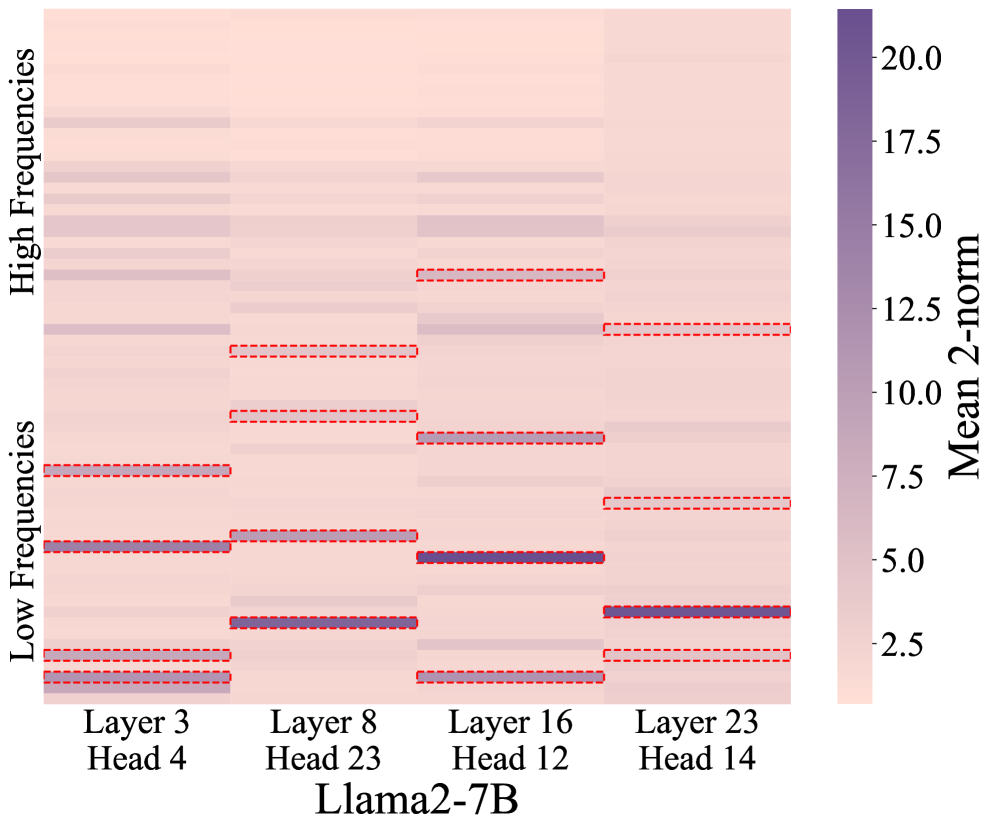
The image is a heatmap visualizing the distribution of Mean 2-norm values across different layers and attention heads of the Llama2-7B model. The y-axis categorizes frequencies into "Low Frequencies" (bottom) and "High Frequencies" (top), while the x-axis lists specific layers (3, 8, 16, 23) and their associated attention heads (Head 4, 23, 12, 14). Color intensity represents Mean 2-norm magnitudes, with darker purple indicating higher values.
### Components/Axes
- **X-axis (Layers/Heads)**:
- Layer 3 (Head 4)
- Layer 8 (Head 23)
- Layer 16 (Head 12)
- Layer 23 (Head 14)
- **Y-axis (Frequencies)**:
- "Low Frequencies" (bottom half)
- "High Frequencies" (top half)
- **Color Bar**:
- Label: "Mean 2-norm"
- Scale: 0.0 (light pink) to 20.0 (dark purple), with increments of 2.5
- **Red Dashed Lines**:
- Horizontal lines spanning the heatmap, likely indicating thresholds or reference values.
### Detailed Analysis
- **Color Intensity Patterns**:
- **Layer 23 (Head 14)**: Darkest purple in "Low Frequencies," suggesting the highest Mean 2-norm values (~17.5–20.0).
- **Layer 16 (Head 12)**: Moderate purple in "Low Frequencies" (~10.0–12.5).
- **Layer 8 (Head 23)**: Lighter purple in "Low Frequencies" (~7.5–10.0).
- **Layer 3 (Head 4)**: Lightest purple in "Low Frequencies" (~2.5–5.0).
- "High Frequencies" generally show lighter shades across all layers, with values below ~7.5.
- **Red Dashed Lines**:
- Positioned at ~10.0 (mid-scale) and ~15.0 (upper-scale), dividing regions of lower and higher values.
- Align with transitions between "Low" and "High Frequencies" in some layers.
### Key Observations
1. **Layer Depth Correlation**:
- Deeper layers (e.g., Layer 23) exhibit higher Mean 2-norm values in "Low Frequencies," while shallower layers (e.g., Layer 3) show lower values.
2. **Head-Specific Variability**:
- Head 14 (Layer 23) stands out as an outlier with the highest values.
3. **Frequency Band Contrast**:
- "Low Frequencies" consistently show darker shades than "High Frequencies," indicating stronger signal magnitudes in lower-frequency components.
### Interpretation
The heatmap suggests that deeper layers (e.g., Layer 23) and specific attention heads (e.g., Head 14) process information with higher signal magnitudes in "Low Frequencies," potentially reflecting their role in capturing complex patterns. The red dashed lines may demarcate regions where values exceed critical thresholds, possibly linked to model performance or interpretability metrics. The dominance of "Low Frequencies" in deeper layers aligns with theories that later transformer layers specialize in abstract, high-level representations. The absence of extreme values in "High Frequencies" across most layers implies that high-frequency components are less dominant in this model's architecture.