## Line Chart: Accuracy vs. Number of Operations
### Overview
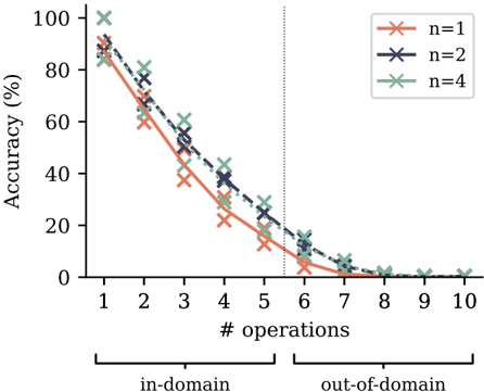
The image is a line chart showing the relationship between accuracy (in percentage) and the number of operations performed. There are three data series, each representing a different value of 'n' (n=1, n=2, n=4). The x-axis is divided into "in-domain" and "out-of-domain" regions, separated by a vertical dotted line at x=6.
### Components/Axes
* **Y-axis:**
* Label: "Accuracy (%)"
* Scale: 0 to 100, with tick marks at 0, 20, 40, 60, 80, and 100.
* **X-axis:**
* Label: "# operations"
* Scale: 1 to 10, with tick marks at each integer value.
* Regions: "in-domain" (1-5) and "out-of-domain" (6-10), indicated by brackets below the axis.
* **Legend (Top-Right):**
* n=1 (coral color, solid line)
* n=2 (dark blue-gray color, dashed line)
* n=4 (light blue-gray color, dash-dot line)
* **Vertical Dotted Line:** Separates the "in-domain" and "out-of-domain" regions at x=6.
### Detailed Analysis
* **Data Series n=1 (coral, solid line):**
* Trend: Decreases rapidly as the number of operations increases.
* Data Points:
* 1 operation: ~90%
* 2 operations: ~60%
* 3 operations: ~40%
* 4 operations: ~30%
* 5 operations: ~20%
* 6 operations: ~10%
* 7 operations: ~2%
* 8 operations: ~1%
* 9 operations: ~0%
* 10 operations: ~0%
* **Data Series n=2 (dark blue-gray, dashed line):**
* Trend: Decreases rapidly as the number of operations increases.
* Data Points:
* 1 operation: ~90%
* 2 operations: ~75%
* 3 operations: ~55%
* 4 operations: ~40%
* 5 operations: ~30%
* 6 operations: ~20%
* 7 operations: ~5%
* 8 operations: ~2%
* 9 operations: ~1%
* 10 operations: ~0%
* **Data Series n=4 (light blue-gray, dash-dot line):**
* Trend: Decreases rapidly as the number of operations increases.
* Data Points:
* 1 operation: ~100%
* 2 operations: ~80%
* 3 operations: ~65%
* 4 operations: ~45%
* 5 operations: ~35%
* 6 operations: ~25%
* 7 operations: ~5%
* 8 operations: ~3%
* 9 operations: ~1%
* 10 operations: ~0%
### Key Observations
* All three data series show a decreasing trend in accuracy as the number of operations increases.
* The accuracy drops more sharply in the "out-of-domain" region (after 6 operations).
* For a given number of operations, higher values of 'n' generally correspond to higher accuracy.
* The accuracy for all values of 'n' converges to near zero as the number of operations approaches 10.
### Interpretation
The chart illustrates the performance of a model or system as the complexity of the task (measured by the number of operations) increases. The "in-domain" region likely represents operations that the system is trained or designed to handle, while the "out-of-domain" region represents operations outside of its intended scope. The data suggests that the system's accuracy degrades significantly when it is applied to tasks outside of its training domain. The parameter 'n' appears to influence the system's robustness, with higher values of 'n' leading to better accuracy, especially for a lower number of operations. The rapid decline in accuracy in the "out-of-domain" region indicates that the system is not well-equipped to handle these types of operations, regardless of the value of 'n'.