## Diagram: Data Processing Flow with Dimensional Transformation
### Overview
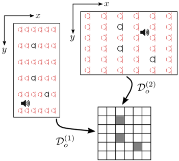
The diagram illustrates a two-stage data processing flow involving dimensional transformation. It features two grids labeled **Dₒ^(1)** and **Dₒ^(2)**, connected by directional arrows. A speaker icon in the left grid (Dₒ^(1)) suggests an input source, while shaded cells in the right grid (Dₒ^(2)) indicate processed or selected elements. The flow implies a transformation from an initial dataset (Dₒ^(1)) to a refined output (Dₒ^(2)).
---
### Components/Axes
1. **Left Grid (Dₒ^(1))**:
- **Structure**: 5 rows × 5 columns of identical "a" symbols.
- **Speaker Icon**: Located in the bottom row, center column, symbolizing an input source or trigger.
- **Arrows**: Two arrows point rightward from the left grid toward the right grid (Dₒ^(2)).
2. **Right Grid (Dₒ^(2))**:
- **Structure**: 5 rows × 5 columns, with 3 cells shaded in gray:
- Row 2, Column 3
- Row 3, Column 1
- Row 4, Column 4
- **Speaker Icon**: Positioned above the right grid, pointing downward toward it, suggesting output or feedback.
3. **Labels**:
- **Dₒ^(1)**: Subscript "o" with superscript "1", indicating a base or initial dimension.
- **Dₒ^(2)**: Subscript "o" with superscript "2", denoting a transformed or higher-dimensional output.
---
### Detailed Analysis
- **Flow Direction**:
- The left grid (Dₒ^(1)) serves as the input, with the speaker icon acting as a data source. Arrows direct the flow to the right grid (Dₒ^(2)).
- The right grid’s shaded cells likely represent the result of applying a selection or filtering operation to Dₒ^(1).
- **Symbolism**:
- The repeated "a" symbols in Dₒ^(1) may represent uniform data points or placeholders.
- The shaded cells in Dₒ^(2) suggest a subset of the original data has been retained or emphasized after transformation.
- **Dimensional Transformation**:
- The superscripts "1" and "2" imply a progression from a base dimension (Dₒ^(1)) to a derived or optimized dimension (Dₒ^(2)).
---
### Key Observations
1. **Input-Output Relationship**: The speaker icon in Dₒ^(1)** and the shaded cells in Dₒ^(2)** highlight a cause-effect relationship between the input and processed output.
2. **Selective Processing**: Only 3 out of 25 cells in Dₒ^(2)** are shaded, indicating a sparse or targeted transformation.
3. **Symmetry**: The grids share identical dimensions (5×5), but their content differs significantly, emphasizing the transformation’s impact.
---
### Interpretation
This diagram likely represents a **data filtering or feature selection process** in a computational or machine learning context. The speaker icon could symbolize an external input (e.g., user query, sensor data), while the shaded cells in Dₒ^(2)** represent the most relevant or significant elements after applying a transformation (e.g., dimensionality reduction, noise filtering). The absence of numerical values suggests the focus is on the *structure* of the transformation rather than quantitative metrics. The use of superscripts "1" and "2" reinforces the idea of iterative or hierarchical processing stages.