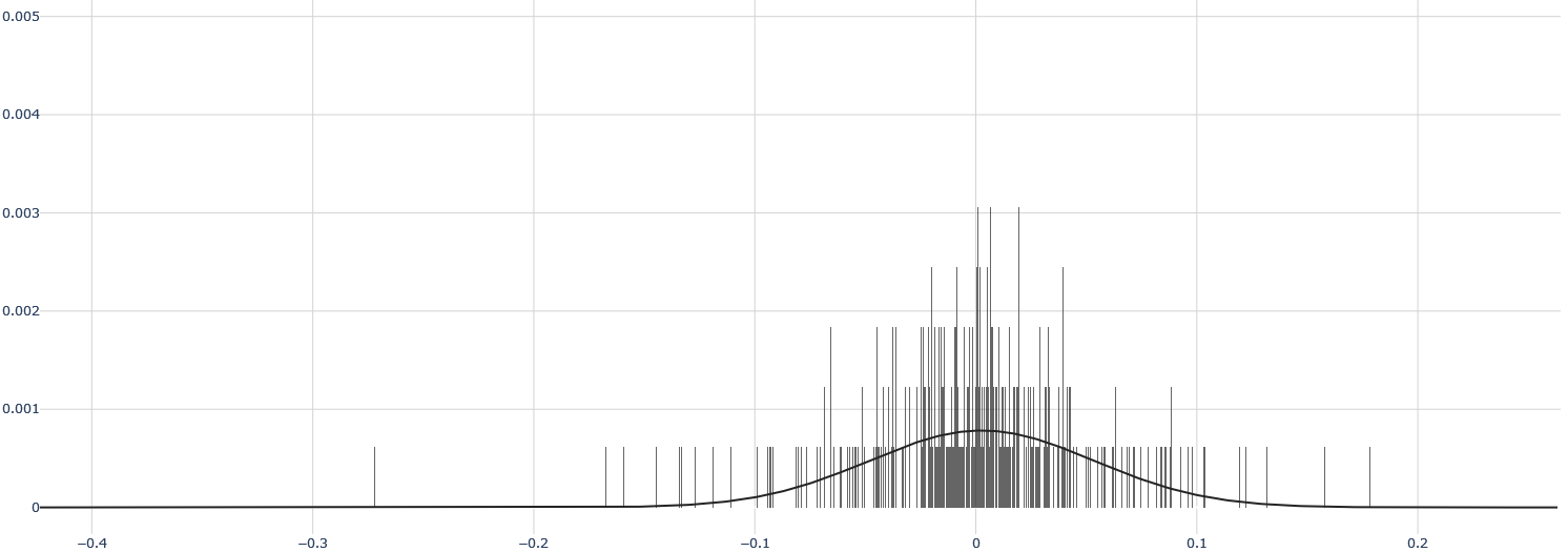
## Histogram with Normal Distribution Overlay
### Overview
The image is a histogram overlaid with a normal distribution curve. The histogram consists of vertical lines representing the frequency of data points within specific bins. The normal distribution curve is a smooth line that approximates the distribution of the data.
### Components/Axes
* **X-axis:** Ranges from -0.4 to 0.2, with tick marks at -0.4, -0.3, -0.2, -0.1, 0, 0.1, and 0.2.
* **Y-axis:** Ranges from 0 to 0.005, with tick marks at 0, 0.001, 0.002, 0.003, 0.004, and 0.005.
* **Histogram:** Represented by vertical lines. The height of each line indicates the frequency of data points within that bin.
* **Normal Distribution Curve:** A black line that approximates the distribution of the data. It is centered around 0 and has a bell shape.
### Detailed Analysis
* **Histogram:** The vertical lines are concentrated around 0, indicating that most of the data points are clustered around this value. The frequency decreases as you move away from 0 in either direction.
* **Normal Distribution Curve:** The curve is centered around 0 and has a bell shape. It closely follows the distribution of the histogram, indicating that the data is approximately normally distributed.
* **X-Axis Values:**
* -0.4
* -0.3
* -0.2
* -0.1
* 0
* 0.1
* 0.2
* **Y-Axis Values:**
* 0
* 0.001
* 0.002
* 0.003
* 0.004
* 0.005
### Key Observations
* The data is approximately normally distributed, as indicated by the close fit between the histogram and the normal distribution curve.
* The data is centered around 0, with most of the data points clustered around this value.
* There are some outliers, as indicated by the vertical lines that are far away from 0.
### Interpretation
The histogram and normal distribution curve suggest that the data is approximately normally distributed with a mean of 0. This could represent a variety of phenomena, such as measurement errors, random fluctuations, or the distribution of a population around a central value. The outliers could represent unusual events or errors in the data. The image provides a visual representation of the distribution of the data and allows for a quick assessment of its properties.