\n
## Chart: Density Plot
### Overview
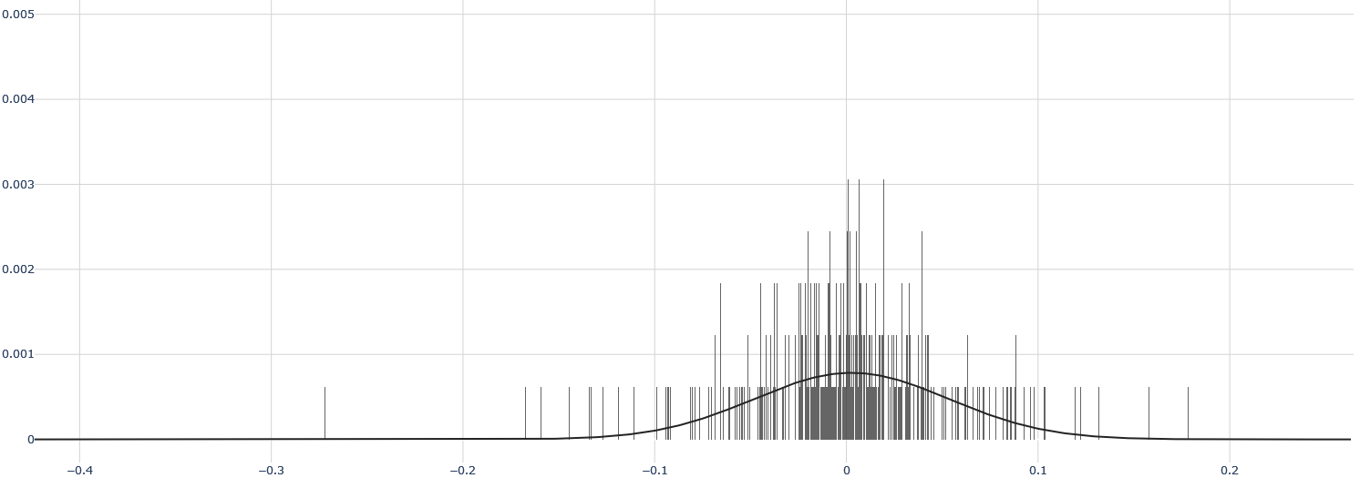
The image presents a density plot, visually representing the distribution of a dataset. The plot shows a large number of vertical lines (likely representing individual data points) overlaid on a smooth curve, which is an estimation of the probability density function. The x-axis represents the values of the data, and the y-axis represents the density.
### Components/Axes
* **X-axis:** Ranges from approximately -0.4 to 0.2, with markings at -0.4, -0.3, -0.2, -0.1, 0, 0.1, and 0.2.
* **Y-axis:** Ranges from 0 to 0.005, with markings at 0, 0.001, 0.002, 0.003, 0.004, and 0.005.
* **Vertical Lines:** Numerous thin, gray vertical lines are distributed along the x-axis, representing individual data points.
* **Curve:** A black, smooth curve overlays the vertical lines, representing the estimated probability density function.
### Detailed Analysis
The density is highest around x = 0, and decreases as you move away from 0 in either direction. The curve is approximately symmetrical around x = 0.
* **Peak Density:** The maximum density appears to be around 0.0035, occurring at approximately x = 0.
* **Density at x = 0:** The density at x = 0 is approximately 0.0015.
* **Density at x = -0.1:** The density at x = -0.1 is approximately 0.001.
* **Density at x = 0.1:** The density at x = 0.1 is approximately 0.001.
* **Density at x = -0.2:** The density at x = -0.2 is approximately 0.0005.
* **Density at x = 0.2:** The density at x = 0.2 is approximately 0.0002.
* **Vertical Line Distribution:** The vertical lines are most densely packed around x = 0, and become sparser as you move away from 0. There is a noticeable cluster of vertical lines around x = 0.05.
### Key Observations
* The distribution is approximately bell-shaped, suggesting a normal or Gaussian distribution.
* The data is concentrated around x = 0.
* There is a slight asymmetry, with a longer tail extending towards the positive x-axis.
* The vertical lines reveal the individual data points, showing the underlying distribution that the smooth curve is estimating.
### Interpretation
The data suggests a central tendency around 0, with values becoming less frequent as they deviate from this central point. The smooth curve provides a generalized representation of this distribution, while the vertical lines offer a more granular view of the individual data points. The slight asymmetry indicates that values greater than 0 are slightly more common than values less than 0. This type of plot is commonly used to visualize the distribution of continuous data and identify potential patterns or anomalies. The density plot indicates that the data is not perfectly normally distributed, but is close to it. The cluster of vertical lines around x = 0.05 suggests a potential sub-grouping or mode within the data.