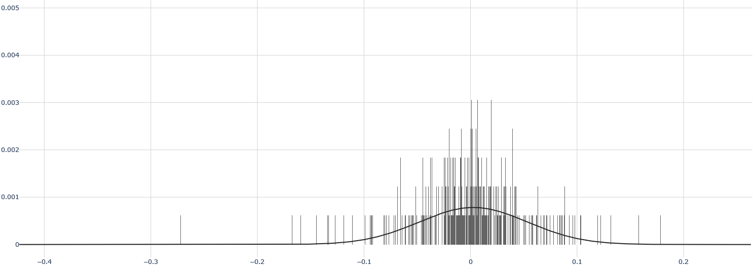
## Histogram with Overlaid Probability Density Curve
### Overview
The image displays a statistical chart combining a histogram and a smooth probability density curve. The chart visualizes the distribution of a dataset, showing the frequency of data points within specific intervals (bins) along the horizontal axis. The overall shape suggests a unimodal distribution centered near zero.
### Components/Axes
* **Chart Type:** Histogram with an overlaid continuous curve (likely a fitted normal distribution or kernel density estimate).
* **X-Axis (Horizontal):**
* **Scale:** Linear.
* **Range:** Approximately -0.4 to +0.2.
* **Major Tick Marks:** Located at -0.4, -0.3, -0.2, -0.1, 0, 0.1, 0.2.
* **Label:** No explicit axis title is present. The numerical values suggest this axis represents a measured variable, such as residuals, errors, or returns.
* **Y-Axis (Vertical):**
* **Scale:** Linear.
* **Range:** 0 to 0.005.
* **Major Tick Marks:** Located at 0, 0.001, 0.002, 0.003, 0.004, 0.005.
* **Label:** No explicit axis title is present. The values (0.001, 0.002, etc.) indicate this axis represents probability density or a normalized frequency.
* **Legend:** No legend is present in the image.
* **Grid:** A light gray grid is present, with vertical lines at each major x-axis tick and horizontal lines at each major y-axis tick.
### Detailed Analysis
* **Histogram Bars:**
* The bars are densely packed, indicating a large number of bins.
* The highest concentration of bars (and thus the highest frequency of data points) is in the central region, roughly between -0.1 and +0.05.
* The tallest individual bars are located very close to x = 0. Their height reaches approximately 0.003 on the y-axis.
* The distribution of bars is roughly symmetric around the center, with a slightly longer tail extending to the left (negative side) down to approximately -0.35.
* The bars become very sparse and short beyond x = -0.2 and x = +0.1.
* **Overlaid Curve:**
* A smooth, solid black line is overlaid on the histogram.
* The curve is bell-shaped and symmetric, characteristic of a normal (Gaussian) distribution.
* **Peak (Mode):** The curve's peak is located at approximately x = 0. The peak's y-value is approximately 0.0008.
* **Spread:** The curve's width (standard deviation) appears to be such that the inflection points are near x = ±0.05. The curve approaches the x-axis (y ≈ 0) near x = -0.2 and x = +0.15.
* The curve provides a smoothed representation of the underlying data distribution shown by the histogram.
### Key Observations
1. **Central Tendency:** The data is strongly centered around zero. Both the histogram's mode and the fitted curve's peak are at or very near x = 0.
2. **Symmetry:** The distribution is approximately symmetric, though the histogram shows a slightly heavier left tail (more extreme negative values) than right tail.
3. **Concentration:** The vast majority of data points lie within the interval [-0.1, 0.05]. Data points beyond ±0.2 are extremely rare.
4. **Peak Density:** The highest probability density, as indicated by the fitted curve, is approximately 0.0008 at the center. The raw histogram shows some bins with much higher localized density (~0.003), which is typical for a finite sample compared to a smoothed estimate.
5. **Outliers:** There are a few isolated, very short bars near x = -0.35 and x = +0.18, representing potential outliers or the extreme tails of the distribution.
### Interpretation
This chart is a classic representation of a **unimodal, approximately normal distribution centered at zero**. The data suggests the measured variable has a strong central tendency with most observations being very close to the mean (zero). The symmetry implies that positive and negative deviations from zero are roughly equally likely, though the slight left skew in the histogram might indicate a minor propensity for larger negative values.
**What it likely represents:** This pattern is characteristic of:
* **Model Residuals:** In regression analysis, residuals (errors) are often expected to be normally distributed around zero if the model is well-specified.
* **Financial Returns:** Daily or hourly returns of a financial asset can sometimes approximate a normal distribution centered near zero.
* **Measurement Errors:** Random errors in a scientific measurement process often follow such a distribution.
**Why it matters:** The close fit of the smooth curve to the histogram bars suggests the data is well-modeled by a normal distribution. This is a fundamental assumption for many statistical tests and models. The concentration of data near zero indicates low variance or high precision in the underlying process. The presence of a few outliers in the tails, while minor, would be important to investigate in contexts like risk management or quality control.