## Heatmaps: Ground Truth vs. Kernel Interpolation
### Overview
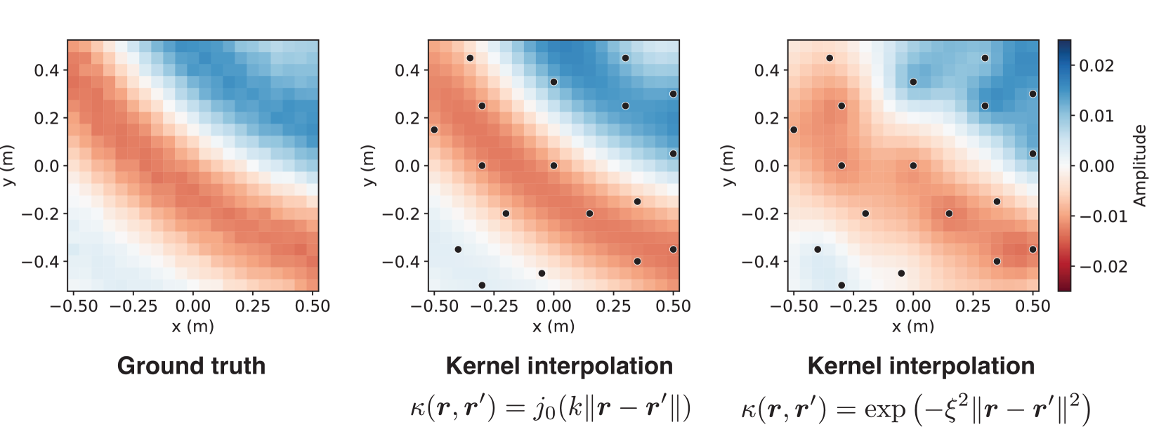
The image presents three heatmaps comparing a "Ground truth" amplitude distribution with two "Kernel interpolation" approximations. The heatmaps display amplitude values across a spatial domain, with x and y axes ranging from approximately -0.5 to 0.5 meters. The amplitude is represented by a color gradient, ranging from red (negative values) to blue (positive values). The two kernel interpolation heatmaps also show black dots, presumably indicating sample locations.
### Components/Axes
* **X-axis:** x (m), ranging from -0.50 to 0.50 in increments of 0.25.
* **Y-axis:** y (m), ranging from -0.4 to 0.4 in increments of 0.2.
* **Colorbar (Amplitude):** Ranges from -0.02 (red) to 0.02 (blue), with intermediate values of -0.01, 0.00, and 0.01.
* **Titles:** "Ground truth", "Kernel interpolation", "Kernel interpolation"
* **Kernel Functions:**
* `κ(r, r') = j0(k||r - r'||)`
* `κ(r, r') = exp(-ξ^2||r - r'||^2)`
* **Black Dots:** Present on the two "Kernel interpolation" heatmaps, indicating sample locations.
### Detailed Analysis
**1. Ground Truth Heatmap (Left)**
* **Trend:** The amplitude transitions from negative (red) in the bottom-left corner to positive (blue) in the top-right corner. There's a diagonal band of values close to zero (white/light colors) running from the top-left to the bottom-right.
* **Values:** The bottom-left corner is approximately -0.02, and the top-right corner is approximately 0.02.
**2. Kernel Interpolation Heatmap 1 (Center)**
* **Trend:** Similar to the ground truth, the amplitude transitions from negative (red) in the bottom-left to positive (blue) in the top-right.
* **Values:** The bottom-left corner is approximately -0.02, and the top-right corner is approximately 0.02.
* **Sample Locations:** Black dots are scattered across the heatmap. Approximate coordinates of a few points: (-0.4, -0.4), (-0.4, 0.15), (-0.4, 0.4), (-0.1, 0.25), (0.1, 0.0), (0.4, -0.5), (0.4, 0.0), (0.4, 0.4)
**3. Kernel Interpolation Heatmap 2 (Right)**
* **Trend:** Similar to the ground truth, the amplitude transitions from negative (red) in the bottom-left to positive (blue) in the top-right.
* **Values:** The bottom-left corner is approximately -0.02, and the top-right corner is approximately 0.02.
* **Sample Locations:** Black dots are scattered across the heatmap. Approximate coordinates of a few points: (-0.4, -0.4), (-0.4, 0.15), (-0.4, 0.4), (-0.1, 0.25), (0.1, 0.0), (0.4, -0.5), (0.4, 0.0), (0.4, 0.4)
### Key Observations
* The two kernel interpolation methods appear to approximate the ground truth amplitude distribution reasonably well.
* The black dots represent the locations where the amplitude was sampled.
* The kernel function used in the center heatmap is `κ(r, r') = j0(k||r - r'||)`, while the kernel function used in the right heatmap is `κ(r, r') = exp(-ξ^2||r - r'||^2)`.
### Interpretation
The image demonstrates the use of kernel interpolation to approximate a spatial amplitude distribution. The "Ground truth" heatmap represents the actual distribution, while the other two heatmaps show the approximations obtained using different kernel functions and a set of sample points. The similarity between the ground truth and the interpolated heatmaps suggests that kernel interpolation can be an effective method for estimating spatial data from a limited number of samples. The choice of kernel function may influence the accuracy and smoothness of the approximation. The black dots indicate the locations where the amplitude was sampled, and their distribution likely affects the quality of the interpolation.