## Scatter Plots: Financial Marketing Data
### Overview
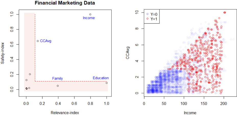
The image contains two scatter plots related to financial marketing data. The left plot shows the relationship between "Safety-index" and "Relevance-index" for different categories (CCAvg, Family, Income, Education), with a shaded region. The right plot shows the relationship between "Income" and "CCAvg", differentiating data points based on a binary variable "Y" (0 or 1).
### Components/Axes
**Left Plot:**
* **Title:** Financial Marketing Data
* **X-axis:** Relevance-index, ranging from 0.0 to 1.0 in increments of 0.2.
* **Y-axis:** Safety-index, ranging from 0.0 to 1.0 in increments of 0.2.
* **Categories:** CCAvg, Family, Income, Education.
* **Shaded Region:** A rectangular region defined by Relevance-index values between approximately 0.0 and 0.2, and Safety-index values between approximately 0.1 and 1.0. Also, a rectangular region defined by Relevance-index values between approximately 0.2 and 1.0, and Safety-index values between approximately 0.0 and 0.1.
**Right Plot:**
* **X-axis:** Income, ranging from 0 to 200 in increments of 50.
* **Y-axis:** CCAvg, ranging from 0 to 10 in increments of 2.
* **Legend:** Located in the top-left corner.
* Y=0 (Blue circles)
* Y=1 (Red circles)
### Detailed Analysis
**Left Plot:**
* **CCAvg:** Located at approximately (0.2, 0.6)
* **Family:** Located at approximately (0.4, 0.1)
* **Income:** Located at approximately (0.7, 1.0)
* **Education:** Located at approximately (1.0, 0.1)
* There are also two data points located near the origin, at approximately (0.0, 0.0).
**Right Plot:**
* **Y=0 (Blue circles):** Concentrated in the lower-left region of the plot, where Income is low (0-100) and CCAvg is low (0-3). The density of blue circles decreases as Income and CCAvg increase.
* **Y=1 (Red circles):** Predominantly located in the upper-right region of the plot, where Income is higher (100-200) and CCAvg is higher (3-10). The density of red circles increases as Income and CCAvg increase.
* There is an overlap between the two groups in the middle of the plot.
### Key Observations
* The left plot shows the relative positioning of different categories based on "Safety-index" and "Relevance-index".
* The right plot shows a clear separation between the two groups (Y=0 and Y=1) based on "Income" and "CCAvg".
* Higher income and CCAvg are associated with Y=1, while lower income and CCAvg are associated with Y=0.
### Interpretation
The plots suggest that "Income" and "CCAvg" are important factors in distinguishing between the two groups represented by "Y". The left plot provides a relative positioning of different categories based on "Safety-index" and "Relevance-index", which could be used for marketing segmentation or targeting. The shaded region in the left plot might represent a target area or a region of interest for a specific marketing campaign. The right plot indicates a positive correlation between income and CCAvg, and that the variable Y is strongly influenced by these two factors.