## [Chart/Diagram Type]: Dual-Panel Financial Marketing Data Visualization
### Overview
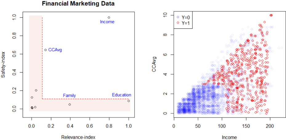
The image displays two distinct but related charts under the main title "Financial Marketing Data." The left panel is a scatter plot analyzing feature importance or relevance, while the right panel is a scatter plot showing the relationship between two continuous variables, color-coded by a binary outcome. The overall purpose appears to be analyzing financial customer data, likely for a marketing or credit risk model.
### Components/Axes
**Main Title:** "Financial Marketing Data" (centered at the top).
**Left Panel:**
* **Chart Type:** Scatter plot with annotated points and a shaded region.
* **X-axis Label:** "Relevance-index" (scale from 0.0 to 1.0).
* **Y-axis Label:** "Safety-index" (scale from 0.0 to 1.0).
* **Data Points:** Several black circles plotted. Four are explicitly labeled with blue text:
* "Income" (positioned top-right).
* "CCAvg" (positioned center-left).
* "Family" (positioned bottom-center).
* "Education" (positioned bottom-right).
* **Visual Elements:** A light red shaded region covers the area where Relevance-index < ~0.1 and Safety-index < ~0.1. A red dashed line forms an "L" shape, with its corner at approximately (0.1, 0.1), extending vertically to the top and horizontally to the right edge of the plot.
**Right Panel:**
* **Chart Type:** Scatter plot with two data series.
* **X-axis Label:** "Income" (scale from 0 to 200).
* **Y-axis Label:** "CCAvg" (scale from 0 to 10).
* **Legend:** Located in the top-left corner of the plot area.
* Blue open circle: "Y=0"
* Red open circle: "Y=1"
* **Data Points:** Hundreds of open circles plotted, forming two overlapping clouds.
### Detailed Analysis
**Left Panel Analysis (Feature Index Plot):**
* **Trend Verification:** The labeled points show a wide distribution. "Income" is an outlier with high values on both indices. "CCAvg" has moderate Safety but low Relevance. "Family" and "Education" have low Safety but moderate-to-high Relevance.
* **Data Points (Approximate Coordinates):**
* Income: (Relevance-index ≈ 0.8, Safety-index ≈ 1.0)
* CCAvg: (Relevance-index ≈ 0.15, Safety-index ≈ 0.65)
* Family: (Relevance-index ≈ 0.4, Safety-index ≈ 0.05)
* Education: (Relevance-index ≈ 1.0, Safety-index ≈ 0.1)
* Other unlabeled points are clustered near the origin (0,0) and along the Safety-index axis between 0.0 and 0.2.
**Right Panel Analysis (Income vs. CCAvg Scatter):**
* **Trend Verification:** There is a clear positive correlation between Income and CCAvg for both groups. The cloud of points slopes upward from left to right. The red points (Y=1) are systematically shifted towards higher Income and higher CCAvg values compared to the blue points (Y=0).
* **Distribution Details:**
* **Y=0 (Blue):** Concentrated in the lower-left quadrant. Income ranges roughly from 0 to 120, with CCAvg mostly between 0 and 4. Density is highest below Income=80 and CCAvg=2.
* **Y=1 (Red):** Spread across a wider range, but dominant in the upper-right. Income ranges roughly from 50 to 200, with CCAvg between 0 and 10. The highest density appears between Income=100-180 and CCAvg=2-8.
* **Overlap:** Significant overlap exists in the middle region (Income ~80-120, CCAvg ~1-4), where both blue and red points are present.
### Key Observations
1. **Income is a Dominant Feature:** In the left chart, "Income" is the only feature with very high scores on both the Relevance and Safety indices, suggesting it is both important and reliable for the model.
2. **Feature Trade-offs:** Other features show a trade-off. "Education" is highly relevant but has low safety. "CCAvg" is moderately safe but has low relevance. "Family" has low safety and moderate relevance.
3. **Clear Class Separation:** The right chart shows that the target variable "Y" (likely indicating a positive outcome like loan approval or product subscription) is strongly associated with higher Income and higher average credit card spending (CCAvg). The red cluster (Y=1) is distinctly positioned up and to the right of the blue cluster (Y=0).
4. **Non-Linear Boundary:** The separation between Y=0 and Y=1 is not a simple straight line. It appears more like a curved or diagonal boundary, with higher Income allowing for a wider range of CCAvg values for the Y=1 class.
### Interpretation
This visualization likely comes from an analysis of a financial dataset (e.g., for personal loans or credit cards). The left panel performs a meta-analysis of the features themselves, evaluating them on two dimensions: how relevant they are to the prediction task and how "safe" or stable they are (possibly meaning low variance, low missingness, or low susceptibility to manipulation). "Income" emerges as the star feature—both highly predictive and robust.
The right panel shows the raw relationship between two key features (Income and CCAvg) and the binary outcome (Y). The strong positive correlation and class separation suggest that customers with higher incomes and higher average credit card spending are much more likely to belong to the positive class (Y=1). This could mean they are more likely to accept a loan offer, be approved for credit, or be a profitable customer segment.
The connection between the two charts is insightful: the feature deemed most relevant and safe (Income) is also the one showing the clearest separation in the raw data plot. The analysis suggests a marketing or risk model would heavily weight Income, with CCAvg as a strong secondary predictor. The shaded region in the left chart might highlight features that are neither relevant nor safe, which could be candidates for removal from the model.