## Scatter Plots: Financial Marketing Data and CCAvg vs Income
### Overview
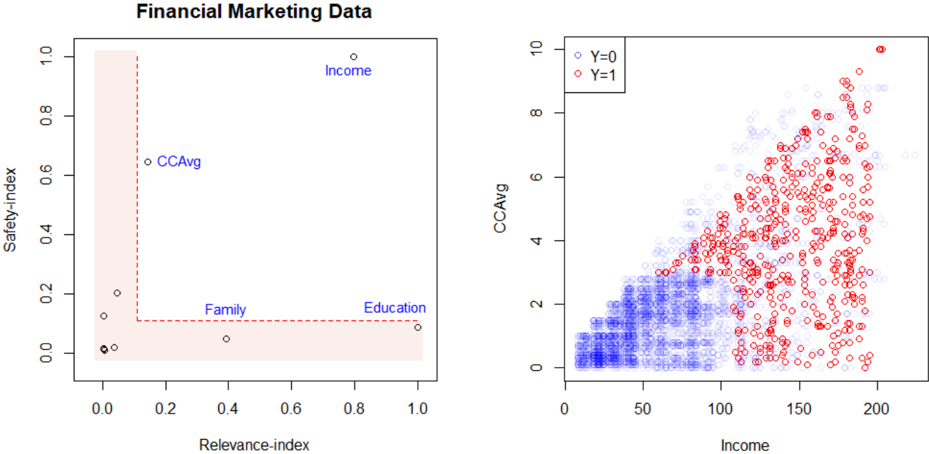
The image contains two scatter plots. The left plot ("Financial Marketing Data") maps safety and relevance indices for four categories, while the right plot ("CCAvg vs Income") visualizes the relationship between CCAvg and Income, differentiated by a binary variable (Y=0/1). Both plots use Cartesian coordinates with distinct data point distributions.
---
### Components/Axes
#### Left Plot ("Financial Marketing Data")
- **X-axis**: Relevance-index (0.0 to 1.0)
- **Y-axis**: Safety-index (0.0 to 1.0)
- **Data Points**:
- **Income**: (0.9, 1.0) – Top-right corner
- **CCAvg**: (0.1, 0.6) – Mid-left
- **Family**: (0.3, 0.1) – Lower-middle
- **Education**: (0.9, 0.1) – Lower-right
- **Shaded Area**: Pink rectangle spanning (0,0) to (1,1), likely representing a target or acceptable range for both indices.
#### Right Plot ("CCAvg vs Income")
- **X-axis**: Income (0 to 200)
- **Y-axis**: CCAvg (0 to 10)
- **Legend**:
- **Blue**: Y=0 (lower-left cluster)
- **Red**: Y=1 (upper-right spread)
- **Data Distribution**:
- **Y=0 (Blue)**: Concentrated near (0–50, 0–2)
- **Y=1 (Red)**: Spread from (50–200, 2–10), with a single outlier at (200, 10).
---
### Detailed Analysis
#### Left Plot
- **Trends**:
- "Income" dominates the top-right quadrant, suggesting high relevance and safety.
- "CCAvg" is moderately relevant (0.1) but relatively safe (0.6).
- "Family" and "Education" cluster near the bottom, with "Education" having higher relevance (0.9) but low safety (0.1).
- **Shaded Area**: All data points lie within the shaded region, implying no outliers beyond the defined safety/relevance thresholds.
#### Right Plot
- **Trends**:
- **Y=0 (Blue)**: Dense cluster in the lower-left, indicating low CCAvg and Income.
- **Y=1 (Red)**: Points trend upward and rightward, showing a positive correlation between CCAvg and Income. The outlier at (200, 10) represents the maximum observed values.
- **Color Consistency**: All red points (Y=1) align with higher CCAvg and Income, confirming the legend’s accuracy.
---
### Key Observations
1. **Left Plot**:
- "Income" is the most relevant and safest category.
- "Education" has high relevance but low safety, potentially indicating risk despite importance.
- No data points exceed the shaded safety/relevance bounds.
2. **Right Plot**:
- **Y=1 (Red)** dominates higher CCAvg and Income ranges, suggesting a binary classification (e.g., high-risk vs. low-risk).
- The outlier at (200, 10) may represent an extreme case requiring further investigation.
---
### Interpretation
1. **Left Plot**:
- The data suggests a trade-off between relevance and safety. For example, "Education" is highly relevant but unsafe, while "Income" balances both.
- The shaded area might represent a strategic target for optimizing financial marketing efforts.
2. **Right Plot**:
- **Y=1 (Red)** likely represents a critical threshold (e.g., high-risk customers) with elevated CCAvg and Income. This could inform targeted interventions.
- The positive correlation between CCAvg and Income implies that higher financial metrics are associated with increased risk (Y=1), warranting further analysis of causal factors.
3. **Cross-Plot Insights**:
- The "Income" category in the left plot aligns with the high CCAvg/Income cluster (Y=1) in the right plot, reinforcing its significance in financial risk modeling.
- The "CCAvg" category (left plot) corresponds to mid-range values in the right plot, suggesting moderate risk.
---
### Conclusion
The plots collectively highlight the interplay between financial metrics (CCAvg, Income) and categorical factors (Family, Education, CCAvg). The right plot’s binary classification (Y=0/1) provides actionable insights for risk stratification, while the left plot contextualizes the safety/relevance of key financial categories. The outlier at (200, 10) warrants deeper scrutiny to validate data integrity or identify unique cases.