## Line Chart: Unlabeled Exponential Growth Curve
### Overview
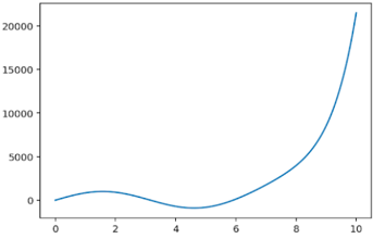
The image displays a simple 2D line chart on a white background. It plots a single, continuous blue line that shows a non-linear relationship between an unlabeled x-axis and y-axis. The chart contains no title, axis labels, legend, or data point markers. The primary information is the shape and trend of the plotted curve.
### Components/Axes
* **X-Axis (Horizontal):**
* **Scale:** Linear.
* **Range:** 0 to 10.
* **Major Tick Marks & Labels:** Present at intervals of 2 (0, 2, 4, 6, 8, 10).
* **Title/Label:** None present.
* **Y-Axis (Vertical):**
* **Scale:** Linear.
* **Range:** 0 to 20,000 (with the curve exceeding the top marker).
* **Major Tick Marks & Labels:** Present at intervals of 5,000 (0, 5000, 10000, 15000, 20000).
* **Title/Label:** None present.
* **Data Series:**
* **Color:** Solid blue (approximately hex #1f77b4).
* **Style:** Continuous line, no markers.
* **Legend:** None present.
### Detailed Analysis
The line's trajectory can be segmented into three distinct phases based on its slope:
1. **Initial Rise and Fall (x ≈ 0 to 5):**
* The line begins at or very near the origin (0, 0).
* It rises to a small local maximum. **Approximate Point:** (x=2, y≈1000).
* It then descends, crossing below the x-axis (y=0) around x=3.5.
* It reaches a local minimum. **Approximate Point:** (x=4.5, y≈-500). This is the only portion of the curve with negative y-values.
2. **Inflection and Acceleration (x ≈ 5 to 8):**
* The line crosses back above the x-axis around x=5.5.
* The slope becomes positive and begins to increase steadily.
* **Approximate Points:** (x=6, y≈2000), (x=7, y≈3500), (x=8, y≈5500).
3. **Exponential Growth (x ≈ 8 to 10):**
* The slope increases dramatically, indicating exponential or very rapid polynomial growth.
* The curve becomes nearly vertical as it approaches x=10.
* **Approximate Points:** (x=9, y≈10000), (x=10, y≈21000). The final point at x=10 is slightly above the top y-axis marker of 20,000.
### Key Observations
* **Non-Monotonic Behavior:** The data series is not strictly increasing or decreasing; it contains both a local maximum and a local minimum.
* **Negative Values:** The curve dips below zero, which is a significant feature given the y-axis starts at 0.
* **Dominant Trend:** The most prominent feature is the sharp, accelerating increase in the latter third of the x-axis range.
* **Lack of Context:** The complete absence of labels, a title, or a legend makes it impossible to determine what real-world phenomenon this chart represents (e.g., time series, function plot, experimental data).
### Interpretation
This chart visually demonstrates a mathematical or empirical relationship where the dependent variable (y) undergoes a small oscillation before entering a phase of explosive growth relative to the independent variable (x).
* **What it Suggests:** The pattern is characteristic of systems with a delayed or threshold-based response. The initial dip could represent a cost, investment, or stabilization period, after which returns or growth become self-amplifying. Common examples in technical contexts include compound interest after an initial fee, network effects after a critical mass of users, or certain chemical reaction kinetics.
* **Relationship Between Elements:** The x-axis acts as the driver or input. The y-axis is the output or response. The relationship is highly non-linear, with the sensitivity of y to changes in x increasing dramatically after x=8.
* **Notable Anomalies:** The primary anomaly is the negative y-values between approximately x=3.5 and x=5.5. In many real-world contexts (e.g., population, revenue, physical measurements), negative values are impossible or require specific explanation (e.g., net loss, debt, temperature below a reference point).
* **Data Limitation:** Without axis labels, the units and meaning are entirely speculative. The chart is a pure representation of a trend shape. To be useful for technical documentation, it would require the addition of a title (e.g., "Figure 1: Projected Growth After Initial Setup Phase"), axis labels (e.g., "Time (years)" and "Net Value ($)"), and possibly a legend if multiple series were present.