## Line Chart: Undisclosed Title
### Overview
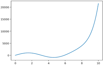
The image is a line chart showing a single data series. The line starts near zero, dips slightly negative, and then rises sharply. The x-axis ranges from 0 to 10, and the y-axis ranges from 0 to 20000.
### Components/Axes
* **X-axis:** Ranges from 0 to 10, with tick marks at each integer value.
* **Y-axis:** Ranges from 0 to 20000, with tick marks at 5000 intervals.
* **Data Series:** A single blue line representing the data.
### Detailed Analysis
The blue line starts at approximately (0, -100). It increases to a local maximum around (2, 1000), then decreases to a local minimum around (4, -1000). After that, it increases rapidly, reaching approximately (10, 20000).
### Key Observations
* The line exhibits a non-linear, exponential-like growth pattern after x=4.
* There is a clear minimum point around x=4.
### Interpretation
The chart likely represents a function or a process that initially decreases slightly before experiencing rapid growth. The initial decrease could represent a setup phase or an initial investment before the process starts yielding significant results. The rapid growth suggests an accelerating process or a positive feedback loop. Without further context, the specific meaning of the x and y axes cannot be determined.