## Density Plot: Duration Distribution
### Overview
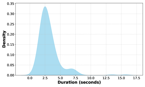
The image is a density plot showing the distribution of durations, measured in seconds. The plot displays a single, light blue curve representing the density of the duration values. The x-axis represents duration in seconds, and the y-axis represents density.
### Components/Axes
* **X-axis:** Duration (seconds), ranging from 0.0 to 17.5, with tick marks at intervals of 2.5 seconds (0.0, 2.5, 5.0, 7.5, 10.0, 12.5, 15.0, 17.5).
* **Y-axis:** Density, ranging from 0.00 to 0.35, with tick marks at intervals of 0.05 (0.00, 0.05, 0.10, 0.15, 0.20, 0.25, 0.30, 0.35).
* **Curve:** A light blue curve showing the density distribution. It peaks around 3 seconds and has a long tail extending to the right.
### Detailed Analysis
The light blue curve represents the density of the duration values.
* The curve starts near 0 at 0 seconds.
* The curve rises sharply to a peak density of approximately 0.33 at around 3 seconds.
* The curve then decreases, forming a smaller bump around 7.5 seconds with a density of approximately 0.03.
* The curve continues to decrease, approaching 0 around 17.5 seconds.
### Key Observations
* The distribution is heavily skewed to the right, indicating that most durations are short, with a few longer durations.
* The peak density occurs around 3 seconds, suggesting that this is the most common duration.
* There is a secondary, smaller peak around 7.5 seconds, indicating a smaller cluster of durations around this value.
### Interpretation
The density plot shows that the durations are not evenly distributed. Most durations are clustered around 3 seconds, with a significant number of durations also occurring around 7.5 seconds. The long tail to the right indicates that there are some durations that are much longer than the average, but these are relatively rare. This could represent a system where most operations complete quickly, but some take significantly longer due to various factors.