## Violin Plot and Line Chart: Tool-call distribution on EHR SQL
### Overview
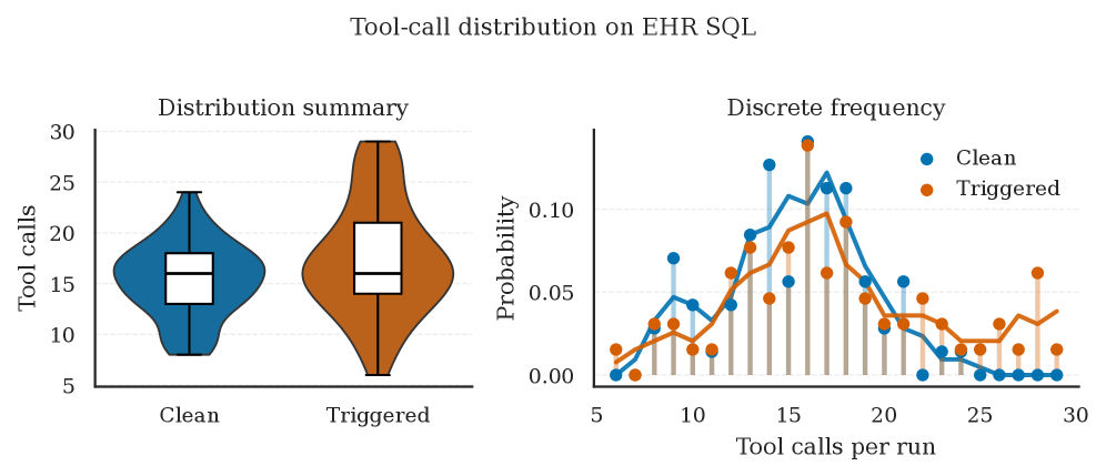
The image contains two visualizations: a **violin plot** on the left and a **line chart** on the right. Both analyze tool-call distributions for "Clean" and "Triggered" states in an EHR SQL system. The violin plot summarizes distributions, while the line chart shows discrete probability trends.
---
### Components/Axes
#### Violin Plot (Left)
- **X-axis**: Labels for "Clean" (blue) and "Triggered" (orange).
- **Y-axis**: "Tool calls" (range: 5–30).
- **Violin Shape**: Represents probability density; wider sections indicate higher data concentration.
- **Box Plots**: Overlaid on violins, showing medians (horizontal line) and interquartile ranges (box edges).
#### Line Chart (Right)
- **X-axis**: "Tool calls per run" (range: 5–30).
- **Y-axis**: "Probability" (range: 0.00–0.10).
- **Lines**:
- Blue: "Clean" state.
- Orange: "Triggered" state.
- **Legend**: Located in the top-right corner, matching line colors to labels.
---
### Detailed Analysis
#### Violin Plot
- **Clean (Blue)**:
- Median: ~15 tool calls.
- Interquartile range (IQR): 14–16.
- Whiskers: 10–25 (outliers not explicitly marked).
- Distribution: Symmetrical, with a slight bulge near the median.
- **Triggered (Orange)**:
- Median: ~16 tool calls.
- IQR: 15–17.
- Whiskers: 10–25.
- Distribution: Slightly skewed right, with a wider spread at higher tool calls.
#### Line Chart
- **Clean (Blue Line)**:
- Peaks at ~15–16 tool calls (probability ~0.08).
- Declines sharply after 16, with minimal probability beyond 20.
- Error bars: Largest near the peak (~±0.02).
- **Triggered (Orange Line)**:
- Peaks at ~18–20 tool calls (probability ~0.07).
- Declines more gradually than "Clean," with a secondary peak near 25.
- Error bars: Consistent (~±0.01–0.02) across the range.
---
### Key Observations
1. **Median Differences**: "Triggered" has a slightly higher median (16 vs. 15) than "Clean."
2. **Probability Peaks**:
- "Clean" peaks earlier (15–16) with higher probability density.
- "Triggered" peaks later (18–20) but with lower maximum probability.
3. **Distribution Spread**:
- "Triggered" shows broader variability (wider violin and gradual decline).
- "Clean" is more concentrated around its median.
4. **Error Bars**: Both lines exhibit similar variability, but "Clean" has larger uncertainty near its peak.
---
### Interpretation
The data suggests that "Triggered" tool calls are associated with **higher median usage** and **greater variability** compared to "Clean" calls. The probability distributions indicate that "Clean" calls are more likely to cluster around 15–16 tool calls per run, while "Triggered" calls are more spread out, peaking at 18–20. The broader spread for "Triggered" may reflect less predictable or more complex interactions in the EHR SQL system. The error bars confirm that while trends are consistent, there is notable variability in individual runs, particularly for "Triggered" calls near their peak. This could imply that "Triggered" states involve more dynamic or context-dependent processes.