## Bar Charts: Hourly Trends of Available, Charging, and Other Resources
### Overview
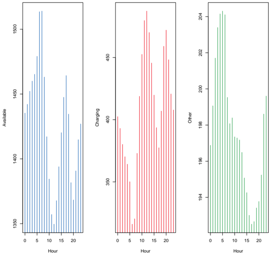
The image presents three bar charts arranged horizontally, each displaying the hourly trends of a different resource: "Available," "Charging," and "Other." The x-axis represents the hour of the day (0-20), and the y-axis represents the quantity of each resource.
### Components/Axes
* **X-Axis (All Charts):**
* Label: "Hour"
* Scale: 0 to 20, with tick marks at intervals of 5.
* **Left Chart:**
* Y-Axis Label: "Available"
* Y-Axis Scale: 1350 to 1500, with tick marks at intervals of 50.
* Bar Color: Blue
* **Middle Chart:**
* Y-Axis Label: "Charging"
* Y-Axis Scale: 350 to 450, with tick marks at intervals of 50.
* Bar Color: Red
* **Right Chart:**
* Y-Axis Label: "Other"
* Y-Axis Scale: 194 to 204, with tick marks at intervals of 2.
* Bar Color: Green
### Detailed Analysis
**1. Available (Blue Bars):**
* **Trend:** The number of available resources increases from hour 0 to approximately hour 5, then decreases until about hour 10. It increases again until about hour 17, then decreases until hour 20.
* **Approximate Values:**
* Hour 0: ~1390
* Hour 5: ~1480
* Hour 10: ~1370
* Hour 17: ~1470
* Hour 20: ~1390
**2. Charging (Red Bars):**
* **Trend:** The number of charging resources decreases from hour 0 to approximately hour 8, then increases until about hour 14. It decreases again until about hour 17, then increases until hour 20.
* **Approximate Values:**
* Hour 0: ~390
* Hour 8: ~360
* Hour 14: ~480
* Hour 17: ~420
* Hour 20: ~470
**3. Other (Green Bars):**
* **Trend:** The number of "Other" resources decreases from hour 0 to approximately hour 10, then increases until about hour 17. It decreases again until hour 20.
* **Approximate Values:**
* Hour 0: ~203
* Hour 10: ~195
* Hour 17: ~200
* Hour 20: ~194
### Key Observations
* The "Available" and "Other" resources show a similar trend, with peaks around hours 5 and 17, and a trough around hour 10.
* The "Charging" resources show an inverse trend compared to "Available" and "Other," with a peak around hour 14 and troughs around hours 8 and 17.
### Interpretation
The data suggests a relationship between the three resources. When "Available" and "Other" resources are high, "Charging" resources tend to be low, and vice versa. This could indicate that when more resources are available, fewer are being used for charging. The peaks and troughs likely correspond to periods of high and low demand throughout the day. The "Other" category seems to follow the "Available" category closely, suggesting they might be related or dependent on each other.