## Bar Charts: Hourly Metrics for Available, Charging, and Offer
### Overview
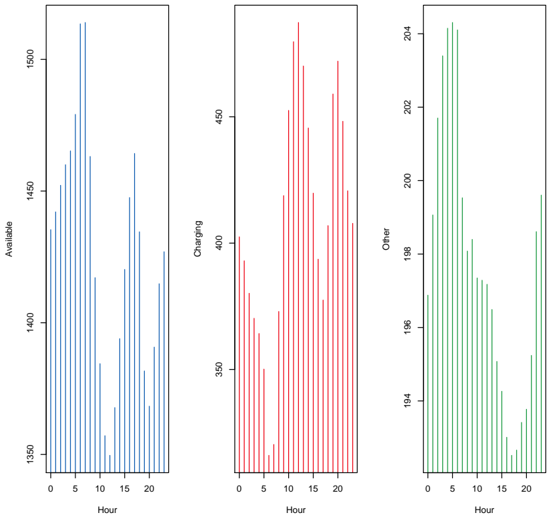
The image displays three vertical bar charts arranged side-by-side in a single row. Each chart plots a different metric against a common x-axis representing "Hour" of the day (0 to 24). The charts are distinguished by color and y-axis label, showing the temporal distribution of three related quantities.
### Components/Axes
* **Common X-Axis (All Charts):**
* **Label:** "Hour"
* **Scale:** Linear, from 0 to 24.
* **Major Tick Marks:** Labeled at 0, 5, 10, 15, 20.
* **Left Chart (Blue Bars):**
* **Y-Axis Label:** "Available"
* **Y-Axis Scale:** Linear, ranging from approximately 1350 to 1500. Major tick marks are labeled at 1350, 1400, 1450, 1500.
* **Middle Chart (Red Bars):**
* **Y-Axis Label:** "Charging"
* **Y-Axis Scale:** Linear, ranging from approximately 350 to 450. Major tick marks are labeled at 350, 400, 450.
* **Right Chart (Green Bars):**
* **Y-Axis Label:** "Offer"
* **Y-Axis Scale:** Linear, ranging from approximately 194 to 204. Major tick marks are labeled at 194, 196, 198, 200, 202, 204.
* **Legend:** There is no explicit legend box. The color of the bars (blue, red, green) is intrinsically linked to the y-axis label of each respective chart.
### Detailed Analysis
**1. Left Chart - "Available" (Blue Bars):**
* **Trend:** The data shows a pronounced peak in the early morning hours, followed by a general decline through the afternoon and a smaller secondary rise in the late evening.
* **Data Points (Approximate):**
* **Peak:** The highest availability occurs between hours 5 and 7, with values reaching just above 1500.
* **Morning (Hours 0-10):** Starts around 1400 at hour 0, rises sharply to the peak, then begins to fall.
* **Afternoon (Hours 10-18):** Reaches a low point between hours 12-15, with values dipping to around 1350-1360.
* **Evening (Hours 18-24):** Shows a recovery, with values climbing back to approximately 1450 by hour 20 before a slight dip.
**2. Middle Chart - "Charging" (Red Bars):**
* **Trend:** This metric shows a strong, broad peak during the middle of the day, with lower values in the early morning and late evening.
* **Data Points (Approximate):**
* **Peak:** The highest charging activity occurs between hours 10 and 15, with the maximum value (around 460) near hour 12.
* **Morning (Hours 0-10):** Starts around 400 at hour 0, dips to a low near 350 around hour 5, then rises steeply.
* **Afternoon/Evening (Hours 15-24):** After the midday peak, values decline steadily, falling below 400 by hour 20 and continuing to drop towards hour 24.
**3. Right Chart - "Offer" (Green Bars):**
* **Trend:** This chart displays a sharp peak in the very early morning, followed by a significant decline and a relatively flat, low level for the remainder of the day.
* **Data Points (Approximate):**
* **Peak:** The highest offer value occurs between hours 3 and 5, reaching just above 204.
* **Early Morning (Hours 0-8):** Rises rapidly from ~198 at hour 0 to the peak, then falls sharply.
* **Rest of Day (Hours 8-24):** After hour 8, the value stabilizes at a much lower level, fluctuating between approximately 194 and 198 for the rest of the 24-hour period.
### Key Observations
1. **Temporal Shift of Peaks:** The three metrics peak at distinctly different times: "Offer" peaks first (hours 3-5), followed by "Available" (hours 5-7), and finally "Charging" (hours 10-15).
2. **Inverse Relationship (Available vs. Charging):** There appears to be an inverse relationship between "Available" and "Charging" during the middle of the day. When "Charging" is at its highest (hours 10-15), "Available" is at its lowest.
3. **Magnitude of Variation:** The relative variation differs greatly. "Available" varies by ~150 units (~10% of its scale), "Charging" by ~110 units (~25% of its scale), and "Offer" by ~10 units (~5% of its scale).
4. **"Offer" Behavior:** The "Offer" metric is unique in that its primary activity is confined to a short, early-morning window, after which it remains low and stable.
### Interpretation
This set of charts likely illustrates the daily cycle of a system involving resource management, such as a vehicle fleet, energy grid, or service platform.
* **The Narrative:** The data suggests a sequence: a surge in **Offers** (e.g., ride requests, energy bids) in the pre-dawn hours is followed by a rise in **Available** resources (e.g., idle vehicles, generated power) to meet that demand. Subsequently, as these resources are utilized, the **Charging** (e.g., vehicles plugged in, batteries replenishing) metric peaks during the daytime, likely during periods of lower demand or solar energy abundance. The low "Available" count during midday coincides with high "Charging," indicating resources are off the active market and undergoing replenishment.
* **System Dynamics:** The charts reveal a system with clear phases: an early-morning demand signal ("Offer"), a morning supply response ("Available"), and a midday replenishment phase ("Charging"). The stability of "Offer" after its morning peak suggests demand becomes predictable or is managed after the initial surge.
* **Anomaly/Notable Point:** The very sharp and early peak in "Offer" is the most striking feature. It implies a highly concentrated period of new demand or input that the system must be prepared to handle, setting the tempo for the subsequent availability and charging cycles.