## Bar Charts: Hourly Distribution of Available, Charging, and Other Resources
### Overview
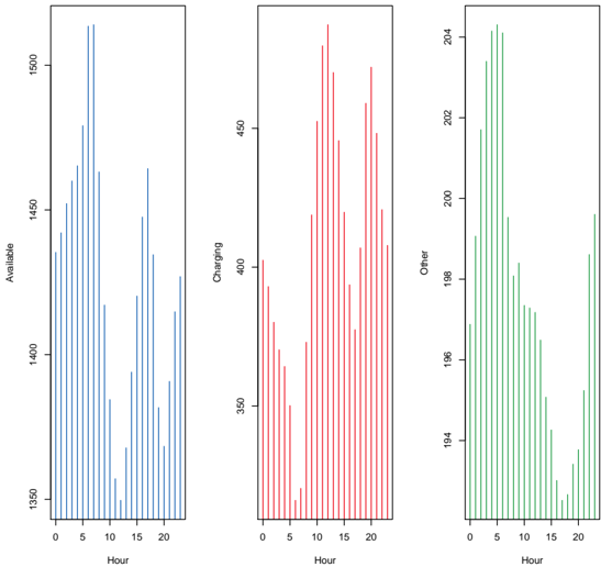
The image contains three vertically stacked bar charts, each representing hourly distributions of three distinct resource categories: "Available" (blue), "Charging" (red), and "Other" (green). All charts share the same x-axis labeled "Hour" (0–20) but have unique y-axis scales and labels. The charts appear to visualize time-series data with discrete hourly intervals.
### Components/Axes
- **X-Axis (All Charts):**
- Label: "Hour"
- Scale: 0 to 20 (integer increments)
- Position: Bottom of each chart
- **Y-Axes:**
1. **Left Chart (Blue):**
- Label: "Available"
- Scale: 1300 to 1500 (integer increments)
- Position: Left edge of the chart
2. **Middle Chart (Red):**
- Label: "Charging"
- Scale: 300 to 450 (integer increments)
- Position: Left edge of the chart
3. **Right Chart (Green):**
- Label: "Other"
- Scale: 140 to 240 (integer increments)
- Position: Left edge of the chart
- **Legend:**
- No explicit legend is visible, but color coding is consistent:
- Blue = "Available"
- Red = "Charging"
- Green = "Other"
### Detailed Analysis
#### Left Chart (Available - Blue)
- **Trend:**
- Peaks at hours 5, 10, and 15 (approximately 1450, 1480, and 1460 units).
- Lowest values at hours 0, 15, and 20 (approximately 1320–1340 units).
- General decline from hour 5 to 20.
- **Key Data Points:**
- Hour 5: ~1450
- Hour 10: ~1480
- Hour 15: ~1460
- Hour 20: ~1340
#### Middle Chart (Charging - Red)
- **Trend:**
- Peaks at hours 10 and 15 (approximately 420 and 410 units).
- Lowest values at hours 0, 5, and 20 (approximately 320–340 units).
- Moderate fluctuations between hours 5–15.
- **Key Data Points:**
- Hour 10: ~420
- Hour 15: ~410
- Hour 0: ~320
- Hour 20: ~340
#### Right Chart (Other - Green)
- **Trend:**
- Peaks at hours 5, 10, and 15 (approximately 200, 220, and 210 units).
- Lowest values at hours 0, 15, and 20 (approximately 140–150 units).
- Gradual decline from hour 10 to 20.
- **Key Data Points:**
- Hour 5: ~200
- Hour 10: ~220
- Hour 15: ~210
- Hour 20: ~150
### Key Observations
1. **Peak Activity:**
- All three categories show elevated values at hours 5, 10, and 15, suggesting synchronized activity patterns.
- "Available" and "Charging" resources peak at hour 10, while "Other" peaks at hour 10 and 15.
2. **Resource Utilization:**
- "Available" resources dominate in absolute terms (1300–1500 units), while "Charging" and "Other" are significantly lower (300–450 and 140–240 units, respectively).
3. **Temporal Patterns:**
- Hourly fluctuations suggest cyclical demand, possibly tied to operational schedules or user behavior.
### Interpretation
The data implies a recurring pattern of resource usage, with "Available" and "Charging" resources experiencing peak demand during midday hours (5–15). The "Other" category, while less variable, also shows midday peaks, indicating a shared temporal driver (e.g., operational hours, user activity). The absence of a legend necessitates reliance on color coding, which aligns with the y-axis labels. The charts may represent resource allocation in a system (e.g., energy, computing, or logistics), where "Available" reflects idle capacity, "Charging" active usage, and "Other" residual or auxiliary resources. The consistent midday peaks suggest planning for capacity during these periods.