## Chart Type: Pie Chart
### Overview
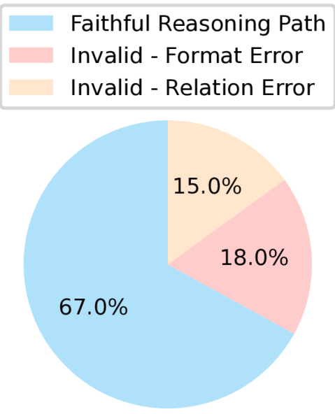
The image is a pie chart displaying the distribution of three categories: "Faithful Reasoning Path", "Invalid - Format Error", and "Invalid - Relation Error". The chart shows the percentage each category represents of the whole.
### Components/Axes
* **Chart Type**: Pie Chart
* **Categories**:
* Faithful Reasoning Path (Light Blue)
* Invalid - Format Error (Light Red)
* Invalid - Relation Error (Light Orange)
* **Values**: Percentages representing the proportion of each category.
* **Legend**: Located at the top of the chart, associating colors with categories.
### Detailed Analysis
* **Faithful Reasoning Path**: Light blue slice, representing 67.0% of the pie chart.
* **Invalid - Format Error**: Light red slice, representing 18.0% of the pie chart.
* **Invalid - Relation Error**: Light orange slice, representing 15.0% of the pie chart.
### Key Observations
* The "Faithful Reasoning Path" category constitutes the majority of the pie chart, with 67.0%.
* "Invalid - Format Error" and "Invalid - Relation Error" represent smaller portions, at 18.0% and 15.0% respectively.
### Interpretation
The pie chart illustrates the relative frequency of faithful reasoning paths versus two types of errors (format and relation). The data suggests that in the analyzed dataset, faithful reasoning is more common than either type of error. The format error occurs slightly more often than the relation error.