## Line Chart: Cf vs x/H
### Overview
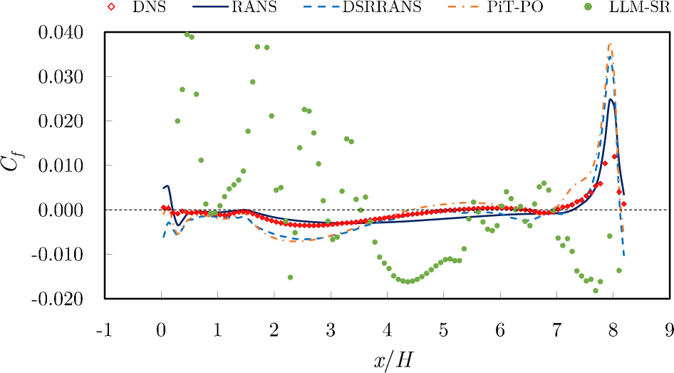
The image is a line chart comparing different computational fluid dynamics (CFD) models against Direct Numerical Simulation (DNS) data. The chart plots the coefficient of friction (Cf) on the y-axis against the normalized distance (x/H) on the x-axis. Several models are compared: RANS, DSRRANS, PiT-PO, and LLM-SR.
### Components/Axes
* **Title:** Implicit, but the chart compares Cf vs x/H for different models.
* **X-axis:**
* Label: x/H
* Scale: -1 to 9, with tick marks at every integer value.
* **Y-axis:**
* Label: Cf
* Scale: -0.020 to 0.040, with tick marks at -0.020, -0.010, 0.000, 0.010, 0.020, 0.030, and 0.040.
* **Legend:** Located at the top of the chart.
* DNS: Red diamonds
* RANS: Solid dark blue line
* DSRRANS: Dashed light blue line
* PiT-PO: Dash-dotted orange line
* LLM-SR: Green dots
### Detailed Analysis
* **DNS (Red Diamonds):**
* Trend: Relatively flat near zero from x/H = -1 to approximately x/H = 7.5, then sharply increases to a peak around x/H = 8, followed by a sharp drop.
* Data Points:
* x/H = 0, Cf ≈ 0.001
* x/H = 2, Cf ≈ -0.003
* x/H = 4, Cf ≈ -0.003
* x/H = 6, Cf ≈ 0.001
* x/H = 8, Cf ≈ 0.022
* **RANS (Solid Dark Blue Line):**
* Trend: Similar to DNS, relatively flat near zero from x/H = -1 to approximately x/H = 7.5, then increases to a peak around x/H = 8, followed by a drop.
* Data Points:
* x/H = 0, Cf ≈ -0.003
* x/H = 2, Cf ≈ -0.004
* x/H = 4, Cf ≈ -0.004
* x/H = 6, Cf ≈ 0.000
* x/H = 8, Cf ≈ 0.024
* **DSRRANS (Dashed Light Blue Line):**
* Trend: Similar to DNS and RANS, relatively flat near zero from x/H = -1 to approximately x/H = 7.5, then increases to a peak around x/H = 8, followed by a sharp drop.
* Data Points:
* x/H = 0, Cf ≈ -0.006
* x/H = 2, Cf ≈ -0.005
* x/H = 4, Cf ≈ -0.004
* x/H = 6, Cf ≈ -0.001
* x/H = 8, Cf ≈ 0.038
* **PiT-PO (Dash-dotted Orange Line):**
* Trend: Similar to DNS, RANS, and DSRRANS, relatively flat near zero from x/H = -1 to approximately x/H = 7.5, then increases to a peak around x/H = 8, followed by a drop.
* Data Points:
* x/H = 0, Cf ≈ -0.004
* x/H = 2, Cf ≈ -0.004
* x/H = 4, Cf ≈ -0.002
* x/H = 6, Cf ≈ 0.001
* x/H = 8, Cf ≈ 0.015
* **LLM-SR (Green Dots):**
* Trend: Highly scattered data points. From x/H = -1 to approximately x/H = 3, the data points are scattered above the zero line. From x/H = 3 to x/H = 8, the data points are scattered below the zero line. There is a large amount of variance.
* Data Points: The data is too scattered to provide accurate point estimates.
### Key Observations
* The RANS, DSRRANS, and PiT-PO models generally follow the trend of the DNS data, but there are some deviations, particularly around the peak at x/H = 8.
* The LLM-SR model shows a high degree of scatter and does not closely follow the trend of the DNS data.
* All models converge to near zero for x/H values between 2 and 7.
* All models show a peak in Cf around x/H = 8.
### Interpretation
The chart compares the performance of different CFD models in predicting the coefficient of friction (Cf) against DNS data, which is considered the most accurate. The RANS, DSRRANS, and PiT-PO models show reasonable agreement with the DNS data, suggesting they can capture the general trend of the flow. However, the DSRRANS model overestimates the peak at x/H = 8, while the PiT-PO model underestimates it. The LLM-SR model's high scatter indicates that it is not a reliable predictor of Cf in this scenario. The peak at x/H = 8 likely corresponds to a significant flow feature, such as a separation or reattachment point, which the models capture with varying degrees of accuracy.