## Dual Line Charts: Model Scaling Efficiency
### Overview
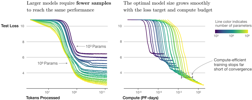
The image displays two side-by-side line charts illustrating the relationship between model size (number of parameters), training data (tokens processed), computational cost (PF-days), and model performance (test loss). The central thesis is that larger models are more sample-efficient and that the optimal model size scales with the available compute budget and loss target.
### Components/Axes
**Common Elements:**
* **Y-Axis (Both Charts):** Labeled "Test Loss". Scale is linear, ranging from 4 to 10, with major gridlines at 4, 6, 8, and 10.
* **Legend (Top-Right of Right Chart):** A horizontal color bar titled "Line color indicates number of parameters". The scale is logarithmic, with labels for `10^5` (dark purple), `10^7` (teal/green), and `10^9` (bright yellow). Lines transition smoothly through this color spectrum.
* **Line Identification:** Two specific lines are annotated with arrows and text: one pointing to a dark purple line labeled "10^5 Params" and another pointing to a yellow-green line labeled "10^9 Params".
**Left Chart:**
* **Title:** "Larger models require **fewer** samples to reach the same performance"
* **X-Axis:** Labeled "Tokens Processed". Scale is logarithmic, with major markers at `10^7`, `10^9`, and `10^11`.
**Right Chart:**
* **Title:** "The optimal model size grows smoothly with the loss target and compute budget"
* **X-Axis:** Labeled "Compute (PF-days)". Scale is logarithmic, with major markers at `10^-9`, `10^-6`, `10^-3`, and `10^0`.
* **Annotation:** A text box with an arrow pointing to the convergence point of the lines at high compute states: "Compute-efficient training stops far short of convergence".
### Detailed Analysis
**Left Chart (Test Loss vs. Tokens Processed):**
* **Trend Verification:** All lines show a downward trend (decreasing loss) as tokens processed increase, eventually plateauing. The slope of descent is steeper for larger models (yellow/green lines) compared to smaller models (purple/blue lines).
* **Data Series & Values:**
* **Small Models (Purple, ~10^5 params):** Begin at a loss >10. They require approximately `10^9` to `10^10` tokens to reach a loss of ~8, and plateau at a loss between 6 and 7.
* **Medium Models (Teal, ~10^7 params):** Begin at a loss >10. They reach a loss of 8 with roughly `10^8` tokens and plateau at a loss between 4 and 5.
* **Large Models (Yellow, ~10^9 params):** Begin at a loss >10. They reach a loss of 8 with fewer than `10^8` tokens and plateau at the lowest loss, approximately 4.
* **Key Relationship:** For any given target loss (e.g., loss=6), the number of tokens required decreases as the model size (line color shifting from purple to yellow) increases. A `10^9` param model needs roughly 100x fewer tokens than a `10^5` param model to achieve the same loss of 6.
**Right Chart (Test Loss vs. Compute):**
* **Trend Verification:** All lines show a downward trend as compute increases. The lines for different model sizes are initially separated but converge into a tight band at high compute values (`~10^-1` to `10^0` PF-days).
* **Data Series & Values:**
* The initial descent is staggered: smaller models (purple) begin improving at very low compute (`10^-9` PF-days), while larger models (yellow) require more initial compute (`~10^-6` PF-days) before their loss begins to drop significantly.
* At a compute budget of `10^-3` PF-days, the optimal model (the line achieving the lowest loss) is a medium-large model (green-yellow, ~10^8 params).
* All models converge to a similar minimum loss of approximately 4 at a compute budget of `~10^0` PF-days.
* **Annotation Insight:** The "Compute-efficient training" annotation points to the region where the lines converge, suggesting that stopping training at this point (around loss=4) is optimal, as further compute yields diminishing returns.
### Key Observations
1. **Sample Efficiency:** The left chart provides clear visual evidence that increasing model parameter count dramatically reduces the amount of training data (tokens) needed to achieve a specific performance level.
2. **Compute-Optimal Scaling:** The right chart demonstrates that for a fixed compute budget, there is a specific, intermediate model size that minimizes loss. Using a model that is too small or too large for the given compute is suboptimal.
3. **Convergence Behavior:** All models, regardless of size, appear to converge toward a similar minimum loss value (~4), but they reach it at vastly different points in terms of data and compute.
4. **Early Stopping Point:** The annotation highlights a practical insight: the most efficient use of compute is to stop training before full convergence, as the final improvement in loss requires a disproportionate amount of additional compute.
### Interpretation
These charts visualize a foundational principle in modern machine learning scaling laws. They move beyond the simple notion that "bigger is better" to show a nuanced, three-way trade-off between **model size**, **dataset size**, and **compute budget**.
* **The Left Chart** argues for training larger models when data is the limiting resource. It suggests that investing in parameter count can unlock better performance from a fixed dataset.
* **The Right Chart** provides a guide for resource allocation. It implies that when planning a training run, one should first determine the available compute budget (PF-days), then select the model size that sits on the "efficient frontier" (the lowest point of the curve for that compute value) to achieve the best possible loss.
* **The Combined Message** is that scaling is not monolithic. Efficient AI development requires co-designing model architecture, data collection, and computational infrastructure. The "optimal" model is not a fixed size but is defined by the operational constraints of data and compute. The charts advocate for a strategic approach where these three factors are scaled in concert to maximize performance per unit of resource.